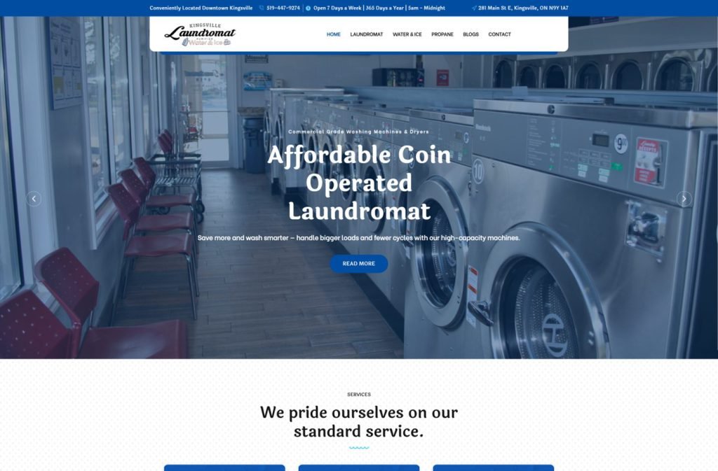
kingsvillelaundromat.com
Case study
313 Driving School.
313 Driving School had been taking every lesson enquiry through social media messages. I built a booking-led site for the Derby school with side-by-side manual and automatic pricing, revision pages for learners and a franchise page to recruit instructors.
IndustryLocal Business
Timeline2026
Built withGoogle Reviews
 HOVER TO SCROLL

// how it was built
From brief to launch.
The school was starting from zero online, so I planned every step around one outcome: a learner in Derby booking a lesson from their phone.
-
01 discover
No website yet
I looked at how enquiries were arriving through social messages and who was sending them, mostly teenagers on mobiles.
-
02 plan
Pages around the learner
I mapped the booking homepage, two pricing sections, revision material, a coverage checker, a pass gallery and the franchise page.
-
03 design
Winged logo palette
I built the look from the badge's red, black and white, using slanted red bands to flag each call to action.
-
04 build
Pricing and gallery
I coded matching manual and automatic pricing blocks and configured the gallery so each successful learner gets a branded card.
-
05 integrate
Reviews and enquiries
I connected the Google Reviews widget and placed the enquiry form beside a Derby coverage map.
-
06 ✓ shipped
Mobile first slide
I tested the phone-only hero with its wide booking button, collapsed the benefits list into one column and checked the FAQ and opening hours.
What I did
The build, step by step.
- Booking before anything else. The homepage opens on an in-car photo and a single booking button, and phone visitors get their own opening slide where that button spans the screen.
- Two pricing tables that mirror each other. Manual and automatic tuition use the same three course levels, so a learner can compare them without reading twice.
- Pages learners actually revisit. I added area coverage checks, road sign and theory question revision, and a franchise page for instructors wanting to join.
- Proof from real passes. The gallery renders each successful student on a branded card, and a Google Reviews widget shows the school's rating.
- Colours lifted from the logo. The winged badge supplies the red, black and white palette. Angled red bands mark each call to action, and light panels carry a quilted texture.
Related work
See them all
More Local Business projects.
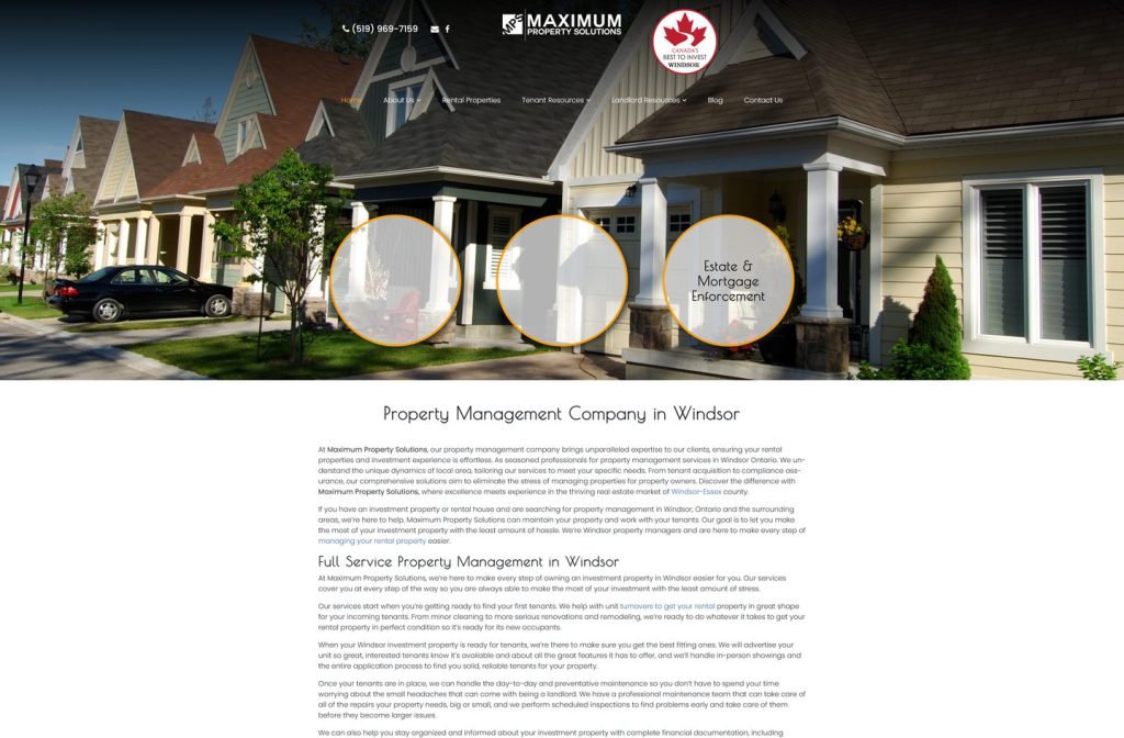
maximum-property.com
Want this for your business?
Send me your URL and I'll reply with a prioritised breakdown of what's costing you enquiries and how I'd fix it. No charge, and no call needed.