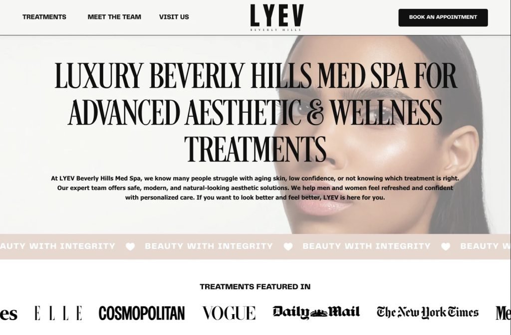
lyevbeverlyhills.com
Case study
B.A.R.E. Essentials Spa.
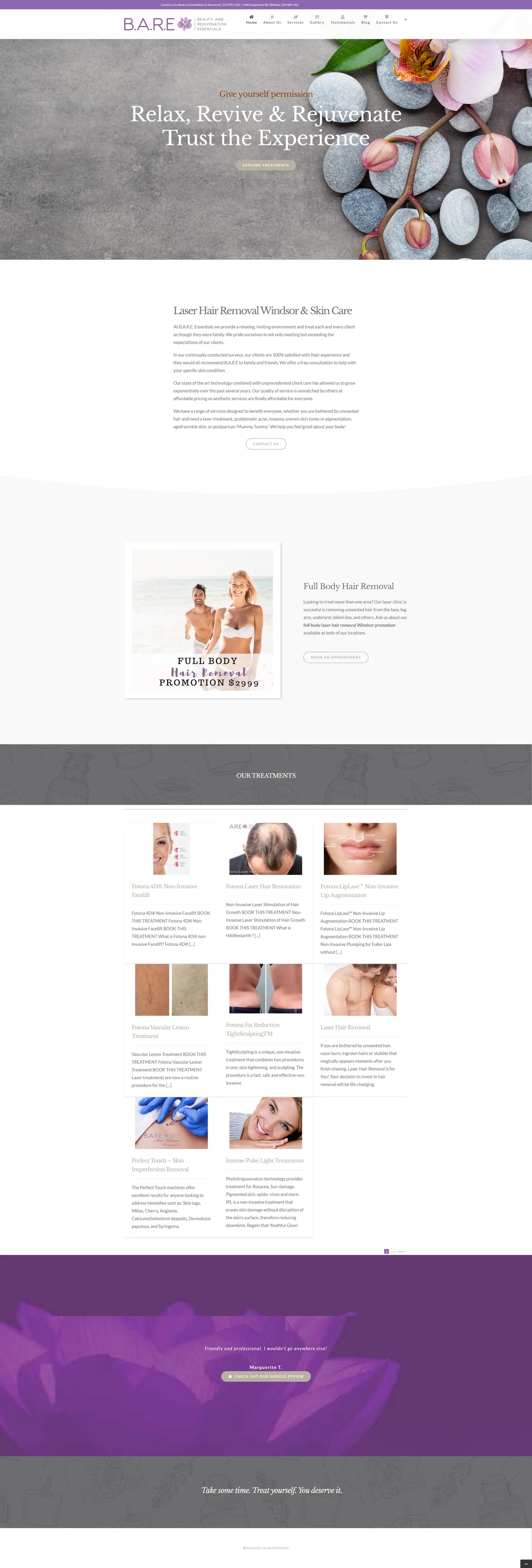
For B.A.R.E. Essentials Spa I built a calm, plum-toned site that pitches medical-grade results at spa prices. The homepage reads as one continuous pitch, from a welcome and featured offer to a card for every treatment, and each card opens a detail page that leads straight to a booking request.
IndustryBeauty & Med Spa
Timeline2024
 HOVER TO SCROLL

// how it was built
From brief to launch.
Many of the spa's clients research treatments on their phones at night, so I planned this build around a short, reassuring route to booking.
-
01 discover
Trust gap identified
I noted that clients need to understand each laser and skin treatment and see genuine outcomes before booking, mostly on mobile.
-
02 plan
Focused homepage
I laid out a welcome, a promoted offer and a treatment grid, and moved results, reviews and articles into separate menu pages.
-
03 design
Plum and grey calm
I paired a gentle plum with warm greys and a quiet hero image, then a stronger purple testimonial band decorated with a lotus.
-
04 build
Treatment pages and promo
I built the detail page for each treatment with a booking path, the promotion module and a band inviting clients to leave reviews.
-
05 content
Before and after gallery
I set up the gallery to show large result photos, alongside the testimonials and blog pages.
-
06 ✓ shipped
Mobile booking check
I confirmed the single stack of cards on phones and that the primary booking prompt sits above the fold.
What I did
The build, step by step.
- One homepage, one pitch. I kept gallery, testimonials and blog on their own menu pages so the homepage stays focused on treatments and booking.
- Every treatment gets a card. The treatment grid links to detail pages that explain what is involved and end with a route to book.
- The offer gets its own button. I gave the featured special a dedicated booking button and added a top-bar note reminding visitors about consultations.
- Soft colours, one bold band. Muted plum and soft grey around a hero of stones and a flower keep things calm, and reviews switch to a vivid purple band with lotus artwork.
- Booking before the scroll. On phones the treatment cards form a single stack and the primary booking prompt shows before any scroll.
Related work
See them all
More Beauty & Med Spa projects.
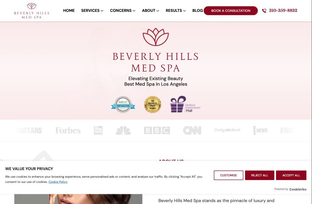
beverlyhillsmedspa.com
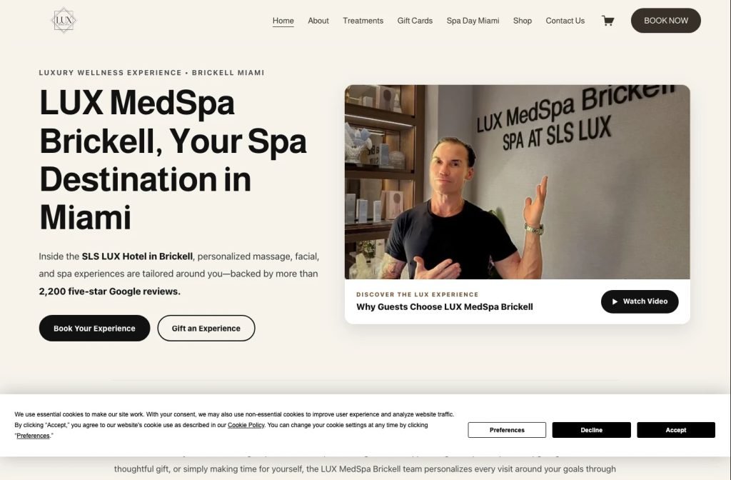
luxmedspabrickell.com
Want this for your business?
Send me your URL and I'll reply with a prioritised breakdown of what's costing you enquiries and how I'd fix it. No charge, and no call needed.