bouncepro.net
Case study
Bounce USA.
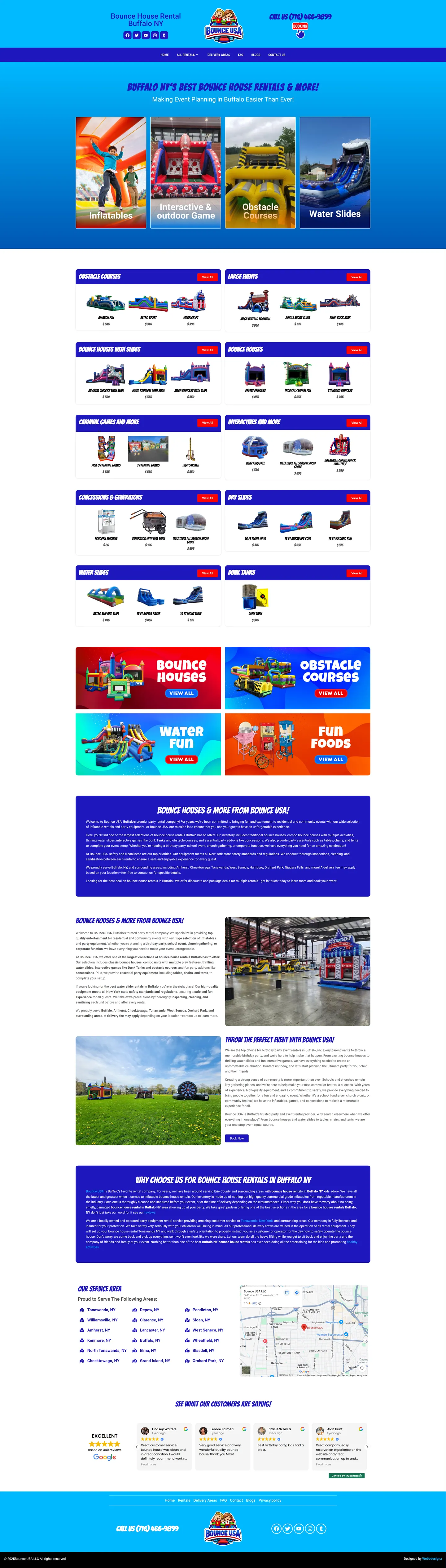
I built Bounce USA a catalog-style site where a parent can go from browsing to reserving without picking up the phone. Every rental card shows its price, every path ends in a date-based reservation, and the category layout lets the range keep growing without a redesign.
IndustryParty Rentals
Timeline2024
 HOVER TO SCROLL

// how it was built
From brief to launch.
Bounce USA's build was about answering three parent questions, what, how much and is it free, at any catalog size.
-
01 discover
Parent questions
I boiled the brief down to what parents need: availability, price and whether their date is open.
-
02 plan
Catalog structure
I laid out top tiles, category rows with full-list bars and separate pages for delivery areas, FAQ and blog.
-
03 design
Sky blue base
I used sky blue with deep blue category bars, white card backgrounds and one orange tile reserved for party snacks.
-
04 build
Date reservations
I linked every rental card to a date-first reservation step and added the Google review carousel.
-
05 optimise
Mobile speed
I compressed product photos for mobile data and turned category rows into swipe strips.
-
06 ✓ shipped
Service towns
I published the towns served, Tonawanda and Orchard Park among them, alongside the warehouse map.
What I did
The build, step by step.
- Shop-window homepage. Big tiles open the page and lead into core groups like water slides and inflatables.
- Rows by category. Each rental category gets its own row that ends in a bar opening the complete list.
- Prices on every card. Parents see cost at a glance, and every route closes with a reservation that starts from their event date.
- Local proof. A map marking the Tonawanda warehouse, a grid of covered towns and rotating Google reviews reassure families.
- Light on mobile data. On phones rows turn into swipe strips, images are compressed for data and the header keeps call and booking links.
Want this for your business?
Send me your URL and I'll reply with a prioritised breakdown of what's costing you enquiries and how I'd fix it. No charge, and no call needed.