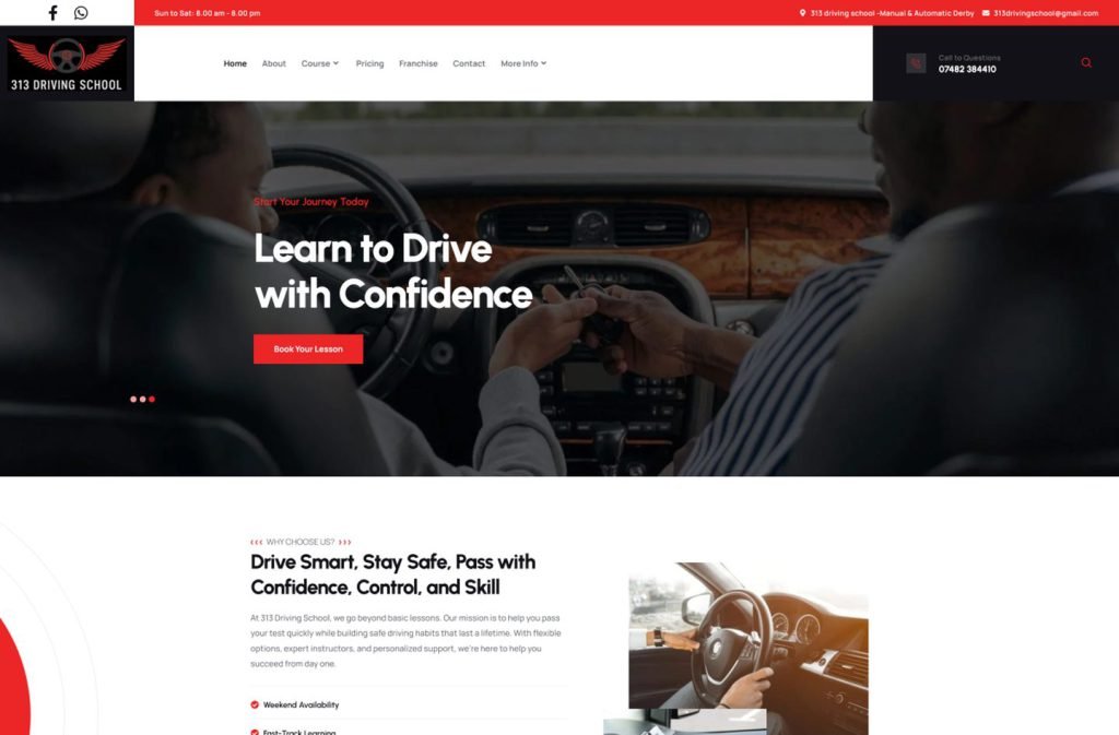
313drivingschool.co.uk
Case study
Maximum Property Solutions.
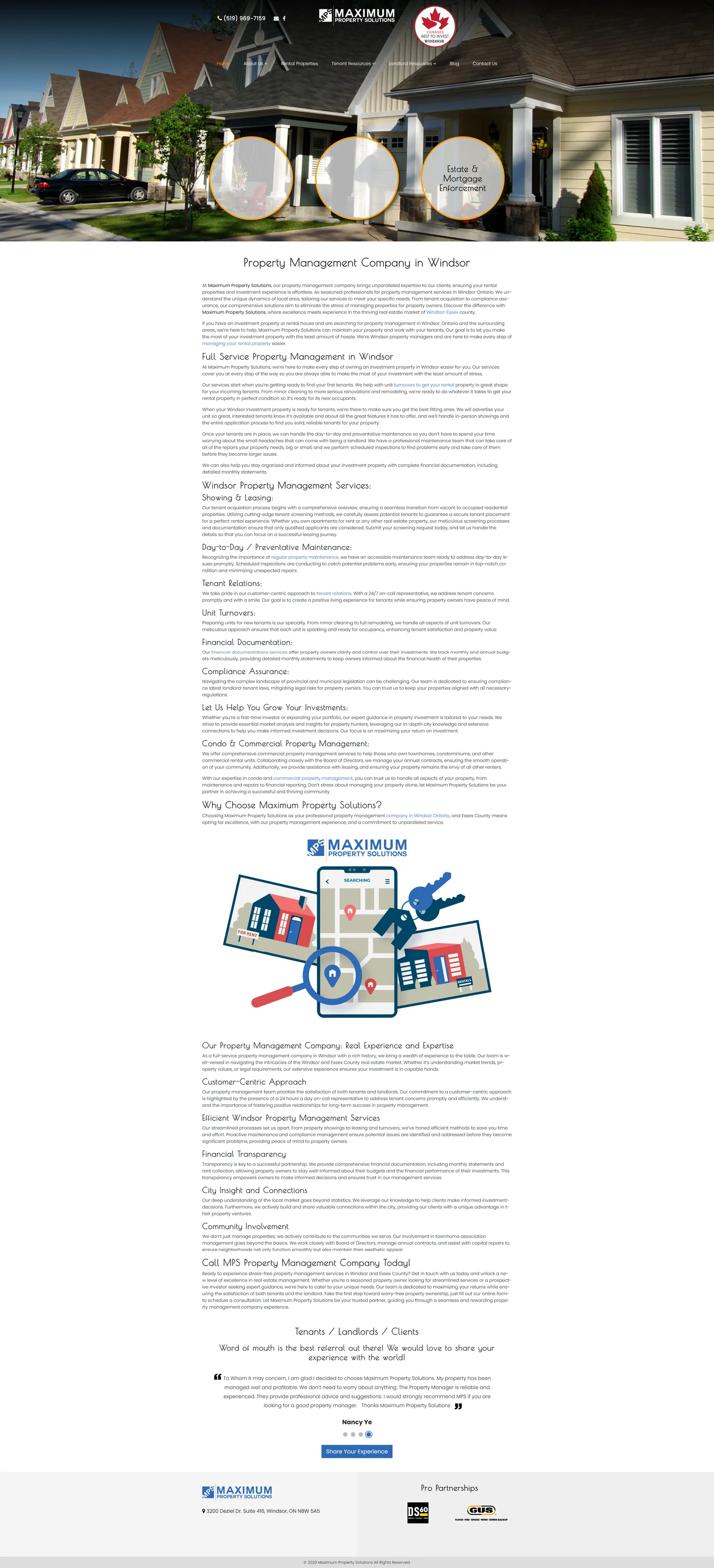
I built this site for a Windsor property manager serving three audiences at once: renters, owners and investors. Each group gets its own path through the navigation and the contact form, and the homepage reads like a calm, detailed management proposal for owners.
IndustryLocal Business
Timeline2023
 HOVER TO SCROLL

// how it was built
From brief to launch.
The main job was untangling three audiences on one site, and I planned each stage around keeping them apart.
-
01 discover
Three audiences
I mapped what renters, owners and investors each came for and where their needs clashed.
-
02 plan
Audience-based navigation
I gave owners and renters separate dropdowns and made visitor type the first question in the contact form.
-
03 design
Brochure feel
I used serif type and generous plain text so owners could read the service scope without pressure.
-
04 build
Services and listings
I built the full services overview, the hero callout circles, rental listings, a review slider and partner logos.
-
05 optimise
Skimmable on phones
I kept subheadings visible on small screens and regrouped the three circles under the hero photo.
-
06 ✓ shipped
Labelled enquiries
Every message now reaches the Windsor office tagged by visitor type.
What I did
The build, step by step.
- Separate menus per audience. Renters and owners each have their own resources dropdown.
- Enquiries arrive sorted. The contact form first asks whether the visitor is a renter, owner or investor.
- Services laid out in full. The homepage walks through leasing, showings, upkeep, turnovers, monthly statements, compliance, renter support and condo or commercial properties.
- Street photo with callouts. A real street scene holds an award badge plus three service callouts ringed in orange.
- Listings and reviews. I added a rental listings area and reviews in a slider that asks visitors to add their own.
Related work
See them all
More Local Business projects.
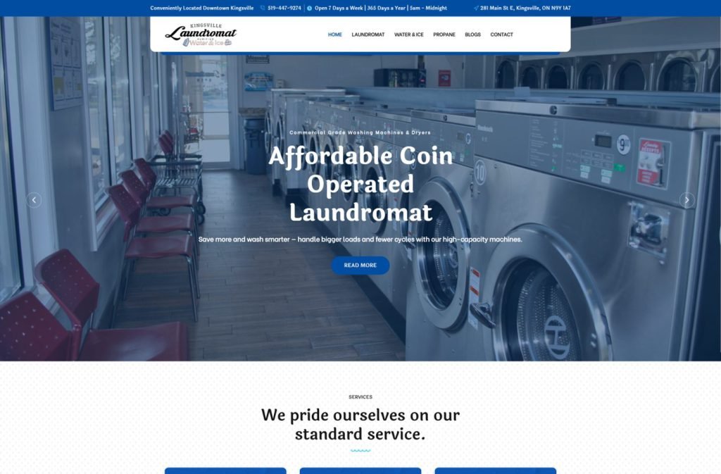
kingsvillelaundromat.com
Want this for your business?
Send me your URL and I'll reply with a prioritised breakdown of what's costing you enquiries and how I'd fix it. No charge, and no call needed.