tefitness.com
Case study
Carrie Smith Health.
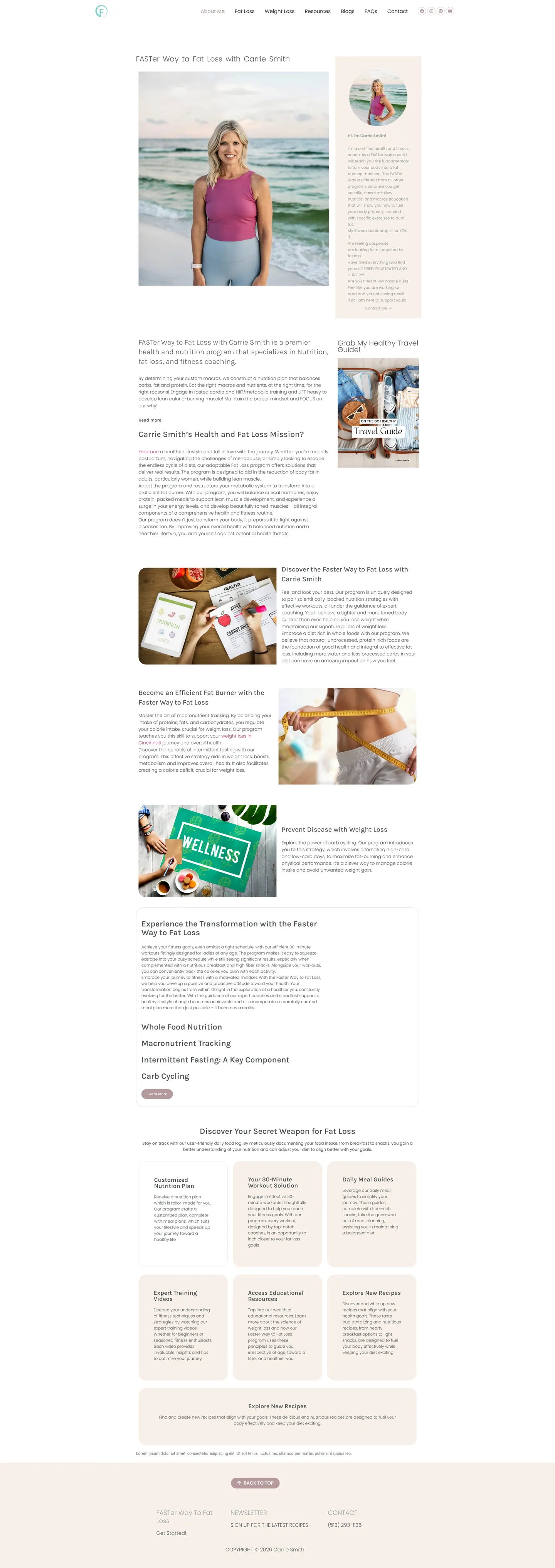
I built a gentle, teach-first site for a certified fitness and health coach whose audience has tried every diet already. The homepage explains how her method works before any offer, and a free travel guide gives cautious visitors an easy first step.
IndustryFitness & Wellness
Timeline2023
 HOVER TO SCROLL

// how it was built
From brief to launch.
This audience distrusts hype, so I planned the site to explain, reassure and only then ask.
-
01 discover
Wary visitors
I focused on people who have been let down by diets before and need to understand a method before trusting it.
-
02 plan
Education order
I placed the program foundations first, the benefits grid next and the offer after that, with menu links for each topic.
-
03 design
Blush and teal
I chose soft pink and cream sections, a quiet teal monogram, letter-spaced headings and plenty of whitespace.
-
04 build
Lead capture
I built the travel guide opt-in, the footer recipe signup and the persistent profile card.
-
05 optimise
Readable pastels
I tuned font sizes so the light colours stay legible on phones.
-
06 ✓ shipped
Hand-off
I set things up so the coach can publish posts and change bootcamp details for each round without a developer.
What I did
The build, step by step.
- Method before pitch. Carb cycling, whole foods, macro counting and intermittent fasting are explained ahead of the program offer.
- Benefits as a card grid. A personalised nutrition plan, quick workouts and meal guidance each day are laid out as member benefits.
- A soft opt-in. The free travel guide sits beside the introduction as the main list builder, with a recipe newsletter in the footer.
- A face beside the program. A profile card with her photo and contact option stays on screen, moving below the portrait on phones.
- Editable by the coach. She publishes her own articles and updates bootcamp rounds herself, and an FAQ page covers common questions.
Related work
See them all
More Fitness & Wellness projects.
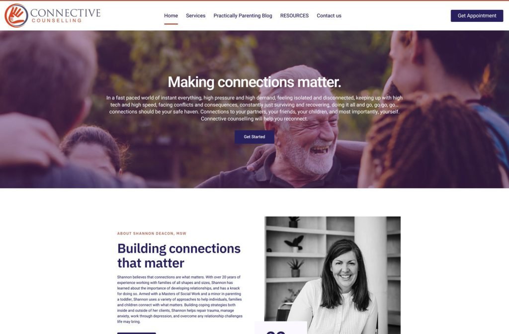
shannondeacon.ca
Want this for your business?
Send me your URL and I'll reply with a prioritised breakdown of what's costing you enquiries and how I'd fix it. No charge, and no call needed.