liverpoolglobaleducation.org
Case study
Children in Limbo Task Force.
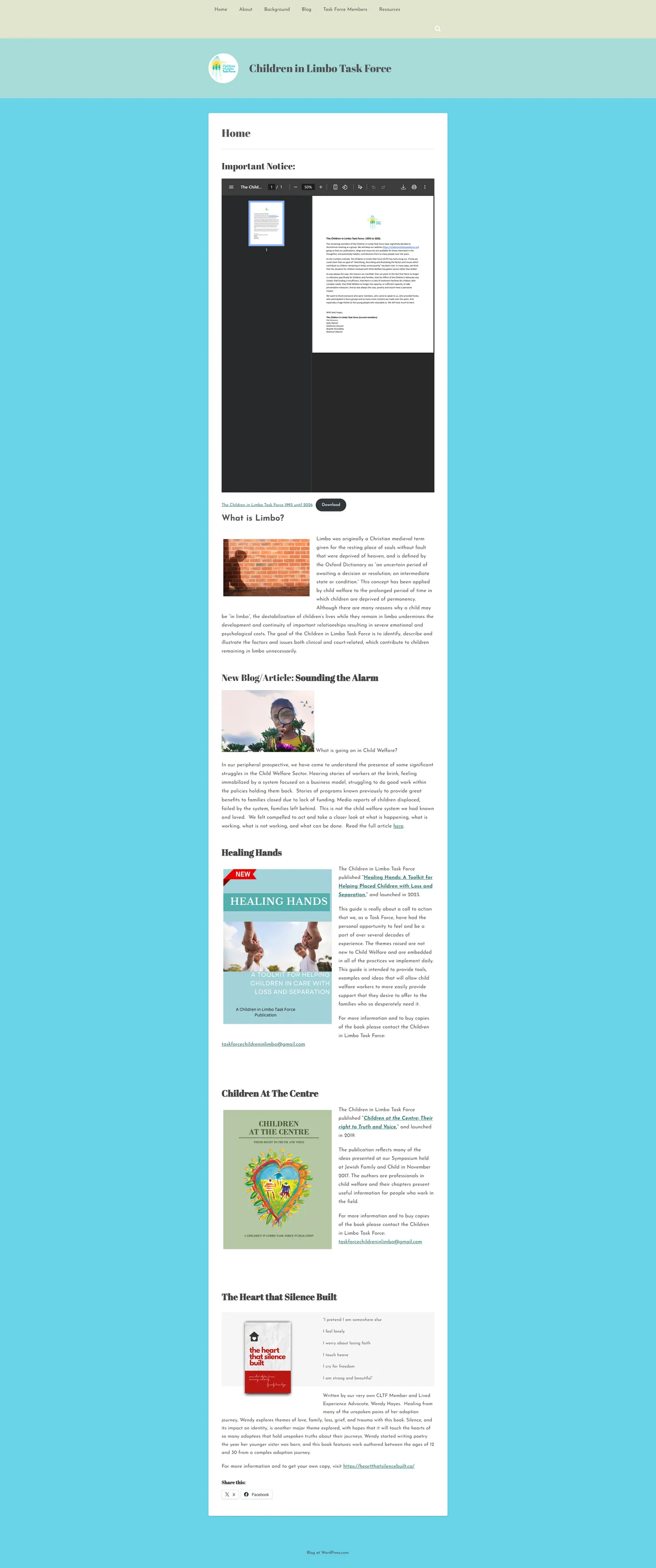
The task force's readers are caseworkers, social workers and adoptive families who need to grasp the issue quickly and read long documents comfortably. I built a calm publishing site with a guided homepage, an embedded notice viewer and a home for the group's books.
IndustryEducation & Nonprofit
Timeline2023
 HOVER TO SCROLL

// how it was built
From brief to launch.
This was a reading site first, so I built it in stages that protected long-form content and made the volunteers' expertise easy to find.
-
01 discover
Readers and writers
I looked at the mix of caseworkers, social workers and families reading, and the volunteers who would keep publishing.
-
02 plan
A reading sequence
I ordered the homepage as notice, explainer, featured article and books, with history, members and resources behind it.
-
03 design
Sky blue and serif
I set a single white column on a bright blue background and chose the shadow-of-a-child image to open the page.
-
04 build
PDF viewer and books
I embedded the notice viewer with a download button and built book blocks with covers, backstories and ordering links.
-
05 content
Blog and archive
I set up the blog with share buttons, the notice archive, the members list and the resource library for volunteers to update.
-
06 ✓ shipped
Phone reading
I swapped the viewer for a direct file link on mobile and tuned line length and spacing for long documents.
What I did
The build, step by step.
- A homepage that reads in order. It runs from the latest notice, to a plain explanation of limbo for a child, to a featured piece and finally the published books.
- Notices in the page. The important notice opens in an embedded PDF viewer with a button to save a copy.
- Books with their backstory. Each publication shows its cover, how it came to be written and a link to order it.
- One column for reading. A white text column sits on sky blue, with classic serif headings and book covers supplying the colour.
- Kinder on phones. On mobile the embedded viewer is replaced by a file link and download button, and body text uses short line lengths with roomy spacing.
Related work
See them all
More Education & Nonprofit projects.

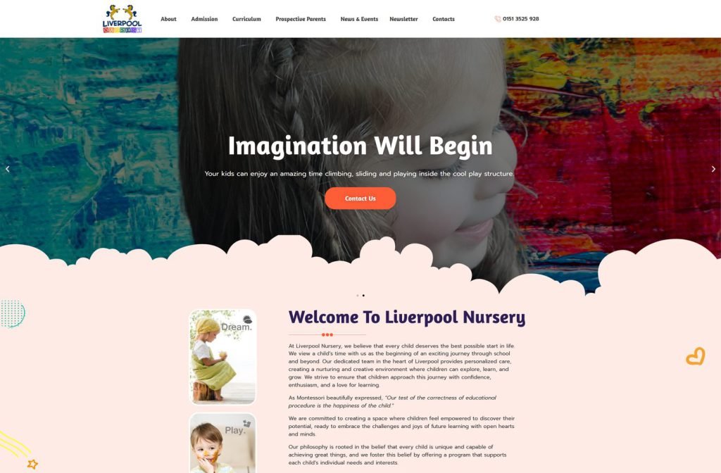
liverpoolnursery.org
Want this for your business?
Send me your URL and I'll reply with a prioritised breakdown of what's costing you enquiries and how I'd fix it. No charge, and no call needed.