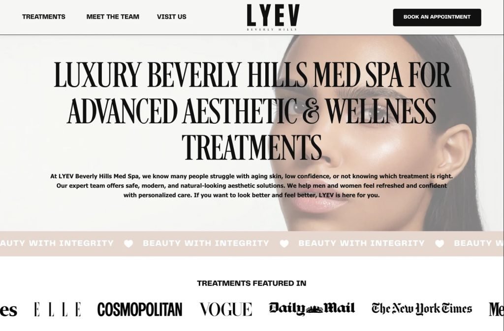
lyevbeverlyhills.com
Case study
SISI Clinic.
Most salon sites list dozens of treatments. SISI Clinic offers only sugaring, so I built a single-flow site that explains the paste, compares it with waxing and ends at one appointment form, all in the unhurried tone of the Manchester studio.
IndustryBeauty & Med Spa
Timeline2026
 HOVER TO SCROLL

// how it was built
From brief to launch.
With a single treatment to sell, the build was about pacing. I planned it so a first-time visitor learns, trusts and books in one scroll.
-
01 discover
One treatment, one message
I started from the clinic's niche as the only sugaring-only studio in Manchester and what newcomers would not yet know.
-
02 plan
Story order
I sequenced the homepage as explainer, waxing comparison, promises and finally the booking form, with nothing competing in between.
-
03 design
Sand and cocoa
I set serif headings on a warm palette and kept skin photography natural so the page feels like the studio.
-
04 build
Ribbon and reviews
I coded the slow-scrolling benefits ribbon and a review carousel that shows each client's name and date.
-
05 content
Blog and newsletter
I set up the blog with starter sugaring articles, the experience badge, daily opening times and a newsletter signup.
-
06 ✓ shipped
Phone booking flow
On mobile I placed the form fields straight under the closing headline and made reviews swipe one card at a time.
What I did
The build, step by step.
- A page that argues gently. The sections run in order from what sugaring is, to why it beats waxing, to the clinic's promises, and only then to booking.
- One form, no scattered buttons. Every section points to the same appointment request, which sits next to the studio's details.
- Warm, natural styling. Sand and cocoa tones, serif headings and lightly retouched skin photos keep the page as relaxed as the treatment room.
- A slow benefits ribbon. Short phrases about the treatment drift across the page, repeating the key selling points without shouting.
- Content that keeps working. I set up a named and dated review carousel, a blog with starter posts on sugaring and a newsletter signup.
Related work
See them all
More Beauty & Med Spa projects.
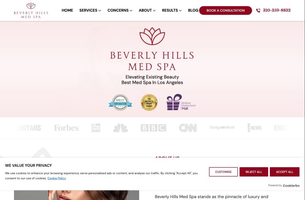
beverlyhillsmedspa.com
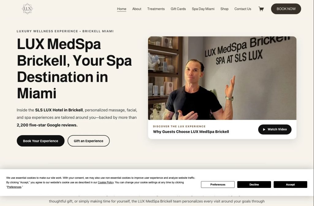
luxmedspabrickell.com
Want this for your business?
Send me your URL and I'll reply with a prioritised breakdown of what's costing you enquiries and how I'd fix it. No charge, and no call needed.