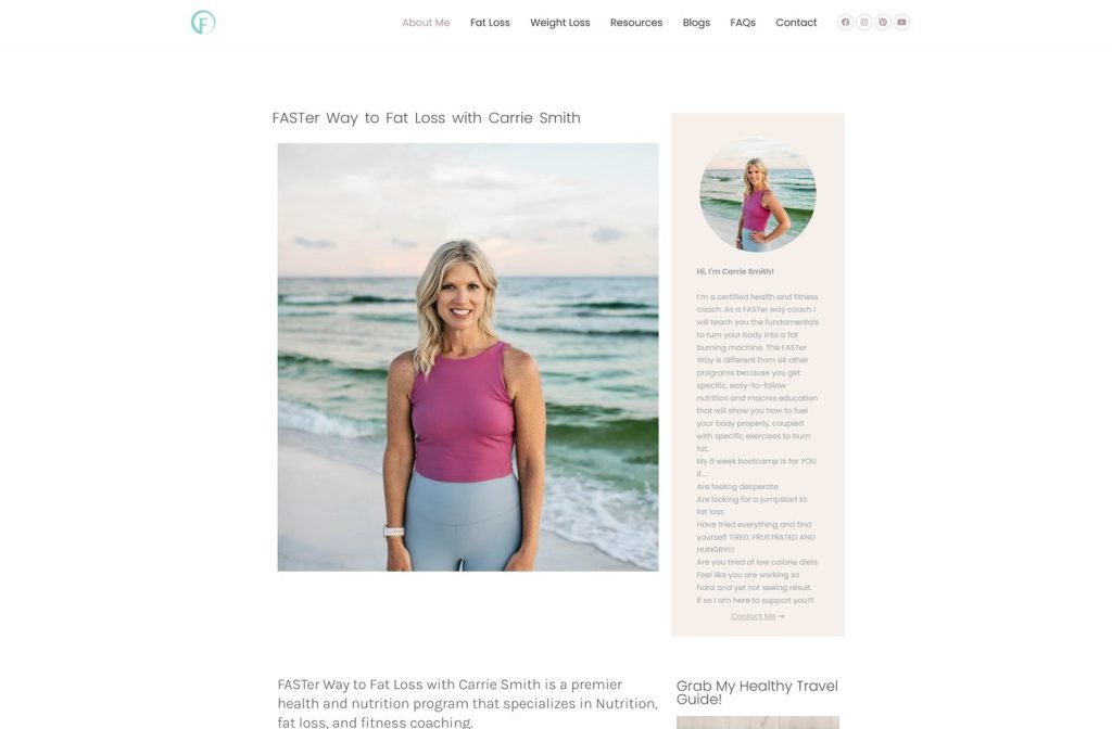
carriesmithhealth.com
Case study
TE Fitness.
I built a sales site around a coach whose story does the selling: a pro football title and TV bootcamps. Private clients, app users and film productions all arrive together, so I gave each a lane from the first screen and made every plan purchasable without leaving its card.
IndustryFitness & Wellness
Timeline2026
 HOVER TO SCROLL

// how it was built
From brief to launch.
This project was about turning a personal story into sales, so every step of the build was measured against how quickly a visitor could buy.
-
01 discover
Three buyers
I separated the audiences into one-to-one clients, app plan buyers and film or TV productions, each with different questions.
-
02 plan
Routing by tile
I planned a service tile row at the top and pushed individual plan cards lower down, where most of the selling happens.
-
03 design
Black, grey, red
I used a monochrome base with red accents and placed the coach in action shots throughout the page.
-
04 build
Program sections
I coded plan cards with price, access length, gear, duration and checklists, plus the cast conditioning and monthly remote coaching signup.
-
05 content
Proof and extras
I added the client stories slider, bootcamp event photos, the blog, and a contact page with a form and map.
-
06 ✓ shipped
Selling from day one
I checked every purchase path on mobile and desktop so each program could be bought as soon as the site went live.
What I did
The build, step by step.
- Pick a lane first. A row of service tiles opens the homepage so each visitor chooses coaching, plans or cast conditioning before scrolling.
- Price on every card. Each training plan lists its price and the length of app access it includes, so nobody has to click through to compare.
- Plans that explain themselves. Duration, required gear and an included-items checklist sit on every program, from no-equipment plans to longer strength blocks.
- The coach in every section. Photos of him with ropes, chains and dumbbells, plus his TV and stunt background in the About block, carry the credibility.
- Buy buttons that stay put. On phones I kept each plan's price and purchase button attached to its checklist so they never drift apart.
Related work
See them all
More Fitness & Wellness projects.
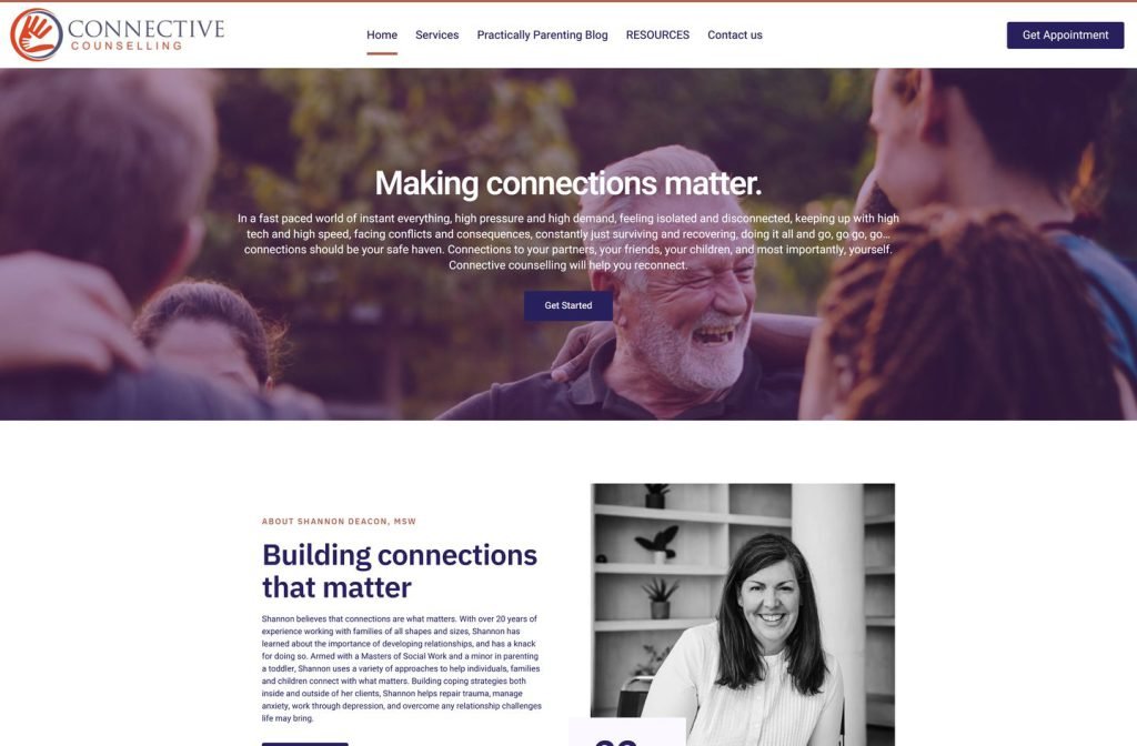
shannondeacon.ca
Want this for your business?
Send me your URL and I'll reply with a prioritised breakdown of what's costing you enquiries and how I'd fix it. No charge, and no call needed.