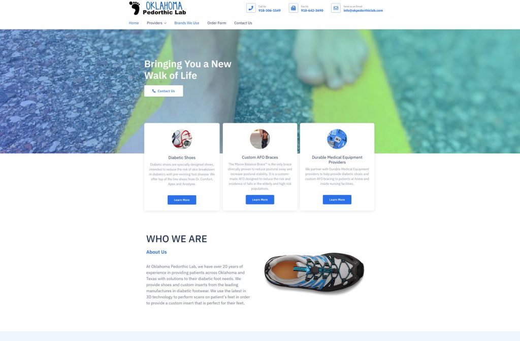
okpedorthiclab.com
Case study
Oklahoma Advantage Storehouse.
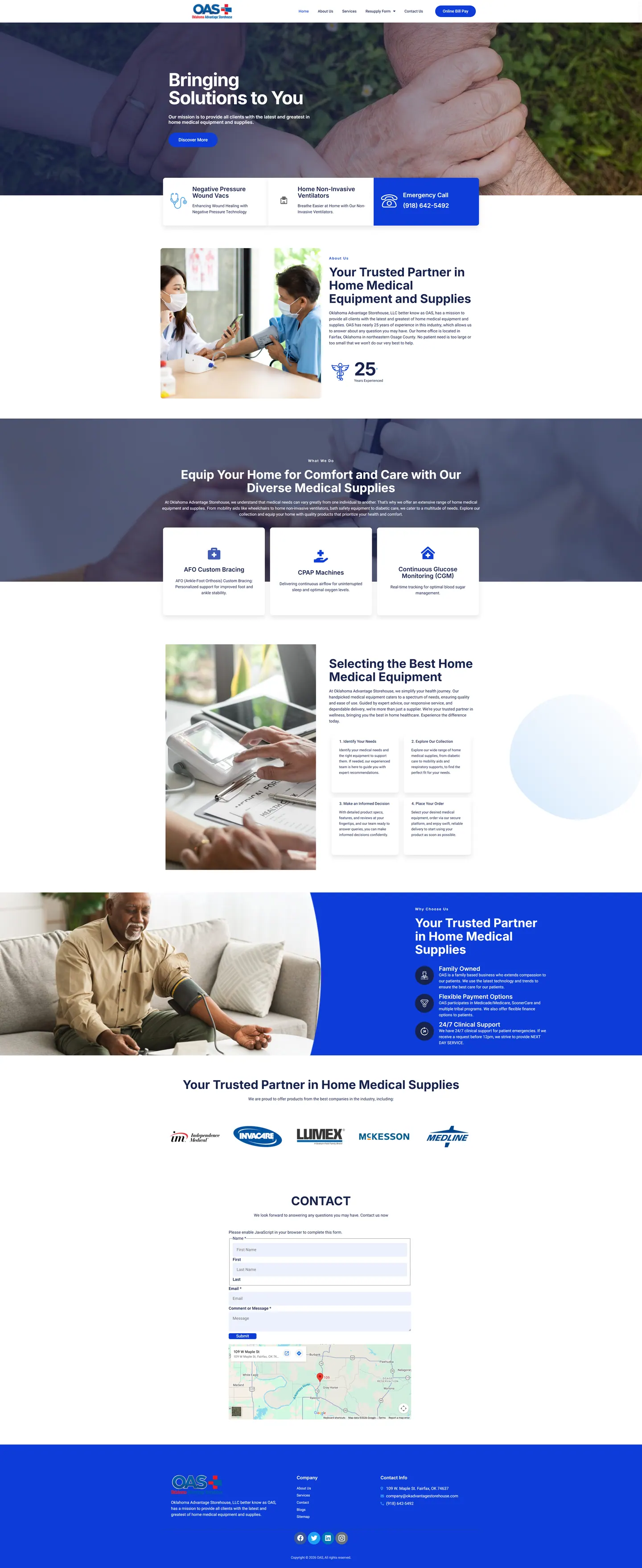
I built this site for a supplier of home medical equipment with two very different visitors: patients looking into equipment for the first time and regulars who just want to reorder or pay a bill. Both shortcuts live in the header, and an emergency call card is always close.
IndustryDental & Medical
Timeline2024
 HOVER TO SCROLL

// how it was built
From brief to launch.
I planned this build around two audiences and one urgent case, then made sure none of them got in each other's way.
-
01 discover
Two kinds of visitor
I separated first-time patients from returning customers and noted what each needed from the first screen.
-
02 plan
Shortcuts in the header
I put reordering and bill payment in the header of every page, with three feature cards under the banner including emergency calls.
-
03 design
Clinical and calm
I used blue and white with genuine care photography and a caduceus badge as the main trust signal.
-
04 build
Forms and sections
I built the supply reorder forms, bill payment access, equipment category sections and a contact form beside a map showing the Fairfax store.
-
05 optimise
Urgent mobile visits
I made the emergency card stretch full width below the banner on phones so it is ready to dial.
-
06 ✓ shipped
Working on day one
The contact form, bill payment and resupply requests all worked from the moment the site went live.
What I did
The build, step by step.
- Reorder and pay from any page. The header holds a resupply menu covering CPAP, wound care, diabetic, ostomy and urology supplies next to a bill payment button.
- Emergency help within reach. A dedicated emergency call card sits under the banner and widens across the screen on phones.
- Equipment explained. Sections on CPAP devices, glucose monitoring and custom ankle-foot braces sit beside a stepped guide to choosing home equipment.
- Credentials without clip art. Real care photos and a caduceus badge for the company's experience replace generic icons, backed by supplier logos.
- Coverage spelled out. A panel explains coverage through Medicare, Medicaid, SoonerCare and tribal programs, along with 24-hour clinical support.
Related work
See them all
More Dental & Medical projects.
atozmm.com

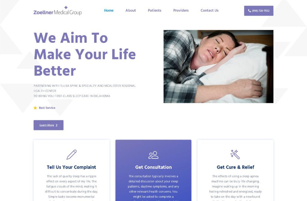
zoellnermedicalgroup.com
Want this for your business?
Send me your URL and I'll reply with a prioritised breakdown of what's costing you enquiries and how I'd fix it. No charge, and no call needed.