drvaidyanathan.com
Case study
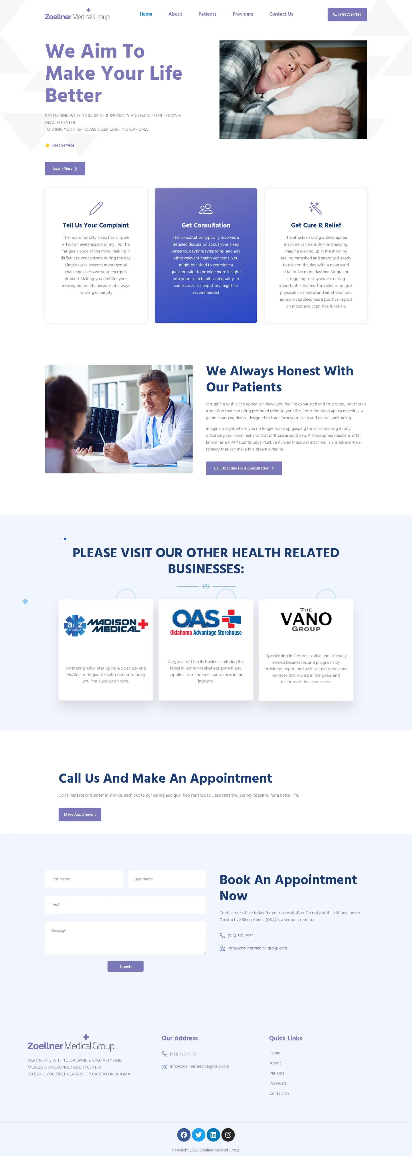
Zoellner Medical Group.
I built this site for patients who are already tired before they start reading. The goal was to explain the route to sleep apnea treatment simply, make the consultation step stand out and keep the appointment request short enough to finish with little effort.
IndustryDental & Medical
Timeline2024
 HOVER TO SCROLL

// how it was built
From brief to launch.
For Zoellner Medical Group I worked backwards from a sleep-deprived patient and cut every step that could slow them down.
-
01 discover
Tired patients
I focused on who arrives here: people worn out by poor sleep who will not wade through dense clinical text.
-
02 plan
Journey in three
I reduced the path to treatment to three cards and flagged consultation as the key step.
-
03 design
Lavender and white
I chose soft lavender and blue with generous white space and a calm sleeping photo in the hero.
-
04 content
CPAP explainer
I set the CPAP section in everyday language and added a strip for the group's sister businesses.
-
05 build
Appointment request
I built a short form with only name, email and message and placed a gentle warning about delaying care beside it.
-
06 ✓ shipped
Phone layout
I stacked the three cards in order on phones and kept the number visible at top and bottom.
What I did
The build, step by step.
- Three-card patient path. Problem, consultation, then treatment and relief, with the consultation card raised and coloured purple.
- Restful opening image. The hero shows someone sleeping peacefully instead of medical equipment.
- CPAP in plain words. I wrote the CPAP section around the practice's plain-spoken tone, free of clinical jargon.
- Three-field appointment form. Name, email and message are all it asks, with a note beside it urging patients not to put off care.
- Phone number twice. The number shows in the header and again in the footer, and a strip points to sister businesses in the group.
Related work
See them all
More Dental & Medical projects.
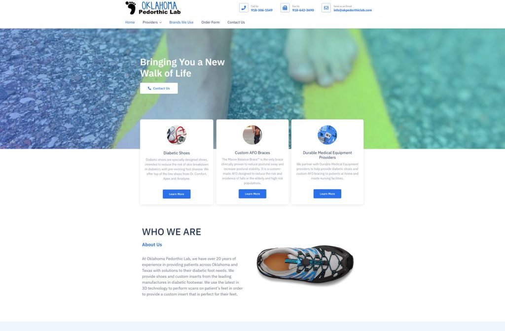
okpedorthiclab.com
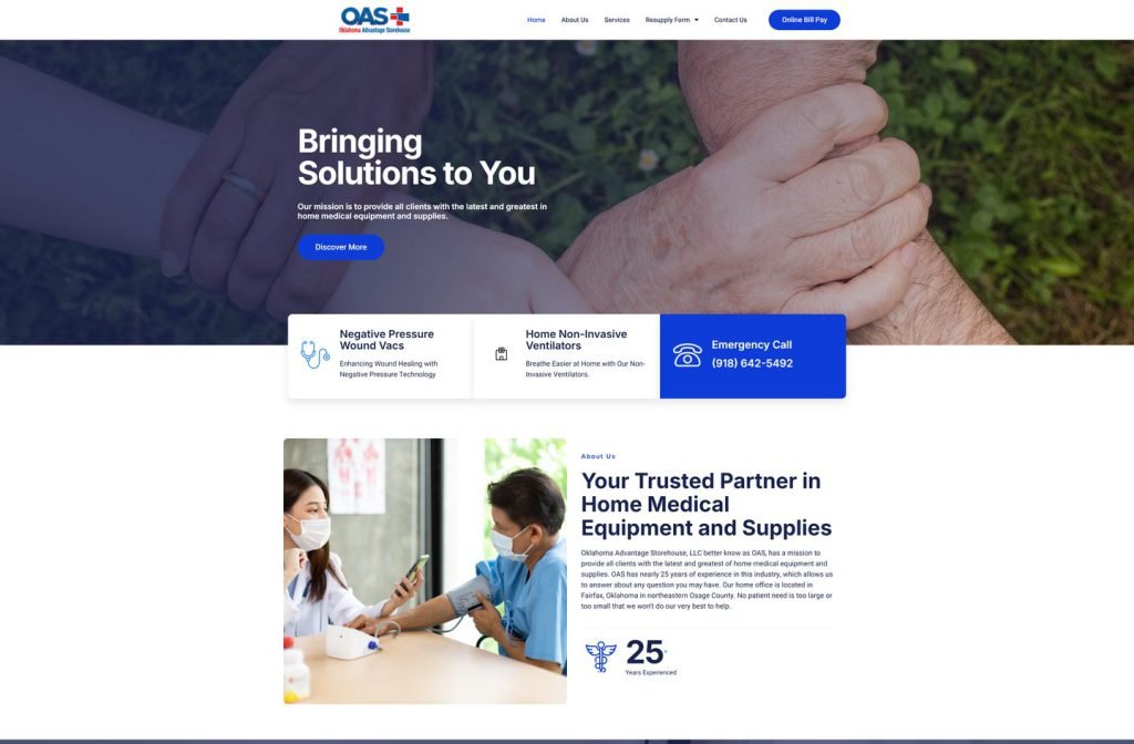
okadvantagestorehouse.com
Want this for your business?
Send me your URL and I'll reply with a prioritised breakdown of what's costing you enquiries and how I'd fix it. No charge, and no call needed.