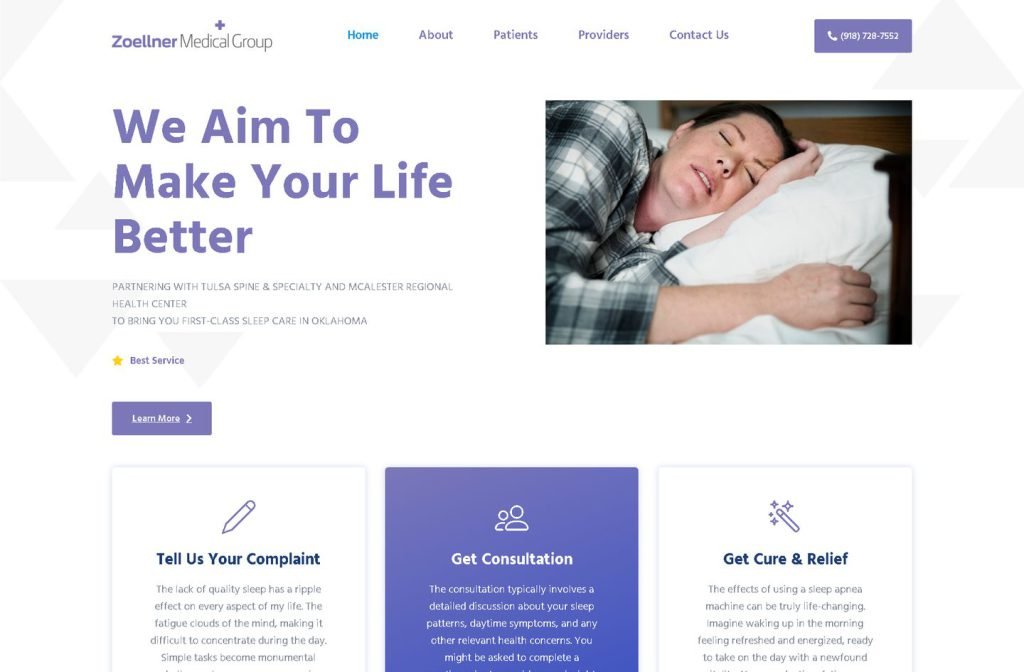
zoellnermedicalgroup.com
Case study
Dr. Vaidyanathan.
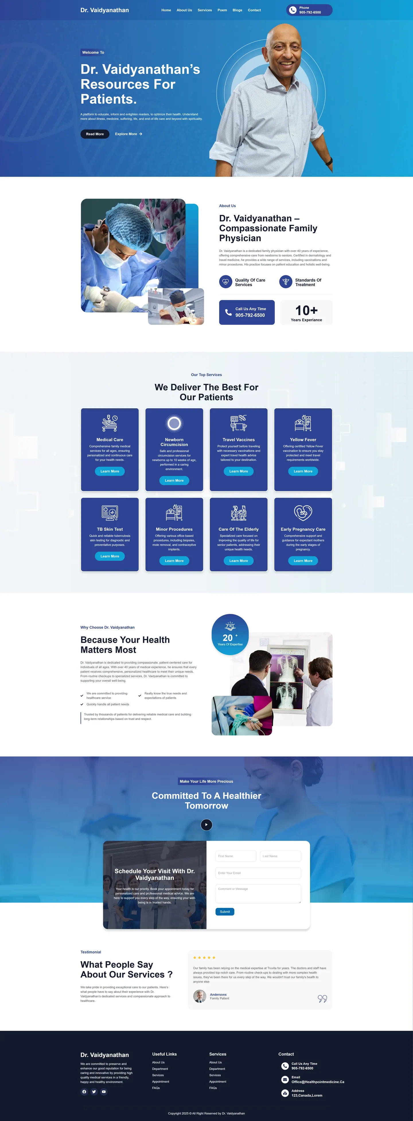
I built Dr. Vaidyanathan a site meant for learning rather than a brochure. It covers patients of every age, newborns through seniors, gives every service its own page, accepts appointment requests online and gives his poetry on health and faith a permanent place in the main menu.
IndustryDental & Medical
Timeline2024
 HOVER TO SCROLL

// how it was built
From brief to launch.
This project balanced a doctor's wish to educate with patients who simply need to book, many of them older and on phones.
-
01 discover
Education goal
I learned he wanted patients to understand his care across all ages, not just find an address.
-
02 plan
Service map
I listed general care, travel vaccines, TB testing, minor procedures, newborn circumcision, early pregnancy support and elderly care as separate pages.
-
03 design
Blue and navy
I placed his cut-out portrait on a blue gradient with dotted accents and gave the navy service cards white line icons.
-
04 build
Appointments and poetry
I built the online request form and set up poetry and blog sections as equal menu items.
-
05 optimise
Older patients
I made cards full width on mobile, widened form fields to the screen edge and pinned a call button to the header.
-
06 ✓ shipped
Video and testimonials
I launched with a wellbeing video band and a slider of patient family testimonials.
What I did
The build, step by step.
- A page per service. Every service card links to a full page, from yellow fever and travel vaccines to TB skin testing and elderly care.
- Poetry beside the blog. His poems sit in the top navigation with the same weight as the blog.
- Calm homepage sequence. Welcome, doctor intro, services, why health comes first, appointment request, then testimonials.
- Split appointment card. The request form shares a card with a photo and a brief introduction, so the step feels personal.
- Built for older phone users. Cards go full width, form fields span the screen and a call button is fixed to the header.
Related work
See them all
More Dental & Medical projects.
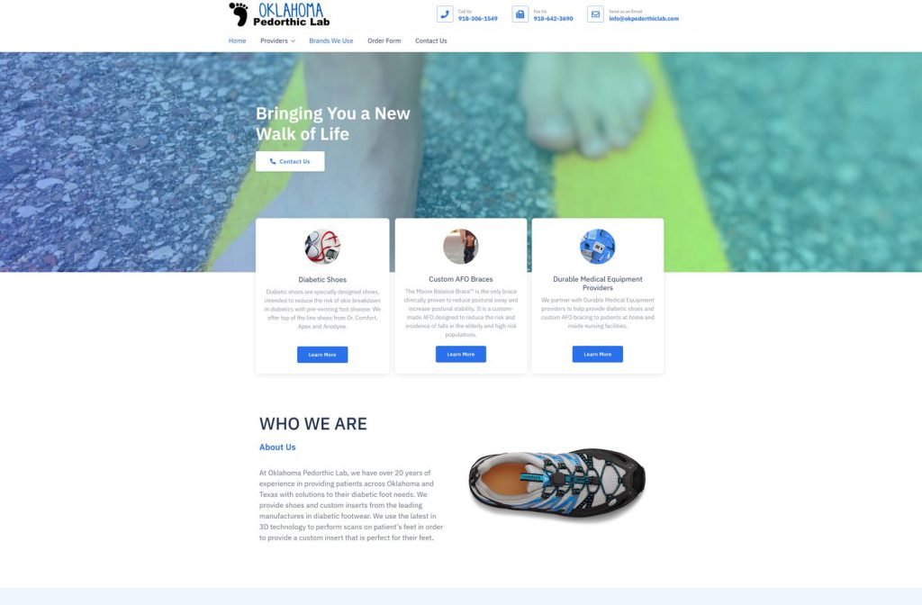
okpedorthiclab.com
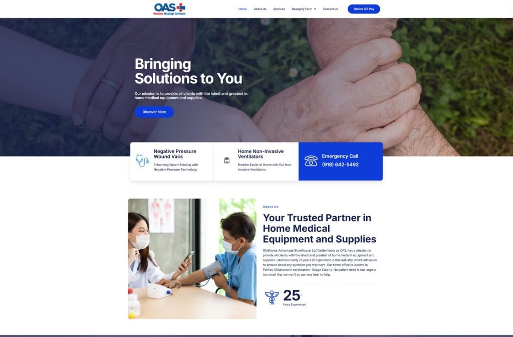
okadvantagestorehouse.com
Want this for your business?
Send me your URL and I'll reply with a prioritised breakdown of what's costing you enquiries and how I'd fix it. No charge, and no call needed.