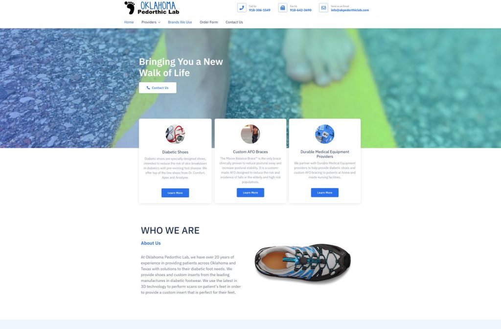
okpedorthiclab.com
Case study
Dr. Abby Jakob.
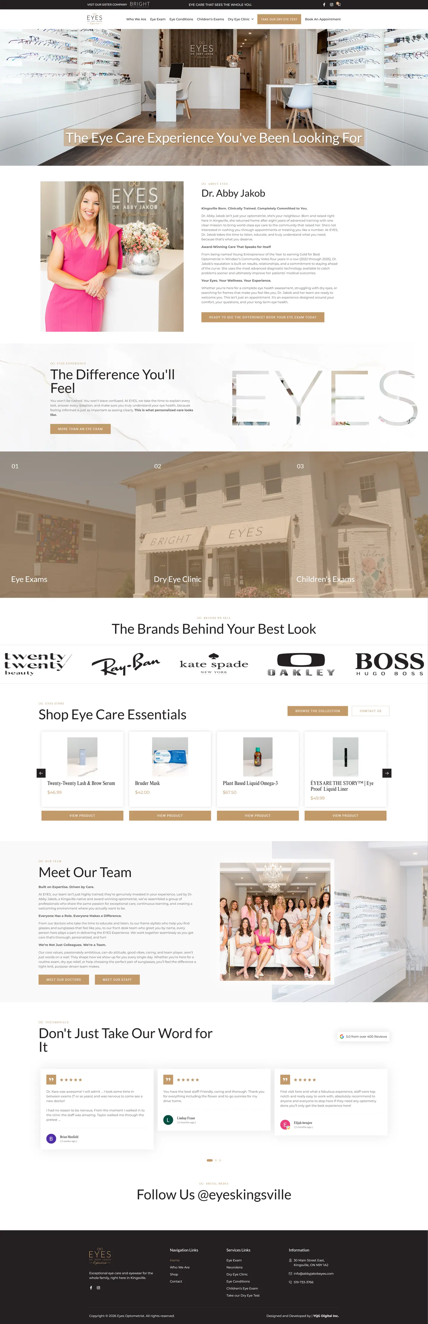
Dr. Abby Jakob wanted her website to feel like her clinic, polished and closer to fashion than medicine. I built a homepage that tours the practice, gives dry eye care its own menu, runs a WooCommerce product carousel and keeps booking in every menu.
IndustryDental & Medical
Timeline2024
Built withWooCommerce
 HOVER TO SCROLL

// how it was built
From brief to launch.
This build balanced style and function, so I planned it around three jobs: booking, product sales and the dry eye speciality.
-
01 discover
Boutique brief
I started from the doctor's wish for a site that felt like her award-winning clinic, and noted that many frame shoppers arrive from social media on phones.
-
02 plan
Homepage as a tour
I ordered the page from her story to three numbered service panels, then brands, products, team and reviews.
-
03 design
White and pale gold
I kept the interface quiet with white backgrounds, gold buttons and small-caps headings, and designed the photo-filled lettering band.
-
04 build
Shop and dry eye
I built the WooCommerce product carousel, the dry eye dropdown with its self-test link, and a booking button closing each menu.
-
05 integrate
Reviews and social
I wired in Google reviews, a social feed section and a top bar promoting the clinic's sister business.
-
06 ✓ shipped
Launch checks
I tested checkout, reviews and bookings before go-live and turned the service panels into tappable cards on phones.
What I did
The build, step by step.
- Homepage as a walk-through. The homepage moves from the doctor's background to numbered panels for routine exams, children's care and dry eye treatment, then brands, products, staff and reviews.
- Dry eye gets top billing. The speciality sits under a dedicated menu dropdown, plus a quick self-test link.
- Fashion over clinical. White space, pale gold buttons and small-caps headings let the shopfront and portrait photos carry the colour.
- Letters filled with the clinic. A mid-page band spells out the clinic name in oversized letters cut out of interior photos.
- Shop, reviews, booking. I built a WooCommerce carousel of eye care products, wired in Google reviews and finished every menu with a booking button.
Related work
See them all
More Dental & Medical projects.
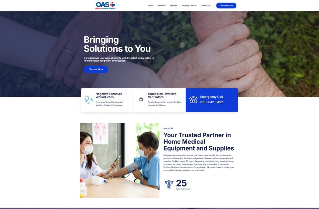
okadvantagestorehouse.com
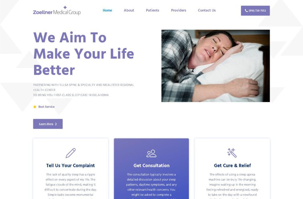
zoellnermedicalgroup.com
Want this for your business?
Send me your URL and I'll reply with a prioritised breakdown of what's costing you enquiries and how I'd fix it. No charge, and no call needed.