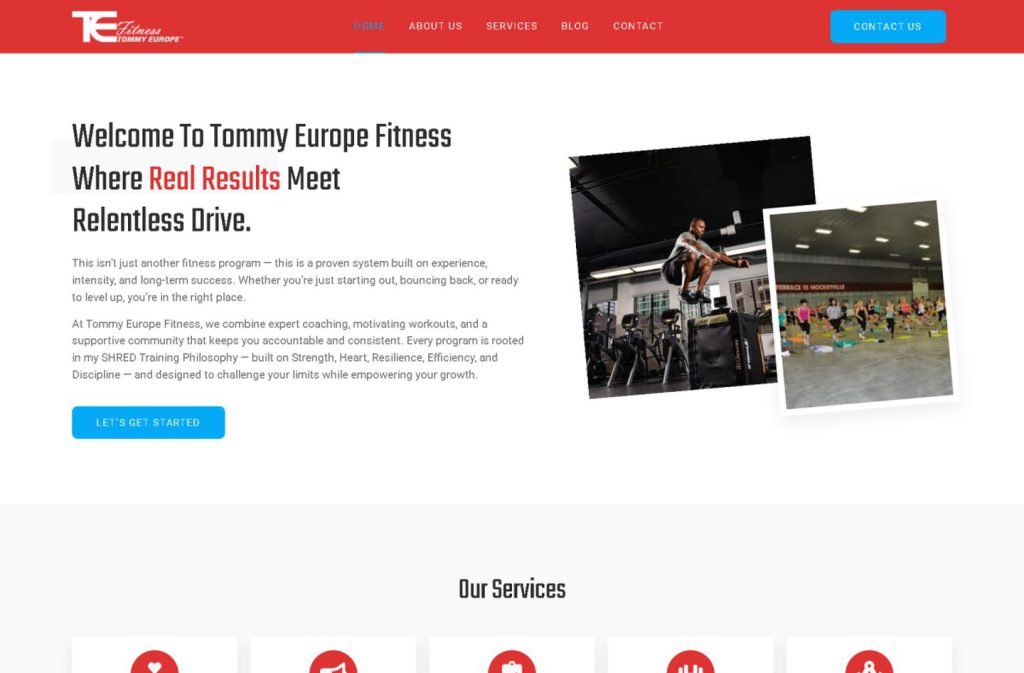
tefitness.com
Case study
Connective Counselling.
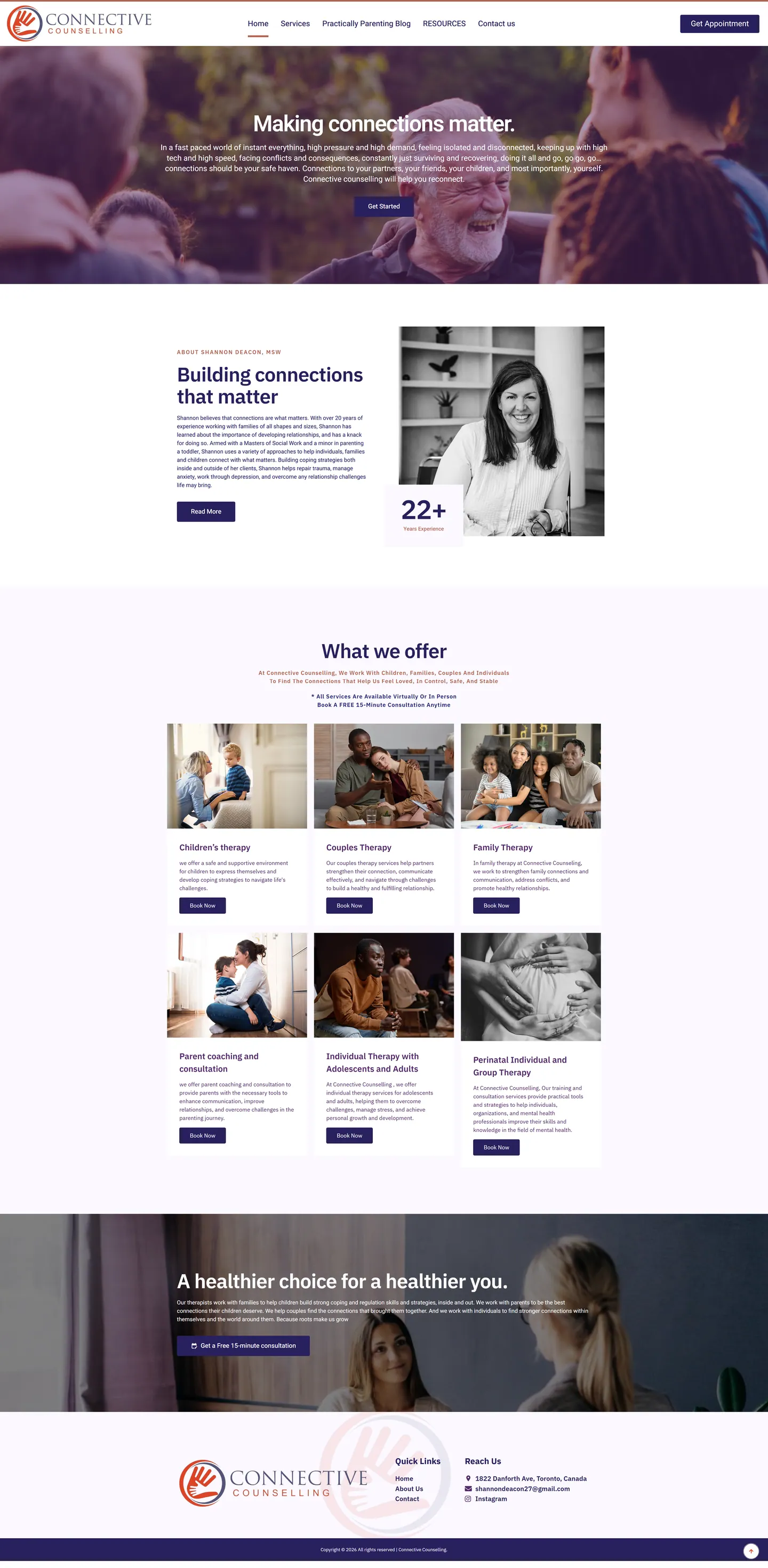
I built a calm, low-friction site for a Toronto counselling practice where the main goal is a booked free consultation. Every service card has its own booking button tied to the practice's online calendar, so nobody has to hunt for a way to start.
IndustryFitness & Wellness
Timeline2023
 HOVER TO SCROLL

// how it was built
From brief to launch.
People often land here from a phone during a hard moment, so I built every step to remove friction before the booking.
-
01 discover
The visitor's moment
I looked at who searches for therapy and how little patience they have for a confusing path to booking.
-
02 plan
Service-led homepage
I structured the page around a service grid so visitors can quickly tell whether their situation is covered.
-
03 design
Soft plum palette
I used purple-tinted photography, indigo buttons and lavender sections so the site never feels like a clinic.
-
04 integrate
Online scheduling
I connected every service card's booking button to the practice's calendar and added the header appointment button.
-
05 content
Articles and links
I set up the parenting articles and a resources page in the menu, plus a note that sessions run online or in person.
-
06 ✓ shipped
Every booking route
Before launch I tested each path end to end so no visitor hits a dead end between reading and reserving.
What I did
The build, step by step.
- A grid for every kind of care. Children, couples, families, parent coaching, teens, adults and perinatal support each get a service card.
- Booking on every card. Each card links straight to the online calendar, and a header appointment button is always visible.
- Colour that feels unclinical. Purple-toned photos, blue-violet buttons and light lilac sections frame the orange hand logo.
- A human introduction. The about section uses a black-and-white portrait of the therapist and a counter for her years in practice.
- No accordions on mobile. On phones every booking button follows its own service text, and a full-width consultation banner sits just above the footer.
Related work
See them all
More Fitness & Wellness projects.
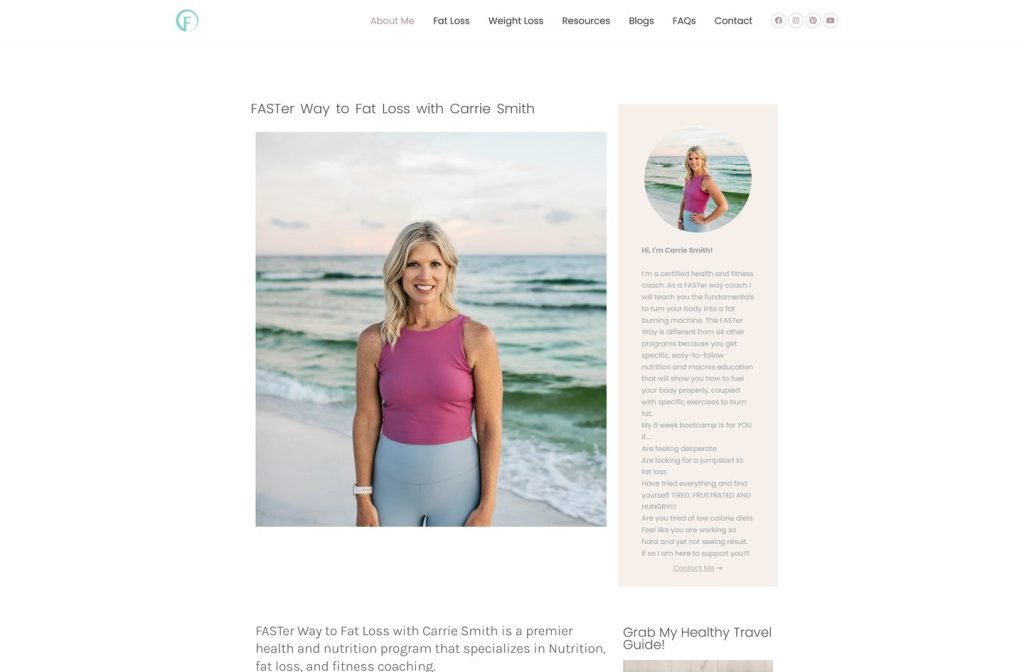
carriesmithhealth.com
Want this for your business?
Send me your URL and I'll reply with a prioritised breakdown of what's costing you enquiries and how I'd fix it. No charge, and no call needed.