childreninlimbotaskforce.ca
Case study
Liverpool Global Education.
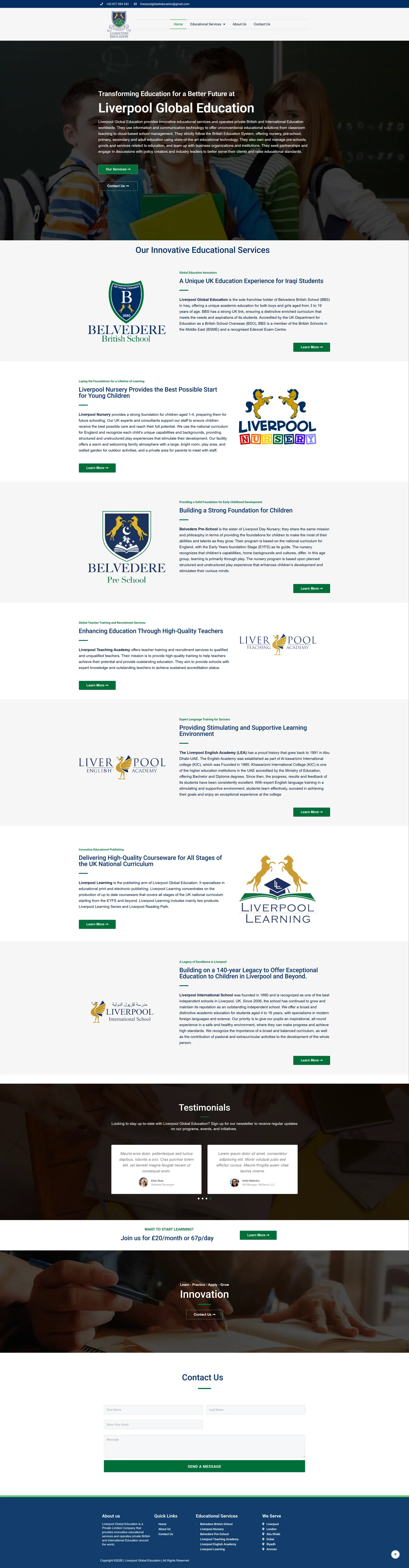
I built Liverpool Global Education a WordPress hub that explains the group once and then passes every visitor on to the brand they came for. All seven institutions get their own block on a long homepage, ordered by learner age, and the group's international presence and accreditations are stated clearly.
IndustryEducation & Nonprofit
Timeline2023
Built withWordPress
 HOVER TO SCROLL

// how it was built
From brief to launch.
With seven brands under one name, the build was about orientation, so I planned each step to get visitors to the right institution quickly.
-
01 discover
Seven brands, one group
I listed every institution, from early years to an established school, teacher training and publishing, and where the group operates.
-
02 plan
One long homepage
I gave each brand its own section in age order and planned a services dropdown that names all seven.
-
03 design
Navy and green heraldry
I took the palette from the crest, used a dimmed chalkboard classroom photo behind the hero and alternated crest positions per block.
-
04 build
WordPress hub
I built the brand sections, a testimonial slider, a membership banner and an enquiry form finished with a full-width green submit bar.
-
05 content
Accreditations stated
I made sure the homepage states the group's British School Overseas status, granted by the Department for Education in the UK, and that it runs an Edexcel exam centre.
-
06 ✓ shipped
Mobile crest and title
I checked the crest stays large on phones and the hero heading wraps neatly onto two lines.
What I did
The build, step by step.
- Brands ordered by age. I arranged the homepage from the nursery at the top through to teacher training and publishing at the end.
- Equal space for everyone. Every brand block has its crest, a short introduction and a green find-out-more button, so no institution is sidelined.
- Colours from the crest. The navy-and-green scheme is taken straight from the group's heraldic coat of arms.
- Alternating layout for scanning. Brand crests swap between left and right down the page, which keeps a long homepage easy to follow.
- Crest kept large on phones. On mobile the full crest stays prominent over the mobile menu toggle, and the hero headline breaks neatly onto two lines.
Related work
See them all
More Education & Nonprofit projects.
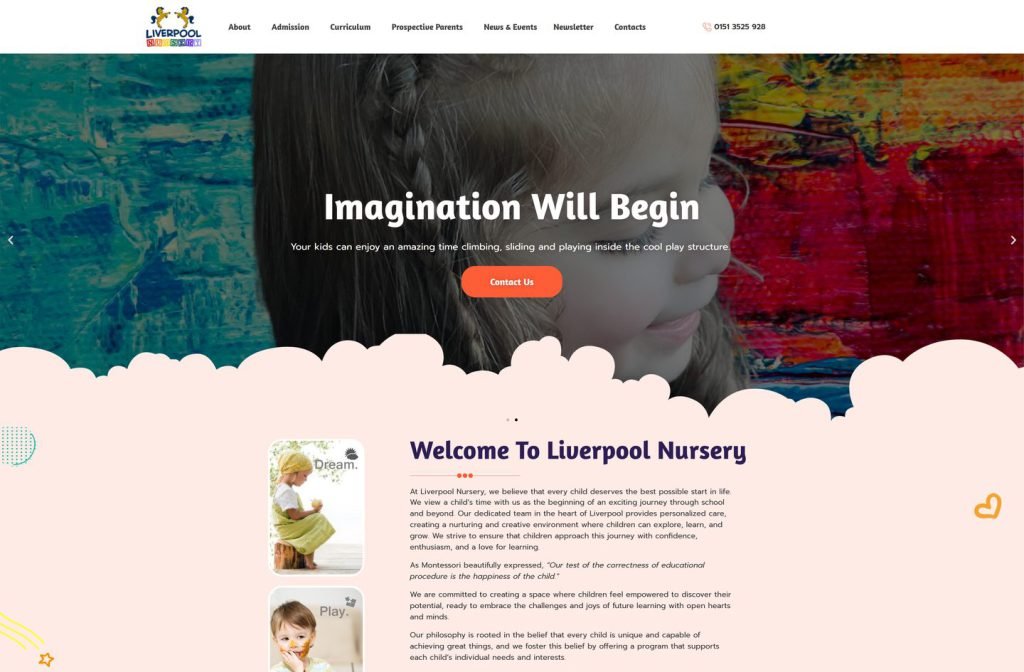
liverpoolnursery.org
Want this for your business?
Send me your URL and I'll reply with a prioritised breakdown of what's costing you enquiries and how I'd fix it. No charge, and no call needed.