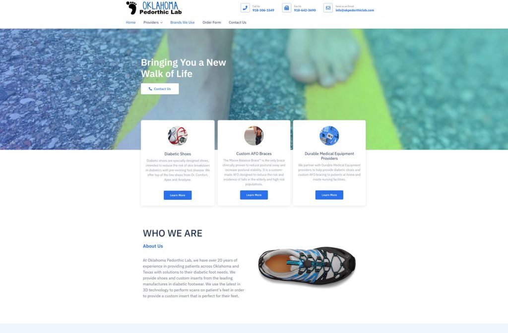
okpedorthiclab.com
Case study
Madison Medical.
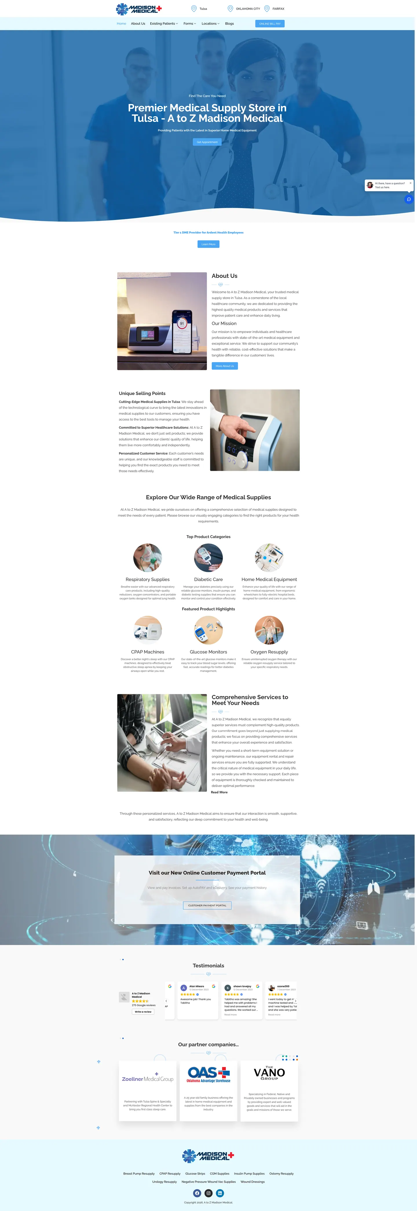
I built Madison Medical's site around the customer who comes back every month. Bill pay, patient forms and resupply shortcuts sit where regulars expect them, while new visitors still see the product range, reviews and the preferred provider status.
IndustryDental & Medical
Timeline2023
 HOVER TO SCROLL

// how it was built
From brief to launch.
Most traffic here is repeat business, so I planned the build around the tasks regulars come back to do.
-
01 discover
Repeat visits
I identified the monthly jobs: paying a bill, grabbing a form, reordering CPAP or diabetes supplies.
-
02 plan
Short routes
I put billing, patient and forms navigation in the header and resupply links in the footer, leaving the homepage for newcomers.
-
03 design
Clinical blue
I placed a staff photo under a curved hero shape and styled matching round icon tiles for the product groups.
-
04 build
Portal and forms
I built the payment portal feature, the forms library and the product group sections.
-
05 integrate
Live reviews
I added a public review feed and partner logos so new customers see social proof alongside the catalogue.
-
06 ✓ shipped
All at once
Store pages, bill pay, forms and reviews went live together, so returning patients could pay and reorder from day one.
What I did
The build, step by step.
- A header for regulars. Store pins, a bill pay button and separate dropdowns for current patients and paperwork all live at the top.
- Resupply in the footer. Shortcuts lead to reorders for CPAP, glucose testing, ostomy and wound care supplies.
- Product groups with icons. Round tiles keep broad categories, respiratory or diabetic, apart from spotlighted products like oxygen or glucose monitors.
- Payment portal promoted. A feature section explains automatic payments and paperless billing, and on phones the pay button is pinned at the very top.
- Forms and reviews. I added a library of downloadable patient and equipment forms, a live review feed and a partner logo strip.
Related work
See them all
More Dental & Medical projects.
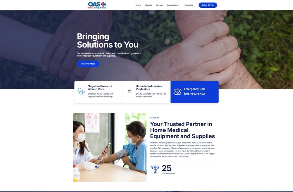
okadvantagestorehouse.com
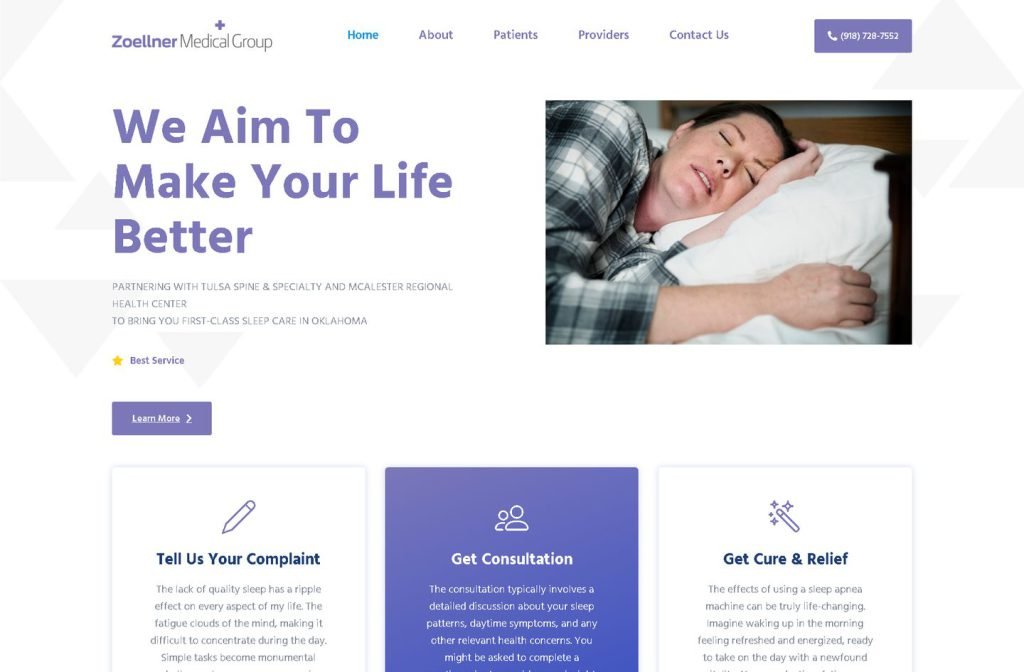
zoellnermedicalgroup.com
Want this for your business?
Send me your URL and I'll reply with a prioritised breakdown of what's costing you enquiries and how I'd fix it. No charge, and no call needed.