liverpoolglobaleducation.org
Case study
Liverpool Nursery.
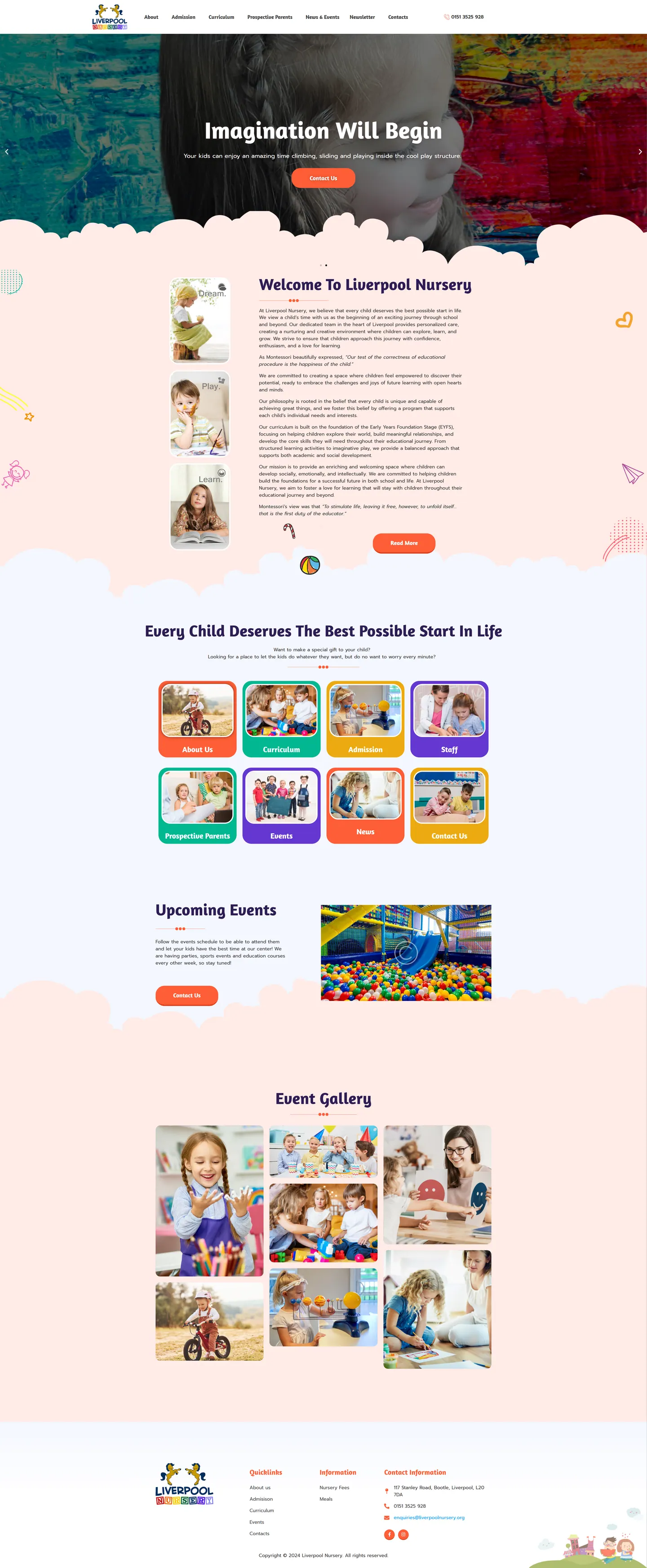
I built a nursery website where the homepage acts as a set of colourful doors instead of a deep menu. Families weigh up a handful of nurseries before touring any, so I made admissions, staff, fees, meals and the EYFS curriculum easy to reach and filled the pages with real nursery photos.
IndustryEducation & Nonprofit
Timeline2023
 HOVER TO SCROLL

// how it was built
From brief to launch.
Parents were the whole audience here, so each step of my build focused on letting them judge the nursery before visiting.
-
01 discover
How parents choose
I looked at what families compare between settings: admissions, staff, fees, meals, events and learning approach.
-
02 plan
Tiles over menus
I planned a homepage of eight photo tiles instead of layered navigation, with fees and meals added to the footer.
-
03 design
Playful and soft
I designed cloud-edged sections, crayon tile borders and doodles, with three photo cards introducing the welcome.
-
04 build
Hero and galleries
I built the rotating hero, including a slide of the indoor climbing frame, the upcoming events block and the masonry photo wall.
-
05 content
EYFS pages
I set up a curriculum page for each EYFS area plus admissions, fees and meals content.
-
06 ✓ shipped
One column on phones
I checked that tiles stack into single wide tap targets on small screens before launch.
What I did
The build, step by step.
- Eight tiles, no digging. Colour-coded photo tiles open the key areas: learning, joining, the team, what's on, updates, plus a page for families considering a place.
- Common questions in the footer. Fees and meals, the topics parents ask about most, sit as permanent footer links.
- A classroom wall feel. Scalloped cloud edges, cream and pink tones, crayon-bright borders and little doodled stars and planes set the mood.
- Curriculum by area. Each EYFS area has its own page, alongside the nursery's Montessori influences.
- Real days on show. A rotating hero, an events block with the ball pit and a masonry photo wall from earlier events show daily life.
Related work
See them all
More Education & Nonprofit projects.

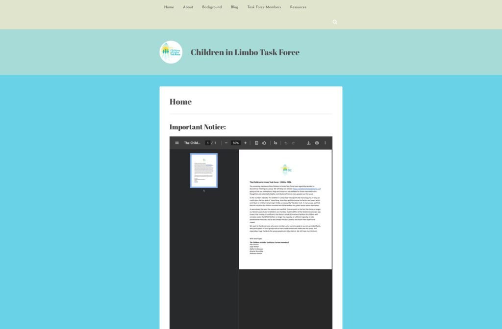
childreninlimbotaskforce.ca
Want this for your business?
Send me your URL and I'll reply with a prioritised breakdown of what's costing you enquiries and how I'd fix it. No charge, and no call needed.