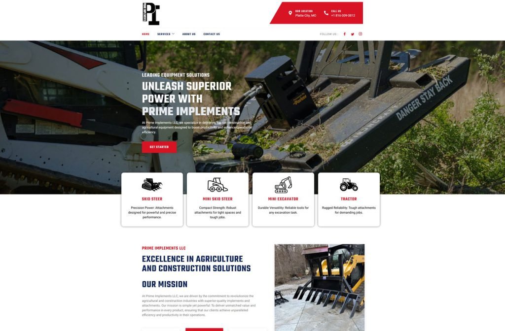
primeimplements.com
Case study
Energy IP.
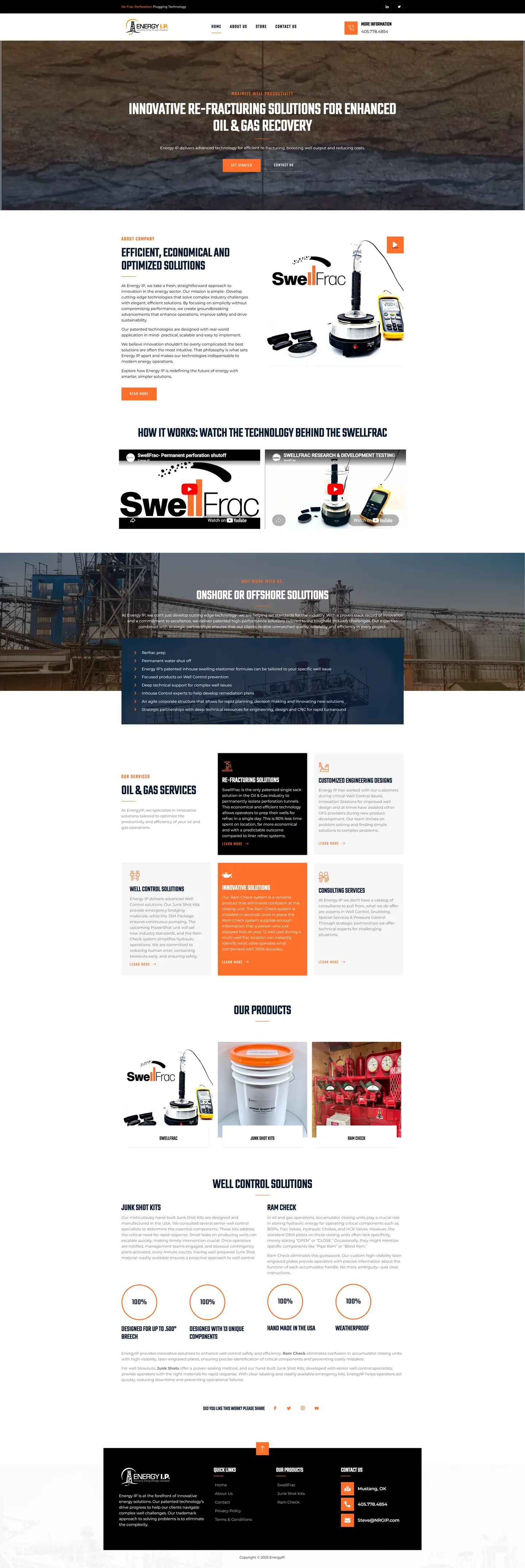
I built Energy IP's WordPress site around video, because a seal that expands down a wellbore is difficult to describe in text. Two demonstration clips come straight after the banner, followed by services, products and hard facts, with a store link held in reserve.
IndustryIndustrial & Energy
Timeline2023
Built withWordPress
 HOVER TO SCROLL

// how it was built
From brief to launch.
The core product is hard to picture, so I planned this WordPress build to show it working before asking anyone to read.
-
01 discover
Hard to visualise
I recognised operators would not grasp a swelling seal from text, so video had to lead.
-
02 plan
Page order
I set the sequence as banner, demonstrations, services, product row and proof points, with a store link held for later.
-
03 design
Equipment language
I borrowed from oilfield gear with navy capitals, safety orange accents and contrasting service cards.
-
04 build
WordPress components
I built the video section, fact counters, explainer columns, sharing buttons and a back-to-top control.
-
05 optimise
Stacked calls to action
On phones I stacked the two main buttons at full width under the headline.
-
06 ✓ shipped
Seen in action
Operators can now watch the technology work, and the dark footer holds product links and the company's Mustang, Oklahoma contact details.
What I did
The build, step by step.
- Video straight after the banner. Two embedded demonstrations sit right under the banner, before services or products.
- Oilfield styling. Safety orange buttons, narrow navy capitals and a black strip naming the technology over the logo.
- Facts in round counters. Counters cover points like hand manufacture in the USA, resistance to weather, and its rated breech size.
- Room for supporting products. Two related products get explainer columns set side by side, and the services grid breaks the scan with one orange and one black card.
- Ready for ecommerce. A store item sits in the menu so online sales can switch on whenever the company chooses.
Related work
See them all
More Industrial & Energy projects.
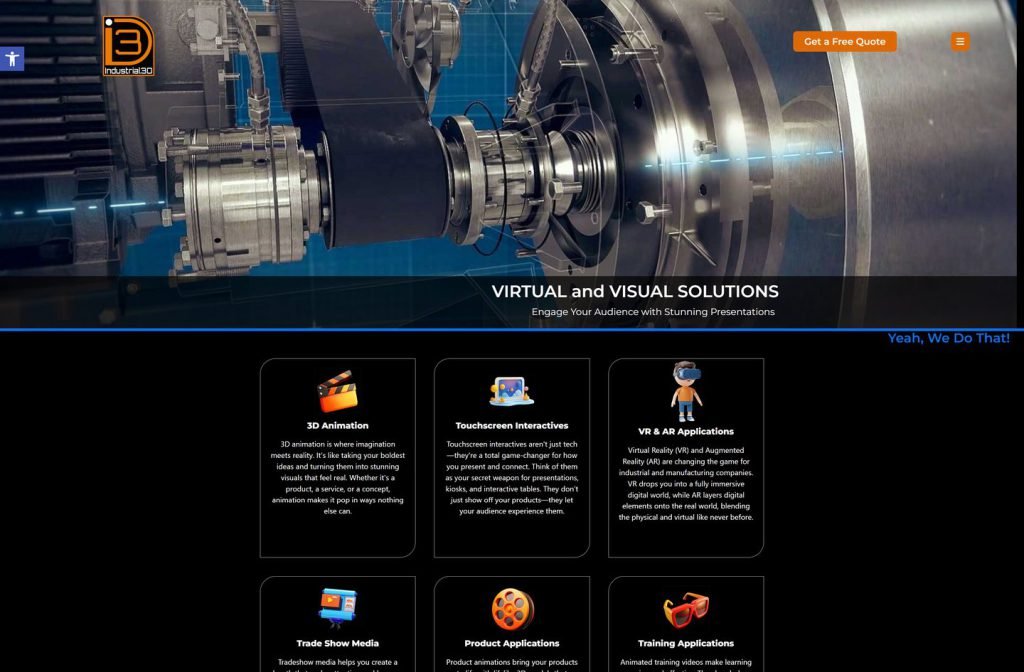
industrial3d.com
Want this for your business?
Send me your URL and I'll reply with a prioritised breakdown of what's costing you enquiries and how I'd fix it. No charge, and no call needed.