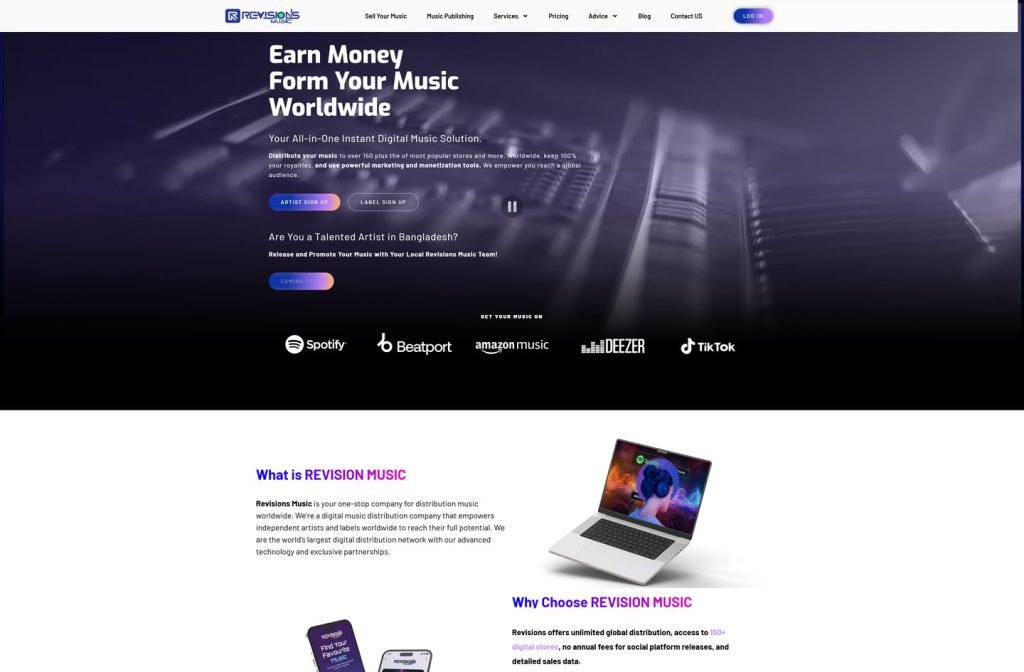
revisionsmusic.com
Case study
Anew Music.
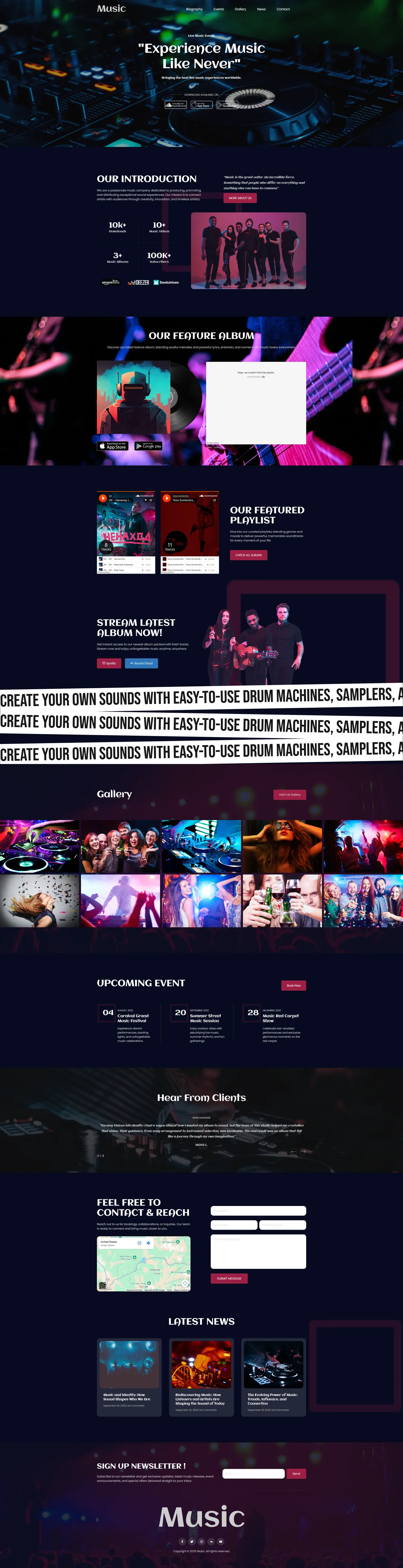
I built a single-page site for a live events brand that needed listening, planning and booking in one place. Streaming links and playlists come first, event cards with booking buttons follow, and the whole page borrows the look of a dark club.
IndustryEvents & Entertainment
 HOVER TO SCROLL

// how it was built
From brief to launch.
Several jobs had to share one page here, so I spent most of the planning deciding what goes first.
-
01 discover
Competing jobs
I listed what the page had to do, play music, show dates and take bookings, for fans who might be checking it on the way to a gig.
-
02 plan
Sound on top
I put streaming links and app badges near the top, then playlists, events, gallery, testimonials and contact.
-
03 design
Dark club mood
I set near-black backgrounds, stage-lit photography and slanted scrolling text bands as section dividers.
-
04 build
Embeds and events
I embedded playlists with full track lists and built event cards with individual booking buttons.
-
05 test
Thumb-friendly playback
I sized the playback buttons for thumb taps and moved the date to the top of each event card on mobile.
-
06 ✓ shipped
One home
From launch day fans could stream the playlists, pick a show and sign up for the newsletter without leaving the page.
What I did
The build, step by step.
- Sound before words. Buttons for Spotify, Deezer, SoundCloud and Amazon Music sit near the top with Apple and Android app store badges.
- Full playlists embedded. Every track is visible in the embeds, so fans can hear the catalogue without clicking away.
- Events you can book. Each upcoming show has its own card and booking button, and on phones the date leads the card.
- Styled like a club night. Near-black backgrounds, pink and blue stage-lit photos and angled strips of scrolling text split up the sections.
- Community sections. A party photo gallery, rotating testimonials, a newsletter signup and a contact form beside a map round out the page.
Related work
See them all
More Events & Entertainment projects.
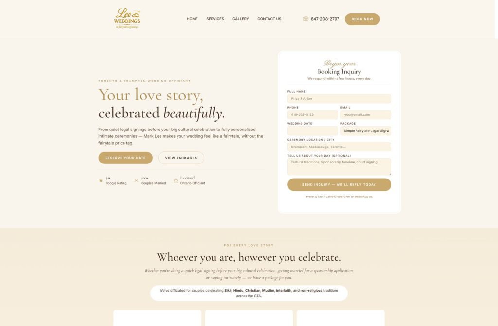
leeweddings.ca
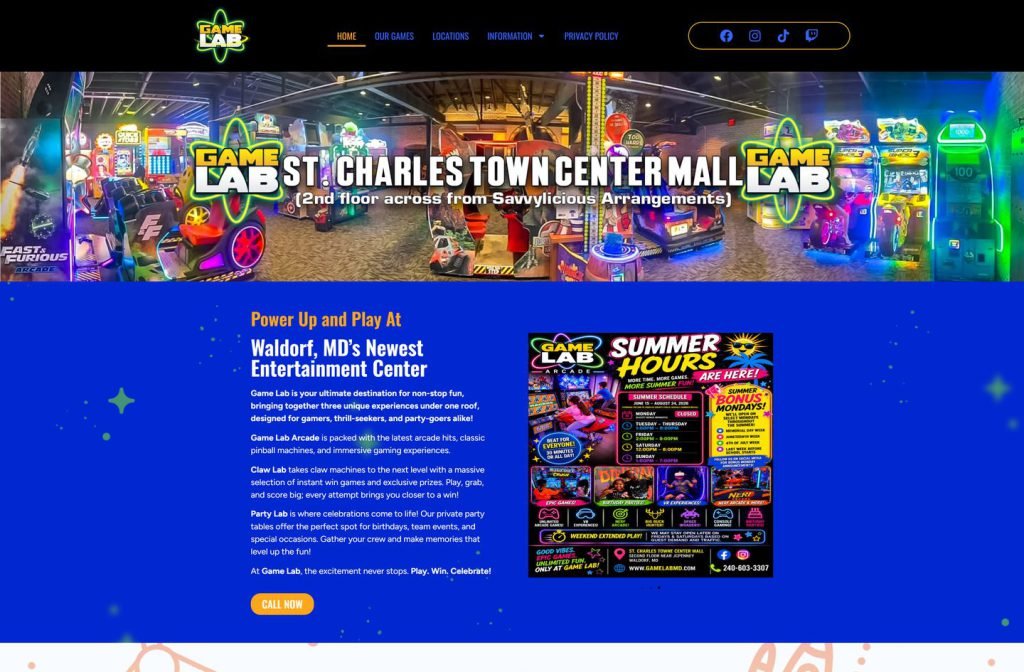
gamelabmd.com
Want this for your business?
Send me your URL and I'll reply with a prioritised breakdown of what's costing you enquiries and how I'd fix it. No charge, and no call needed.