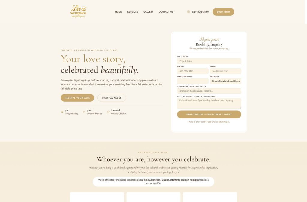
leeweddings.ca
Case study
Game Lab Waldorf.
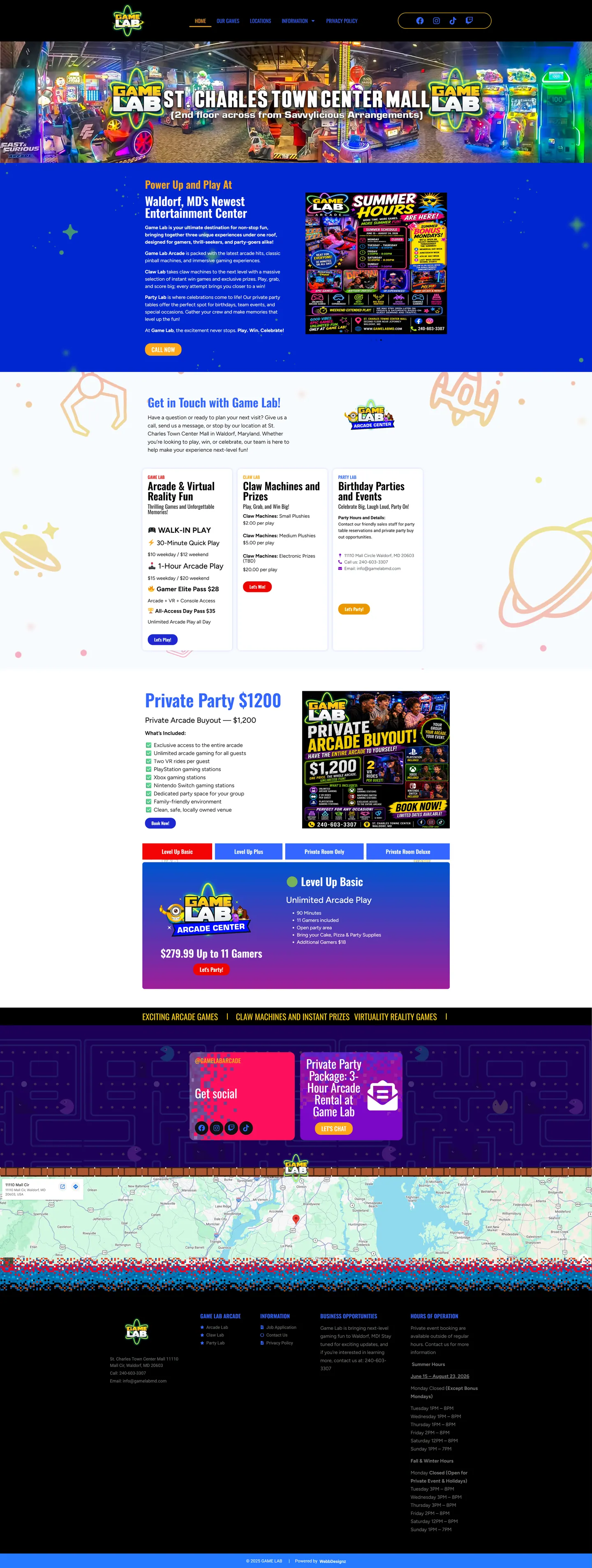
Guests kept struggling to find an arcade tucked upstairs in a shopping centre. I built Game Lab Waldorf a WordPress site that opens with directions, then sorts three brands, party packages and seasonal hours into something a guest can follow at a glance.
IndustryEvents & Entertainment
Timeline2024
Built withWordPress
 HOVER TO SCROLL

// how it was built
From brief to launch.
Game Lab had a lot to say and a hard-to-find location, so I built the WordPress site in steps that put wayfinding first and everything else in tidy order.
-
01 discover
Hard to find
I started with the practical problem: guests could not easily locate an arcade on the upper floor of a mall.
-
02 plan
One page, many goals
I mapped directions first, then brand cards, private hire, party tabs, seasonal hours and a jobs page.
-
03 design
Neon arcade energy
I combined the glowing atom logo, a sketch-filled blue band, a yellow ticker and a maze background for party and social sections.
-
04 build
Cards and tabs
In WordPress I built the three brand cards, the tabbed party packages and a private hire section combining a flyer and an inclusions checklist.
-
05 integrate
Checkout and map
I linked booking buttons to the venue's existing checkout, added the swipeable hours flyer and embedded a Google map of the mall.
-
06 ✓ shipped
Readable on phones
I recropped the top photo for mobile so the directions remain legible over the image.
What I did
The build, step by step.
- Directions before anything else. The first screen tells guests the mall, the level and the shop across the way.
- Three brands side by side. The arcade, claw area and party brand each have a card listing play options from short weekday sessions to full-access day passes.
- Parties in tabs. Packages sit in tabs for quick comparison, and booking buttons hand visitors to the venue's existing checkout.
- Styling as loud as the floor. The logo's glowing atom, a blue band sketched with claws and rockets, a yellow ticker and a maze pattern set the mood.
- Front desk questions, answered. Seasonal hours shown as swipeable flyers, claw prize pricing, private hire details, a job application page and a Google map cover the usual asks.
Related work
See them all
More Events & Entertainment projects.
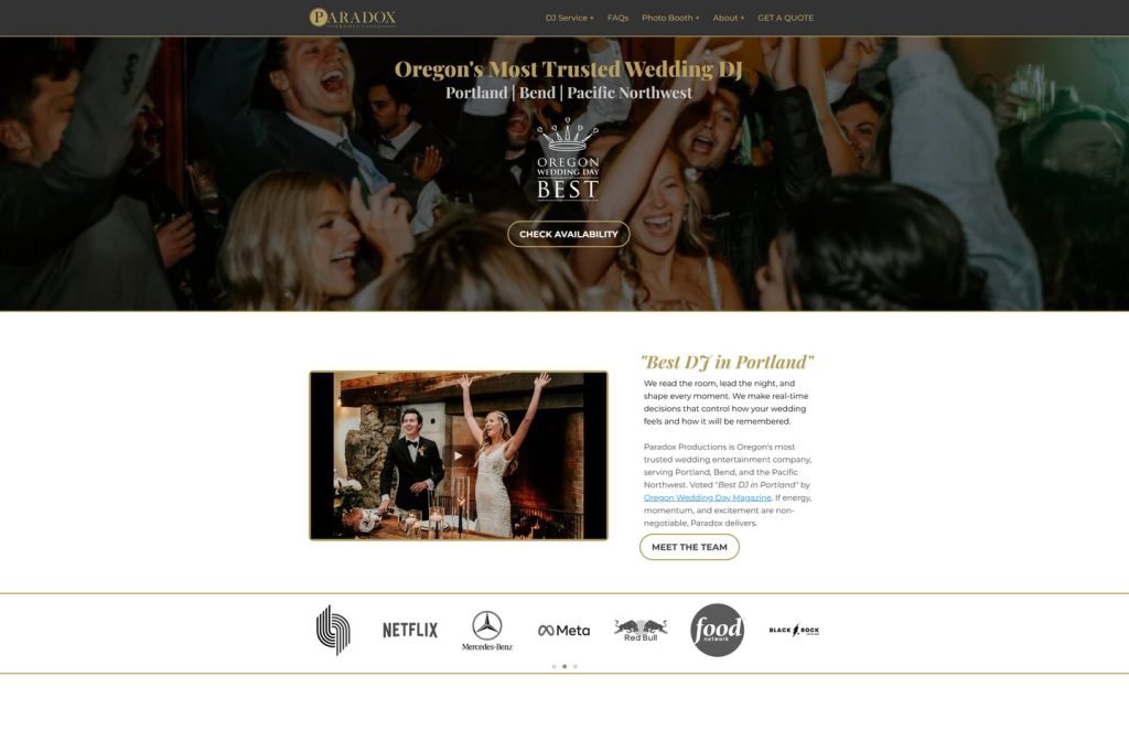
djpdx.com
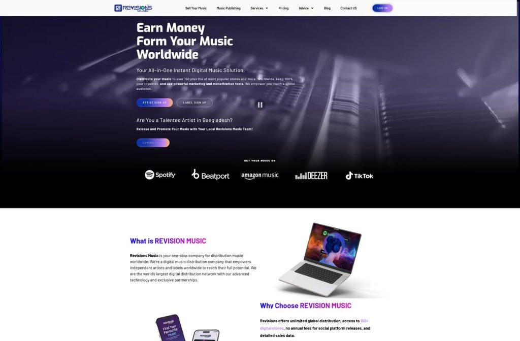
revisionsmusic.com
Want this for your business?
Send me your URL and I'll reply with a prioritised breakdown of what's costing you enquiries and how I'd fix it. No charge, and no call needed.