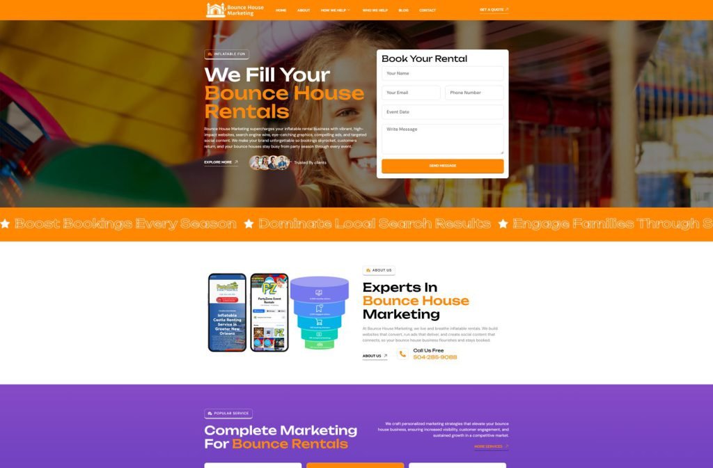
aydinternetmarketing.com
Case study
Chris Labbate.
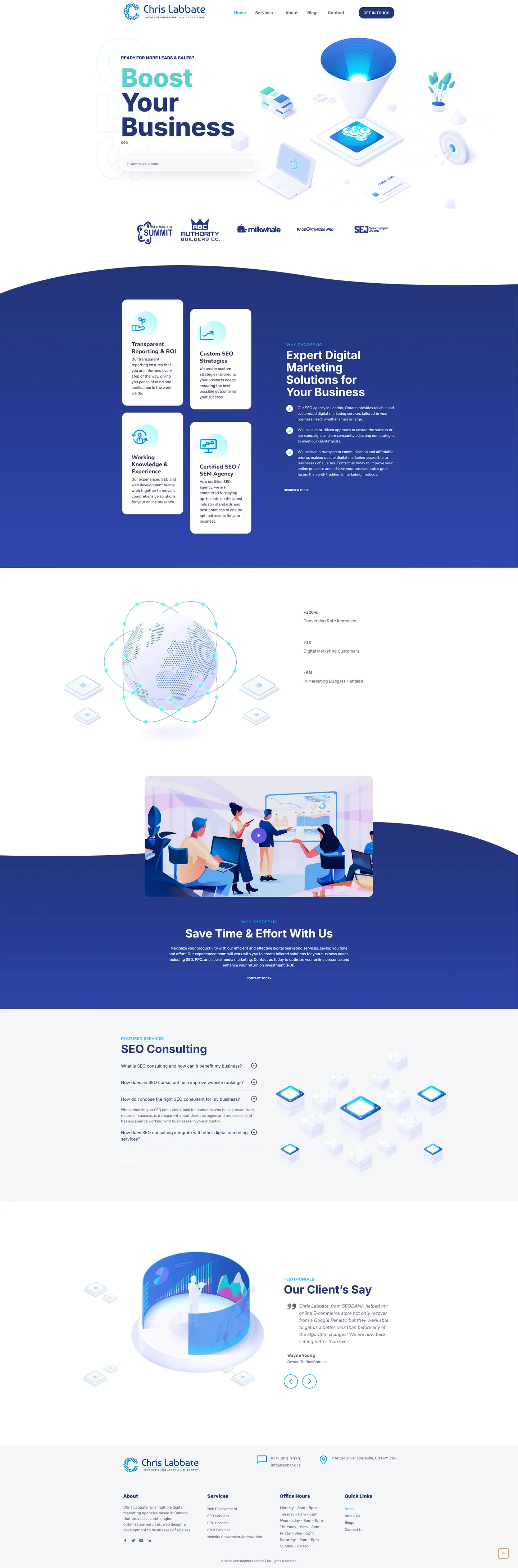
I designed Chris Labbate's site so the first thing a visitor does is type in their own web address. From there the page stacks up credibility, badges, reporting and ROI, figures, an FAQ and client stories, so the case for hiring him is made before the contact form appears.
IndustryAgencies & Tech
Timeline2023
 HOVER TO SCROLL

// how it was built
From brief to launch.
Chris Labbate sells accountability, so each step of this build was about putting evidence where visitors would hit it.
-
01 discover
Proof first
I agreed with the brief that measured results had to appear before any list of services.
-
02 plan
Trust sequence
I ordered badges, value cards, results figures, an SEO consulting FAQ and testimonials ahead of the contact flow.
-
03 design
Navy and mint
I joined dark navy and white sections with curved edges and used mint teal as the accent colour.
-
04 build
Lead capture
I built the opening URL field, the results band and the arrow-driven testimonial slider.
-
05 optimise
Mobile stacking
On phones cards drop into one column, illustrations scale down and curved section edges stay clean.
-
06 ✓ shipped
Matching pages
I carried the same colour scheme through the blog and service pages for a consistent finish.
What I did
The build, step by step.
- Website field as step one. The opening section asks for the visitor's URL, a low-effort way to begin a conversation.
- Layered credibility. Industry badges come first, then cards on reporting, strategy, experience and certification, then a band of results.
- Illustrations over stock. Custom isometric art, including a connected globe and a lead funnel, gives the page a software-product feel.
- Testimonials with a story. The arrow-controlled slider opens with a client recovering from a Google penalty.
- Footer as reference. Office hours and the full service list, from paid ads and social media to web development and conversion work, live in the footer.
Related work
See them all
More Agencies & Tech projects.
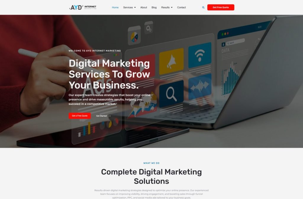
dumpsterrental.marketing
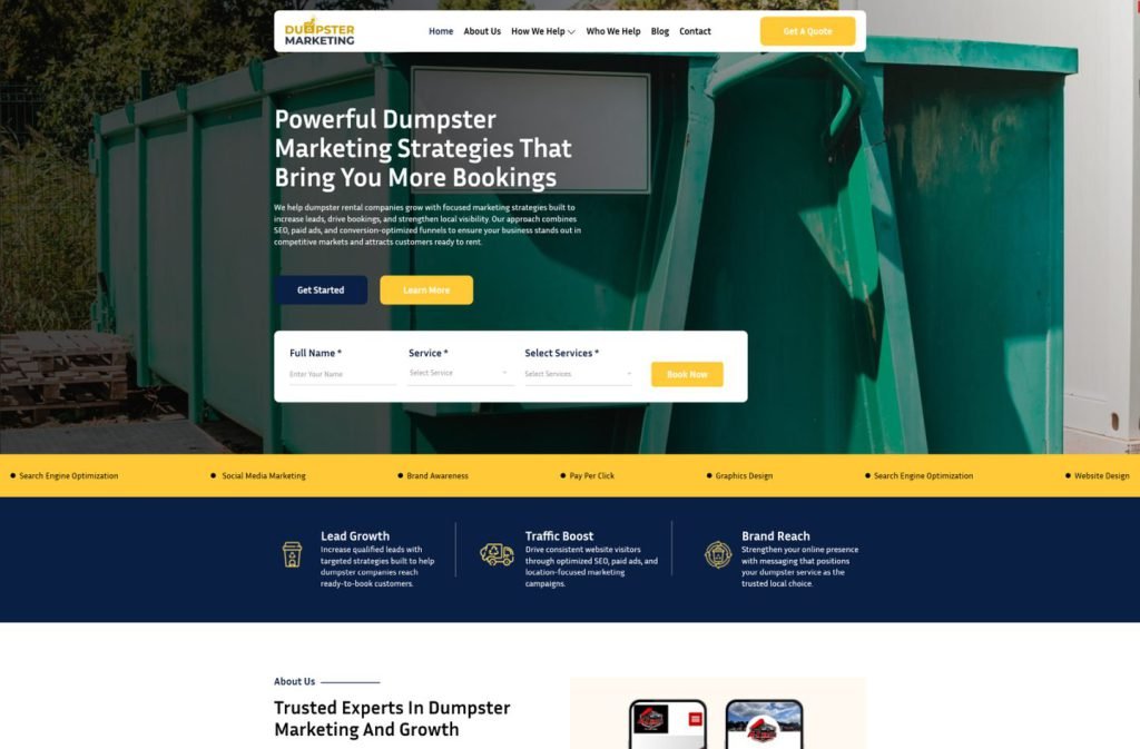
bouncehousemarketing.com
Want this for your business?
Send me your URL and I'll reply with a prioritised breakdown of what's costing you enquiries and how I'd fix it. No charge, and no call needed.