ruthvengreenhouse.com
Case study
LCG Canada.
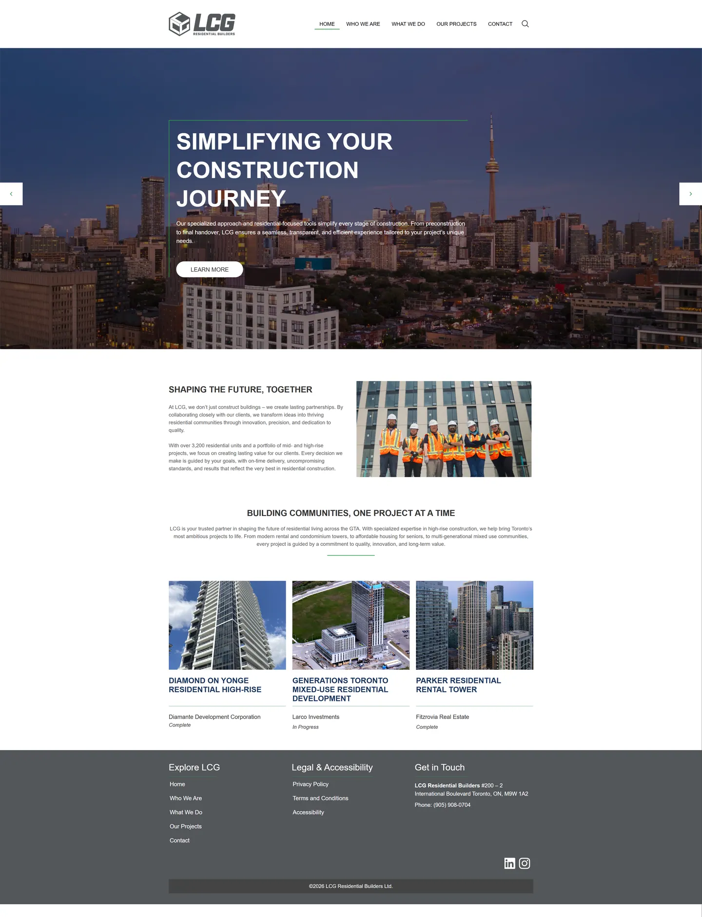
I built LCG Canada a compact WordPress corporate site aimed at the development firms that hire it. Developers size up a contractor fast, so I put the tower portfolio right under the hero and labelled every project with its developer and build stage.
IndustryTrades & Contractors
Timeline2026
Built withWordPress
 HOVER TO SCROLL

// how it was built
From brief to launch.
This build centred on one question from LCG Canada's clients: what have you delivered, and what is underway?
-
01 discover
Developer audience
I looked at how development firms judge a contractor and decided the portfolio had to appear almost immediately.
-
02 plan
Five-area structure
I limited the sitemap to home, about, services, portfolio and contact to keep every page purposeful.
-
03 design
Charcoal and green
I used charcoal as the base, pulled one green from the cube logo and kept portfolio cards white so tower photos lead.
-
04 build
WordPress portfolio
I set up project cards with a developer credit and a build-stage label, plus a rotating hero slider.
-
05 test
Phone behaviour
I checked the green menu icon, restacked slide text and enlarged arrows so the slider works under a thumb.
-
06 ✓ shipped
Footer and policies
I split the footer into three columns so legal and accessibility pages sit apart from general links.
What I did
The build, step by step.
- Five areas, nothing more. Home, company intro, services, portfolio and contact keep the structure small enough to scan in one sitting.
- Skyline slider up top. Short brand messages rotate over an evening shot of the Toronto skyline, and the portfolio grid follows immediately.
- Credit and status per tower. Every project card names the developer and carries a done or under construction label.
- One green accent. Charcoal greys carry the design, and the headline is outlined in a single green borrowed from the cube logo.
- Touch-friendly on phones. The menu turns into a green square button, slide copy moves beneath its headline and slider arrows become large tap targets.
Related work
See them all
More Trades & Contractors projects.
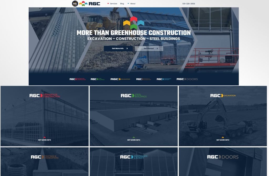
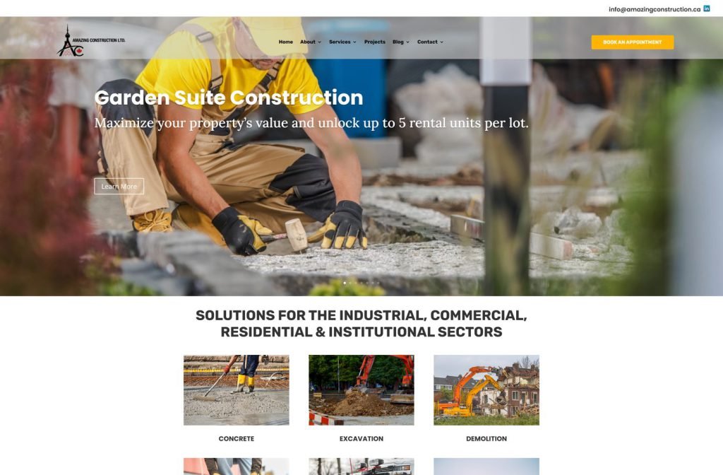
amazingconstruction.ca
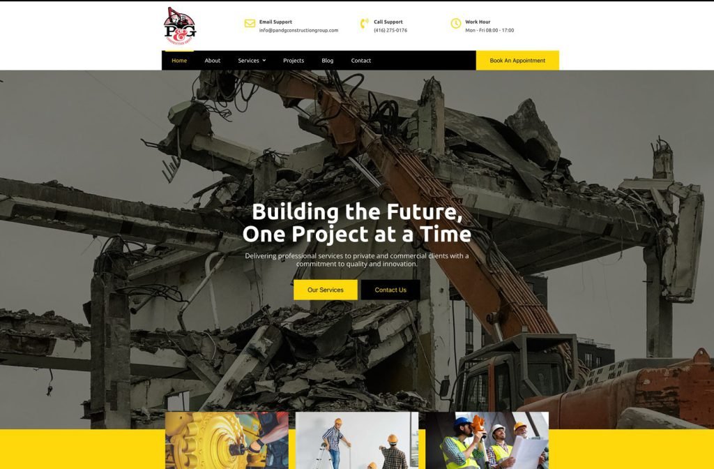
private client site
Want this for your business?
Send me your URL and I'll reply with a prioritised breakdown of what's costing you enquiries and how I'd fix it. No charge, and no call needed.