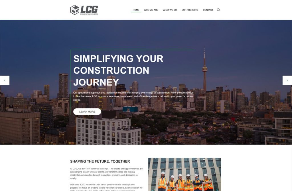
lcgresidential.ca
Case study
RGC Greenhouse Construction.
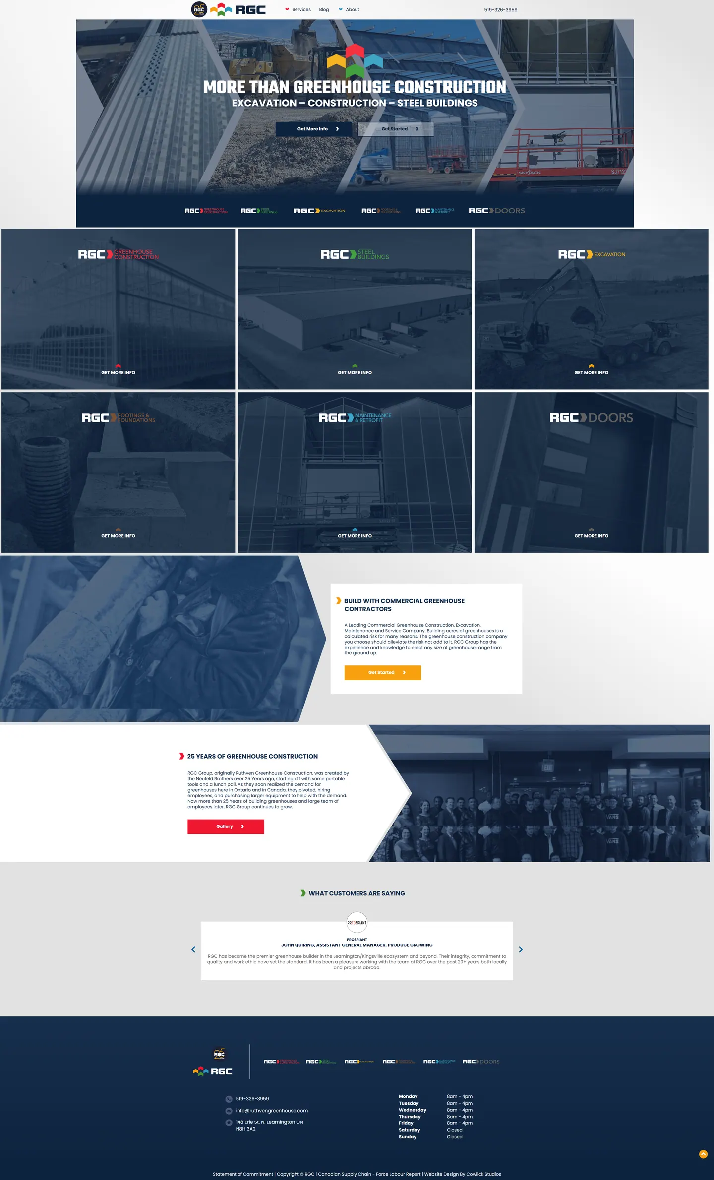
I built RGC's homepage to hold six divisions, from doors and footings to steel buildings and greenhouses, without turning into a crowded list. A colour-coded mark for each division repeats through the page, so visitors grasp the structure without reading an explanation.
IndustryTrades & Contractors
Timeline2023
 HOVER TO SCROLL

// how it was built
From brief to launch.
Six trades, one page: I spent most of the planning deciding how to show separation and unity at the same time.
-
01 discover
Six divisions
I inventoried doors, footings, excavation, retrofit, steel buildings and greenhouses, and how the company grew out of greenhouse work.
-
02 plan
Repeating colour key
I decided a colour-coded division strip would repeat in the header area, through the tiles and near the footer.
-
03 design
Unified imagery
I added slanted section edges and a navy wash over photos, with the anniversary built into the logo.
-
04 build
Division routing
I coded tiles that each lead to their division's information, the origin section and a testimonial slider.
-
05 optimise
Mobile tiles
I dropped tiles to a single column on phones and kept the footer hours as a real table.
-
06 ✓ shipped
Every route working
Each division had a working link on day one, alongside the Leamington location, weekday hours and a gallery of completed builds.
What I did
The build, step by step.
- A colour for each division. Red marks greenhouses, green steel buildings and yellow excavation, and the strip repeats top, middle and bottom.
- Roof-pitch angles. Slanted panel edges echo greenhouse roofs across the sections.
- One wash for many trades. A navy overlay on project photos makes very different work look like one company.
- The founders' story. The brothers' origin sits beside a full staff photo, followed by rotating testimonials led by a produce grower.
- Tiles that stay legible. On phones the division tiles become one column, and darkened photos keep every wordmark legible.
Related work
See them all
More Trades & Contractors projects.
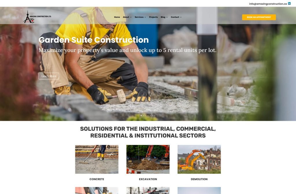
amazingconstruction.ca
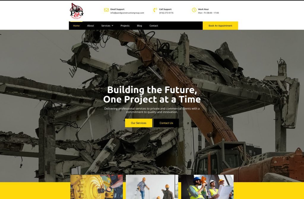
private client site
Want this for your business?
Send me your URL and I'll reply with a prioritised breakdown of what's costing you enquiries and how I'd fix it. No charge, and no call needed.