shop.moonnightmedia.com
Case study
Mr Microsoft.
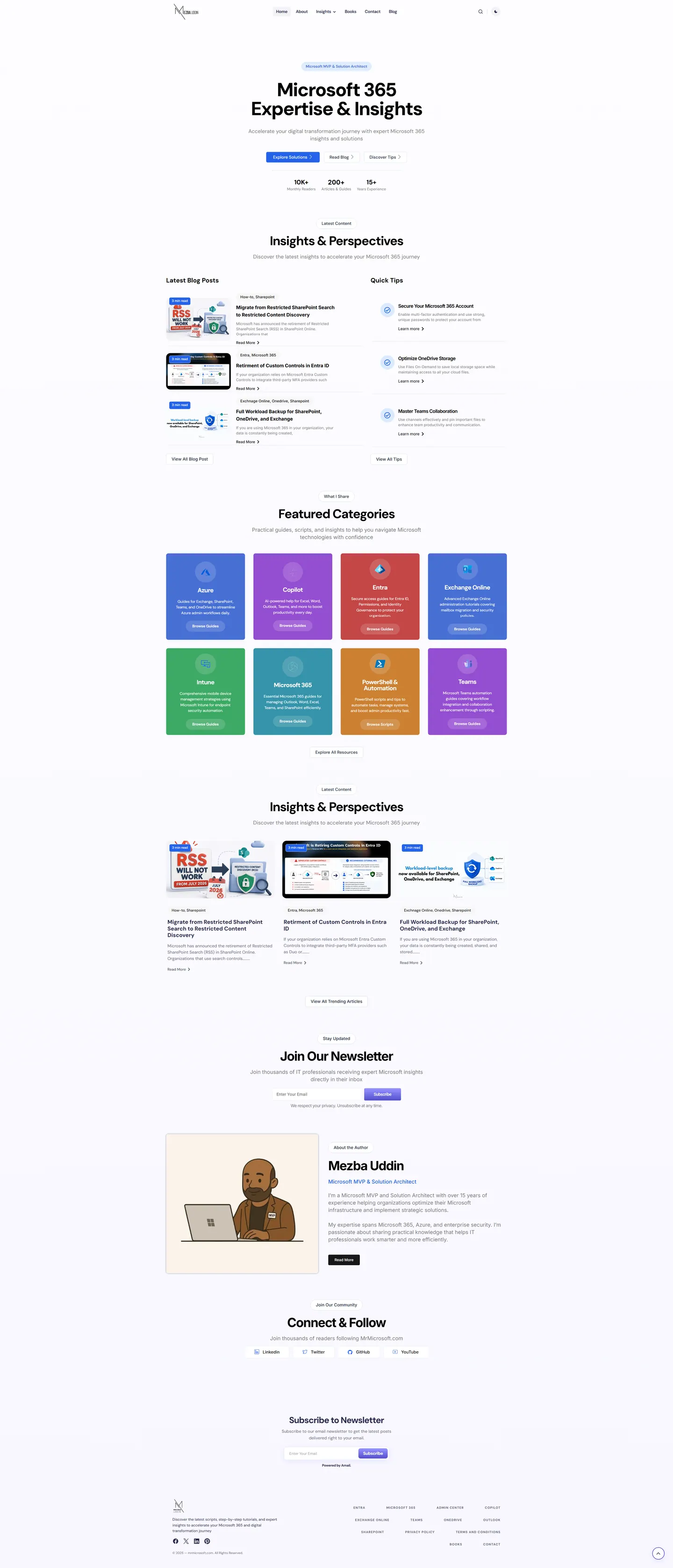
I reworked Mr Microsoft from a date-ordered blog into a magazine layout for IT admins. Readers can now pick a topic hub, choose between a quick tip or a full walkthrough, and see the author's MVP credential before they start reading.
IndustryAgencies & Tech
Timeline2026
 HOVER TO SCROLL

// how it was built
From brief to launch.
The archive already held hundreds of articles, so most of this build was about structure before styling.
-
01 discover
Reader intent
I looked at how admins arrive, usually with one specific problem, and whether they want a fast fix or a complete guide.
-
02 plan
Topic hubs
I mapped the archive into hubs for each Microsoft product area and separated short tips from in-depth posts.
-
03 design
Mostly monochrome
I kept the base palette almost monochrome so each hub colour, like blue for Azure or green for Intune, stands out.
-
04 build
Magazine components
I coded the tips column, topic cards, reading-time labels, monthly archives, dark mode switch and the author panel.
-
05 integrate
Two newsletter forms
I placed two signup points on the page so subscribers could join from wherever they finished reading.
-
06 ✓ shipped
Full from day one
The homepage opened with fresh articles and a stocked tips column, and signups started coming through both forms.
What I did
The build, step by step.
- Depth over dates. I set a slim column of quick how-to tips beside the newest long-form articles, so readers self-select.
- Colour-coded topic hubs. Azure, Intune, Copilot, Teams, Entra, PowerShell and Exchange Online cards each carry their own colour and link into a hub.
- A dark mode toggle. I added a header switch for anyone reading late, keeping the base layout near black and white so both themes hold up.
- Signals on every card. Every post card states how long it takes to read, and monthly archives run back through earlier years.
- Credibility early. An author panel sets the MVP title beside a drawn portrait, and on phones the readership, article and years-of-experience figures appear before the opening headline.
Related work
See them all
More Agencies & Tech projects.
aydinternetmarketing.com
dumpsterrental.marketing
Want this for your business?
Send me your URL and I'll reply with a prioritised breakdown of what's costing you enquiries and how I'd fix it. No charge, and no call needed.