aydinternetmarketing.com
Case study
Bounce House Marketing.
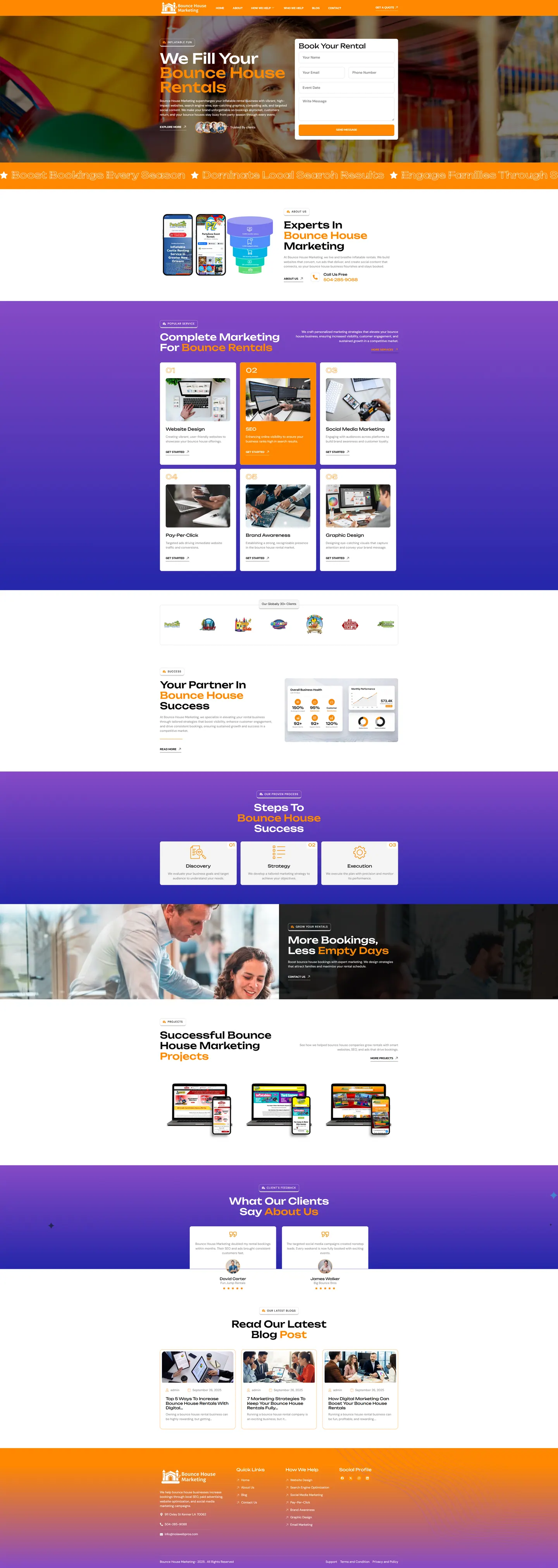
An agency that sells lead generation gets judged on its own homepage. I built Bounce House Marketing a page that asks for the enquiry on the first screen, then lays out every service in numbered order for rental owners browsing on their phones.
IndustryAgencies & Tech
Timeline2026
 HOVER TO SCROLL

// how it was built
From brief to launch.
The site is the agency's sales pitch, so I treated every step of the build as a test of whether it would win an enquiry on its own.
-
01 discover
Site as pitch
I started from the question prospects ask of any agency: if this page cannot get enquiries, why trust it with mine?
-
02 plan
Form, services, proof
I ordered the page as enquiry form, numbered services, client logos, process, showcase and testimonials.
-
03 design
Orange and purple bands
I set heavy headings with orange highlights on alternating wide stripes, and drew a results graphic styled like a dashboard.
-
04 build
Enquiry and ticker
I coded the first-screen form with its event date picker, the scrolling ticker below the hero and the device mockup showcase.
-
05 content
Starter articles
I set up the blog with three posts about marketing a rental company and a footer menu listing every service, including email campaigns.
-
06 ✓ shipped
Phone-first order
I moved the form above the service cards on mobile and made the numbered cards run full width so the sequence stays clear.
What I did
The build, step by step.
- The form comes first. Contact fields, an event date picker and a message box sit next to the headline, over a photo shot from within an inflatable.
- Services in a numbered run. Design, search, paid ads, social, branding and graphics each get a card in sequence, so a wide menu reads as organised.
- Colour that moves. Wide orange and purple bands alternate on scroll, key words in the headings glow orange and a ticker runs under the hero.
- Proof of results. I added a client logo row, a three-stage process, device mockups of client sites, a results graphic styled like a dashboard, and testimonials.
- Phone owners in mind. On mobile the enquiry form is placed ahead of the services, and each numbered card spans the full width.
Related work
See them all
More Agencies & Tech projects.

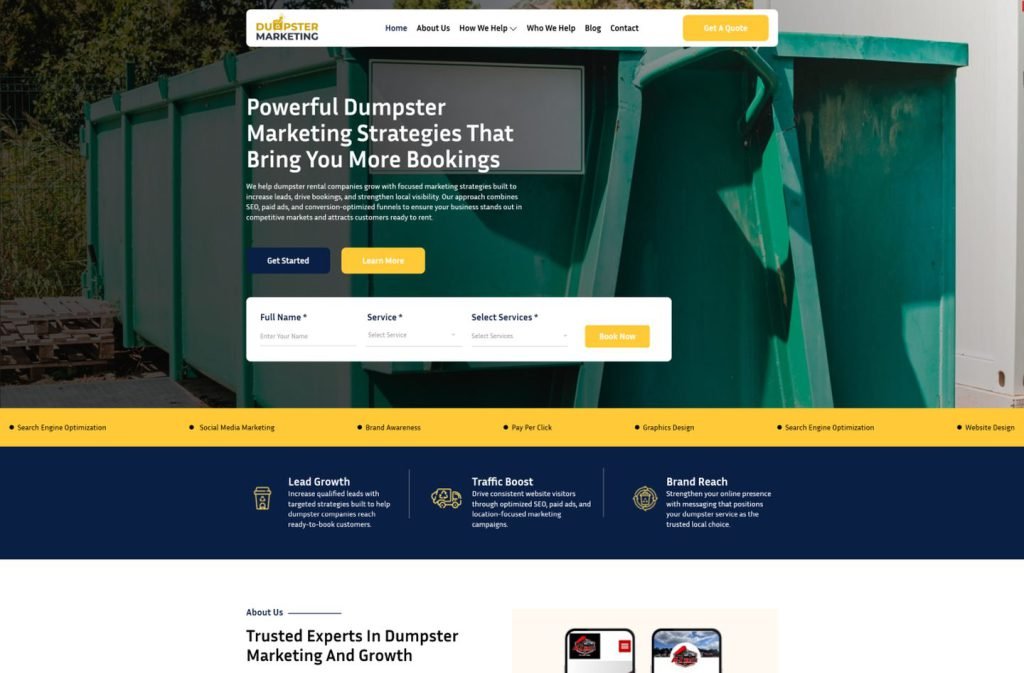
dumpsterrental.marketing
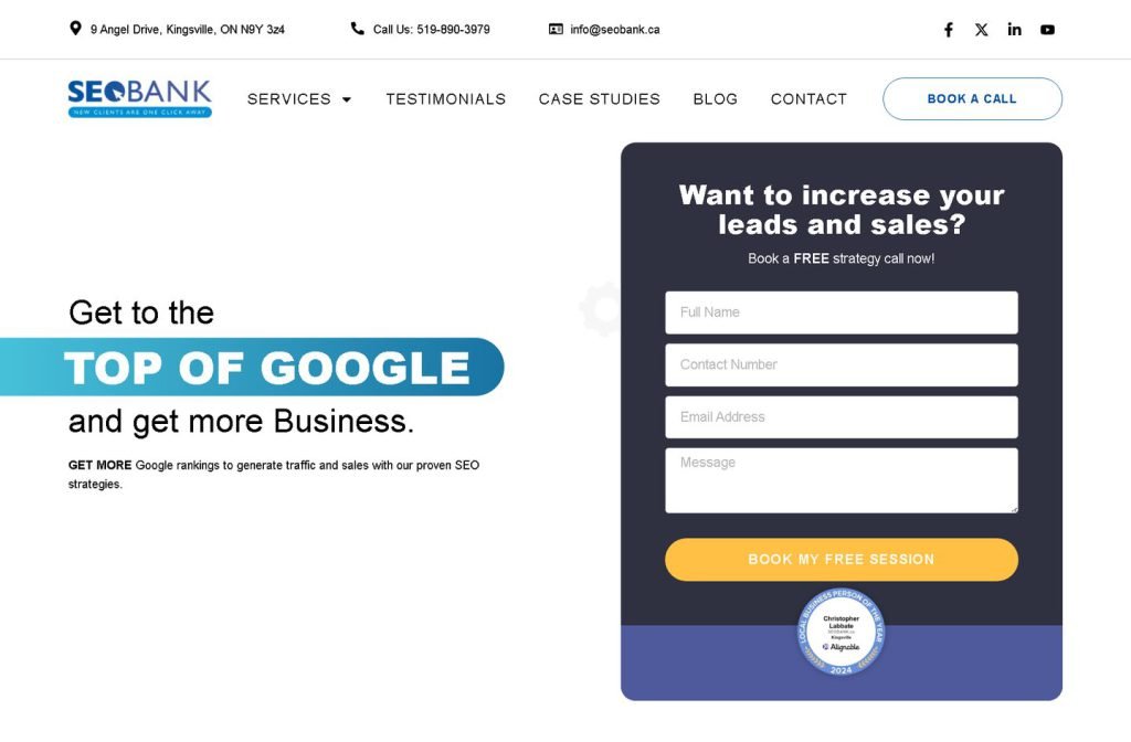
seobank.ca
Want this for your business?
Send me your URL and I'll reply with a prioritised breakdown of what's costing you enquiries and how I'd fix it. No charge, and no call needed.