leeweddings.ca
Case study
Validate.
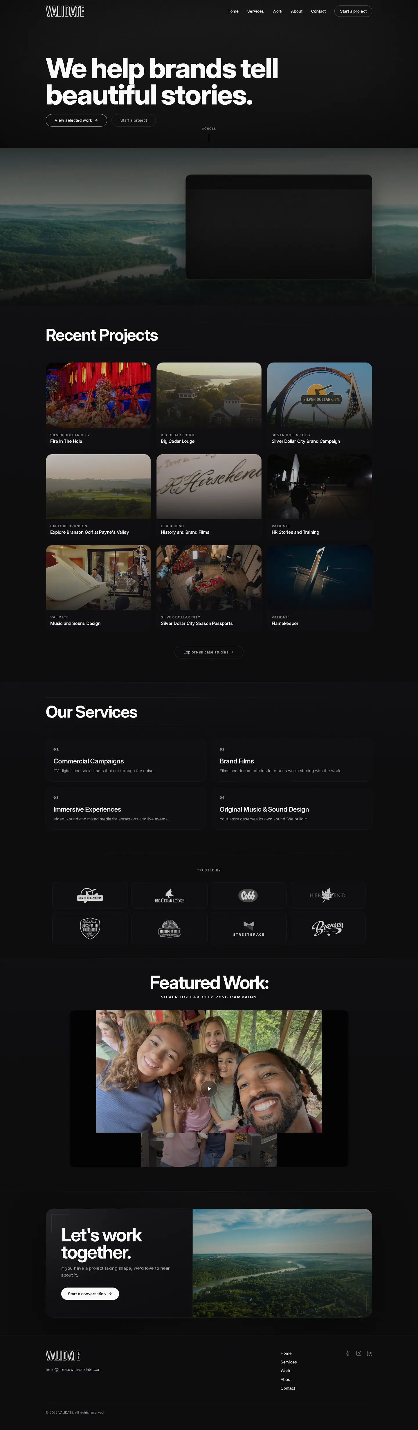
I designed Validate's portfolio so the work arrives ahead of any pitch. A one-line intro gives way to a grid of still frames, each tagged with its client, and a near-black interface saves the brightest colours for the projects themselves.
IndustryEvents & Entertainment
Timeline2022
 HOVER TO SCROLL

// how it was built
From brief to launch.
Validate's clients are often more famous than the studio, so I built this portfolio to step aside and let their projects carry it.
-
01 discover
Work as proof
I recognised that the well-known client projects were the studio's strongest pitch.
-
02 plan
Grid first
I cut the intro to one line and moved the case study grid straight under it.
-
03 design
Dark and minimal
I chose near-black with fine white lettering and framed the showreel over an aerial lake view.
-
04 build
Supporting sections
Under the grid I built the numbered services list, a client logo wall and a featured campaign player.
-
05 optimise
Wide crops
I kept every still in a wide cinematic crop as the grid collapses on small screens.
-
06 ✓ shipped
Featured campaign
I pinned work for a famous client of the studio as the featured campaign, with enquiries invited in the footer.
What I did
The build, step by step.
- One line, then work. The introduction is a single sentence before the project grid takes over.
- Stills over descriptions. Each project leads with a frame from the footage and a small client label above the title.
- Black canvas. Near-black backgrounds and fine white type keep the interface quiet around the imagery.
- Numbered services list. Brand films, commercial campaigns, immersive experiences, original music and sound design sit in a numbered list below the grid.
- Cinematic on phones. As the grid narrows, stills keep their wide framing so they still read as film.
Related work
See them all
More Events & Entertainment projects.
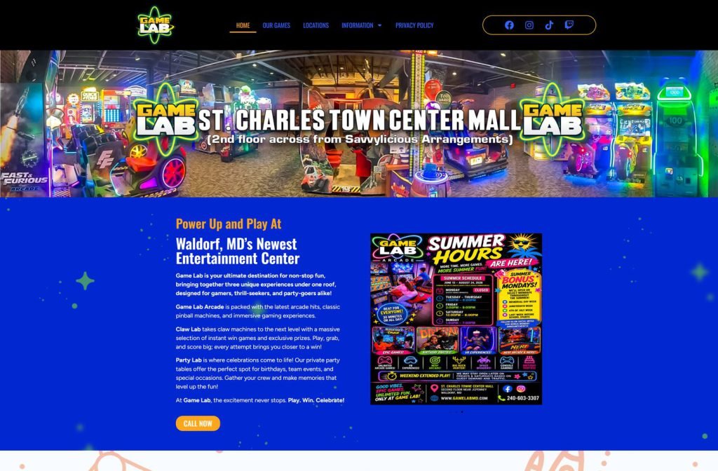
gamelabmd.com
djpdx.com

Want this for your business?
Send me your URL and I'll reply with a prioritised breakdown of what's costing you enquiries and how I'd fix it. No charge, and no call needed.