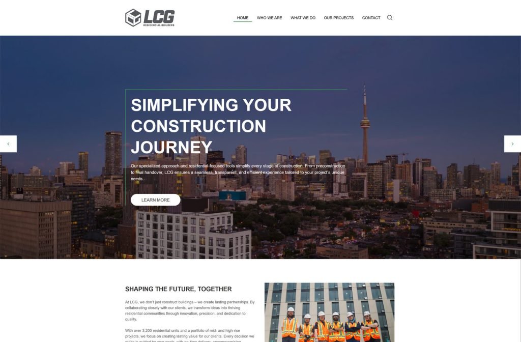
lcgresidential.ca
Case study
P&G Construction Group.
I built a contractor site that fits six trades onto one homepage scroll without looking like a patchwork. Its clients include homeowners as well as institutional buyers, so I kept every trade visible at a glance and pinned an appointment button to the header so a quote is always one tap away.
IndustryTrades & Contractors
Timeline2023
 HOVER TO SCROLL
// how it was built
From brief to launch.
Keeping six services coherent was the main challenge, so I planned structure and styling to pull everything into one identity.
-
01 discover
Six trades, one crew
I reviewed the full service list and the client mix to find what would tie it together online.
-
02 plan
Homepage as overview
I planned intro cards on innovation, teamwork and operations, then the trade grid and project carousel.
-
03 design
Hazard palette
I chose safety yellow and black and an excavator hero to reflect the company's heavy equipment work.
-
04 build
Grid and sliders
I coded the trade tiles, the commercial job carousel, the testimonial slider and the footer newsletter form.
-
05 integrate
Quote routes
I pinned the appointment button to the header and linked the yellow contact band to the quote form.
-
06 ✓ shipped
Phone grid
I checked that trade tiles collapse into a tidy single column and the header button stays reachable on small screens.
What I did
The build, step by step.
- One scroll, every trade. Intro cards, a trade photo grid and a commercial project carousel cover the whole business on the homepage.
- Safety yellow throughout. Black and hazard yellow run through every section, with yellow reserved for calls to action and the intro strip.
- A hero with grit. An excavator in rubble sets the rugged tone that matches the equipment the firm runs.
- Simple trade tiles. Each tile holds only a photo and a name, which keeps the grid clean and lets it drop into one column on phones.
- Appointment always pinned. The header button stays fixed, and a yellow contact band near the bottom points to the quote form.
Related work
See them all
More Trades & Contractors projects.
ruthvengreenhouse.com
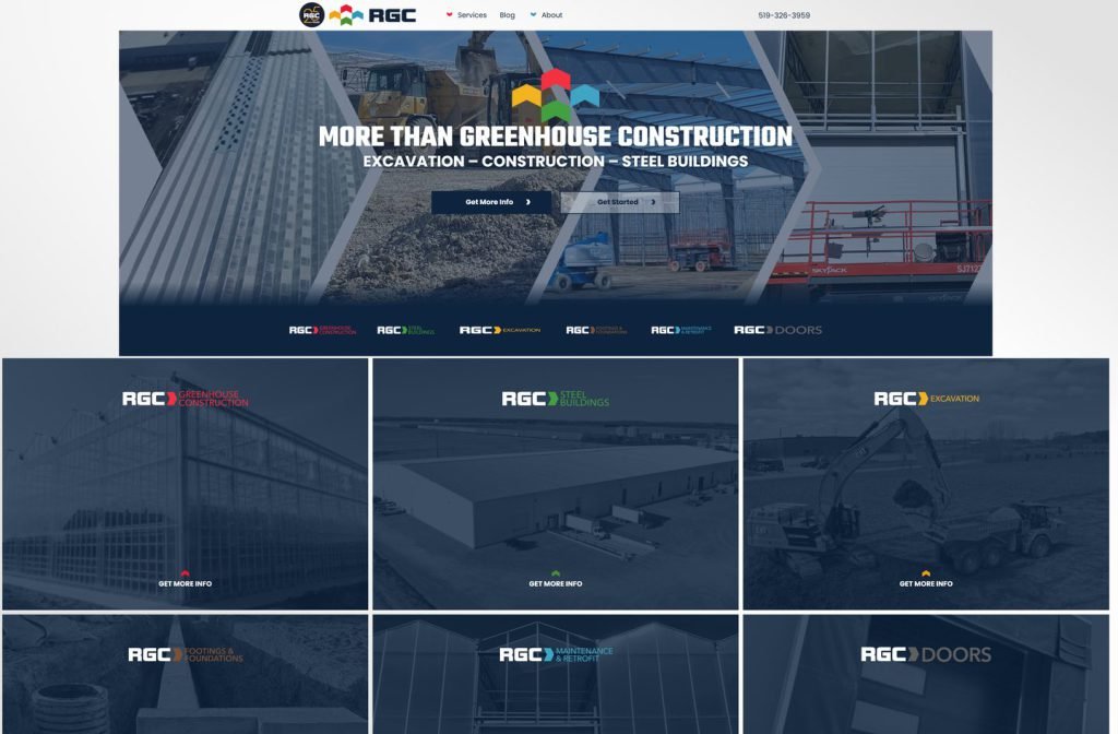
amazingconstruction.ca

Want this for your business?
Send me your URL and I'll reply with a prioritised breakdown of what's costing you enquiries and how I'd fix it. No charge, and no call needed.