longislandlightdecor.com
Case study
Alltech Fire & Security.
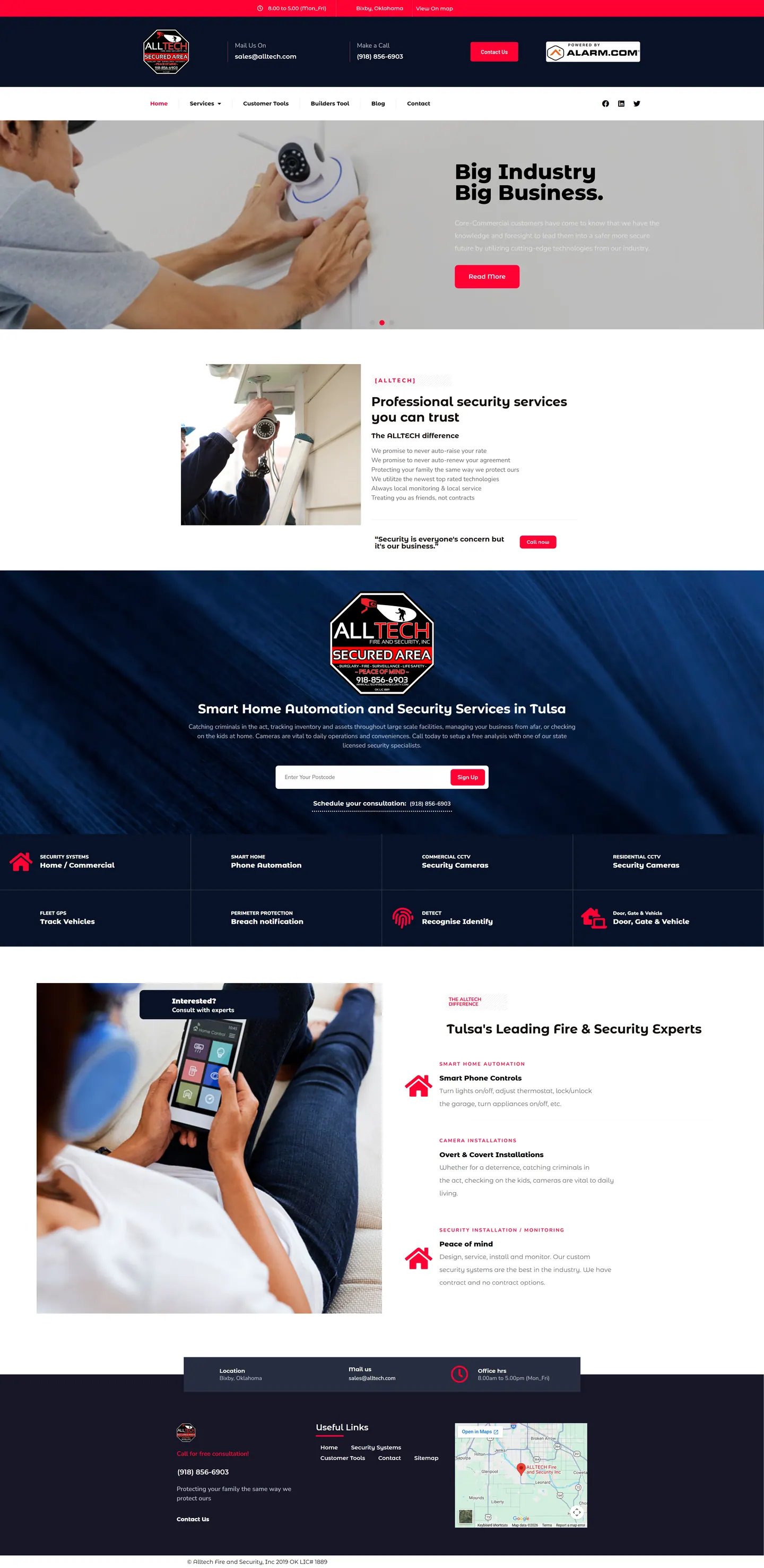
I built a site for a local security company competing with big national monitoring brands. It leads with a promise of no surprise price increases or automatic renewals, lays out eight service areas in a tidy grid and keeps separate routes for current clients and builders.
IndustryHome Services
Timeline2022
 HOVER TO SCROLL
// how it was built
From brief to launch.
Up against national brands, this site had to make the local case quickly, so I built each step around trust.
-
01 discover
The local argument
I pinned down why a buyer would pick Alltech over a national brand: fair pricing and no forced renewals.
-
02 plan
Separate lanes
I kept the main path for new buyers and gave current clients and builders their own menu links.
-
03 design
Navy and pink-red
I paired a navy base with bright pink-red buttons, the octagonal badge on blue fabric and relaxed lifestyle photos.
-
04 build
Service grid
I built the eight-tile grid with icon labels and the one-field postcode capture.
-
05 test
Small screens
I checked that opening hours and a one-tap phone number stay pinned at the top while the grid collapses to single tiles.
-
06 ✓ shipped
Local proof
The site launched with a list of reasons to choose local service, a service rundown and a neighbourhood safety blog.
What I did
The build, step by step.
- Fair billing first. A rotating banner hands straight into the promises about pricing and contract renewals.
- Eight tiles, full range. Alarm and camera systems, gates, perimeter protection and vehicle GPS tracking each have an icon tile.
- Lawn sign branding. The octagonal badge sits on blue fabric, echoing the signs customers know, over a deep navy and pink-red palette.
- One field to start. A single postcode field captures interest, because security sales mostly close on a phone call.
- Trust details visible. The monitoring partner badge is in the header, the footer shows the state license and a map of Bixby, and on mobile a tap-to-call number stays up top.
Related work
See them all
More Home Services projects.
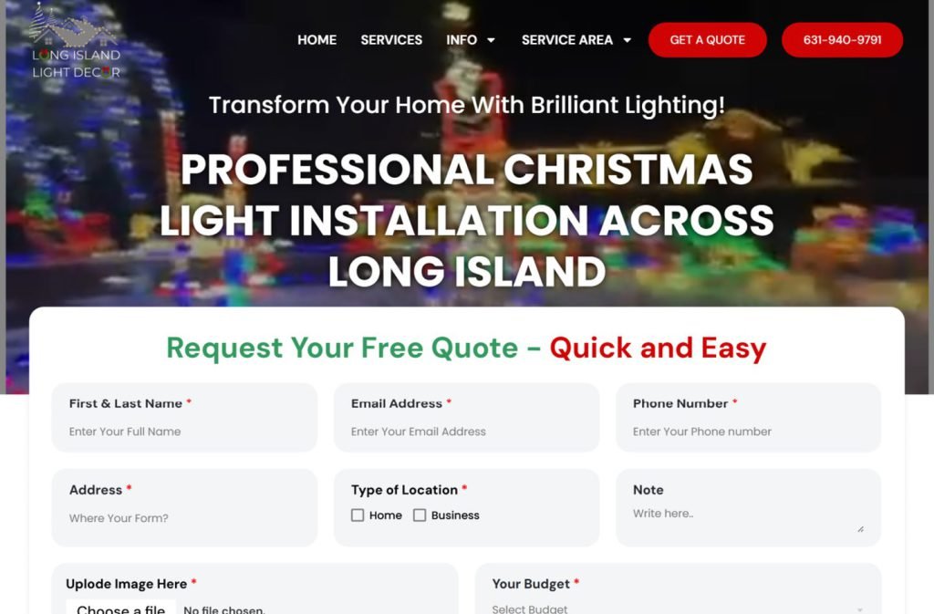
austinkitchens.ca
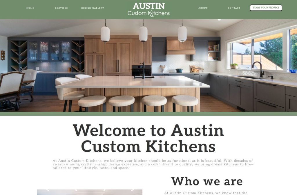
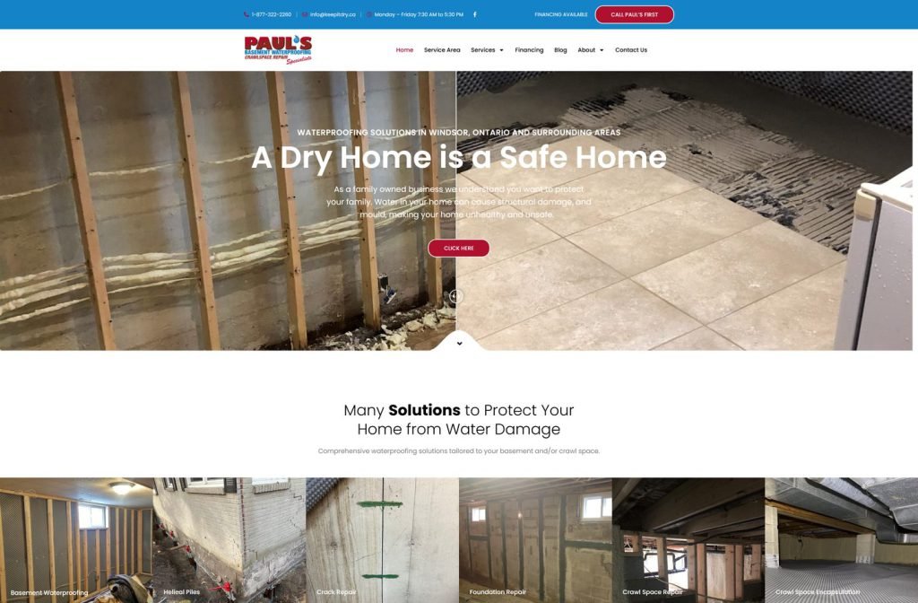
keepitdry.ca
Want this for your business?
Send me your URL and I'll reply with a prioritised breakdown of what's costing you enquiries and how I'd fix it. No charge, and no call needed.