longislandlightdecor.com
Case study
Austin Custom Kitchens.
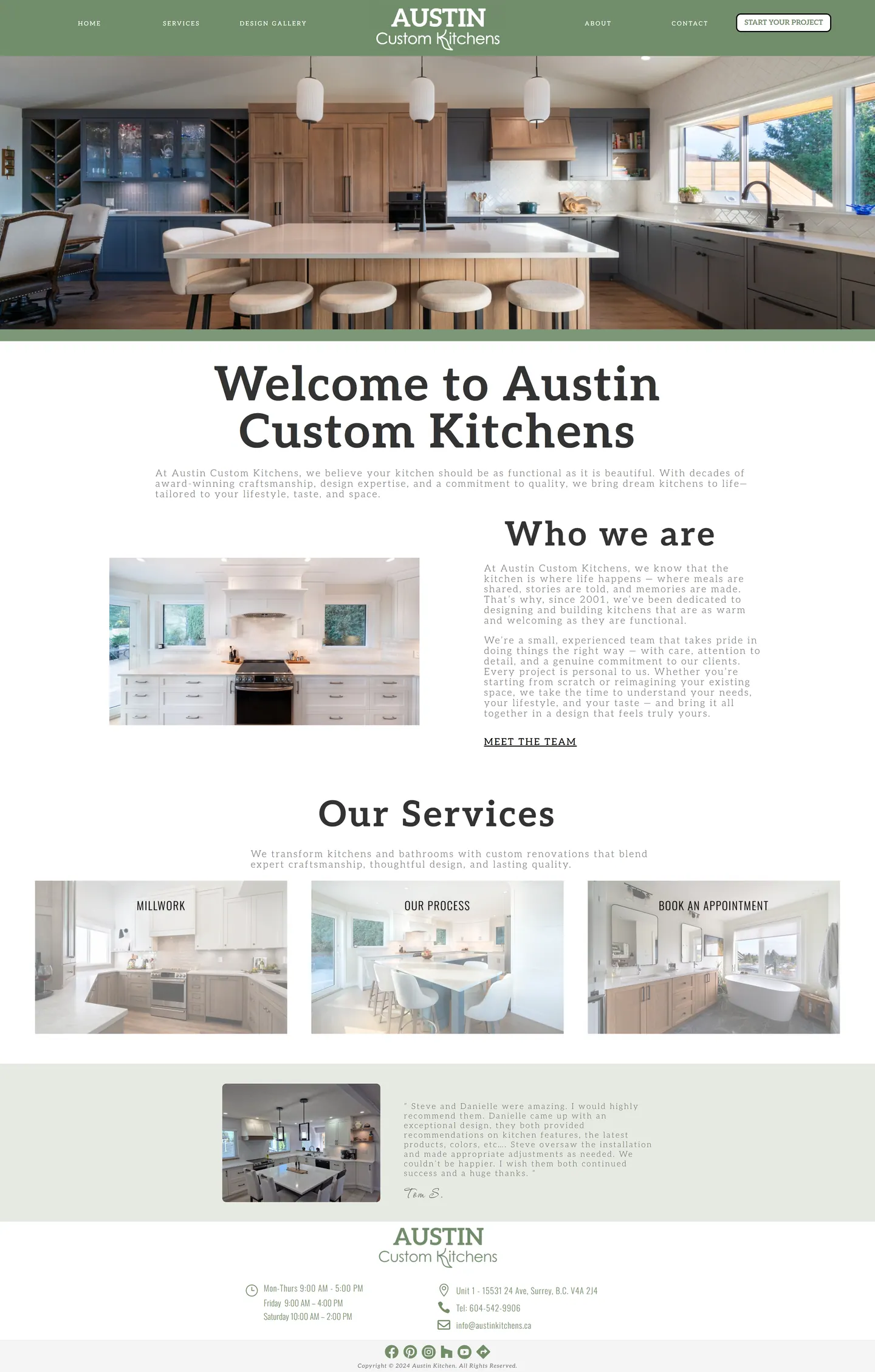
I built Austin Custom Kitchens a gallery-first site where the photography makes the case and the next step is always one click away. A start-a-project button sits in the header on every page, and the home page moves from the team to renovation services to picture links for millwork, process and booking a meeting.
IndustryHome Services
Timeline2024
 HOVER TO SCROLL
// how it was built
From brief to launch.
The brief was to let the finished kitchens do the talking, so I shaped each stage around photography and a constant path to enquiry.
-
01 discover
Craft into enquiries
I learned the Surrey crew both designs and builds its kitchens, and that design-minded homeowners are the audience to win.
-
02 plan
Proof then next step
I planned a short navigation, a home page running team, kitchen and bath renovation, then three image links to millwork, process and booking.
-
03 design
Sage and slab serif
I framed pages in sage green around warm cabinetry shots and used a slab serif for headings to set a magazine tone.
-
04 build
Gallery-led pages
I built the design gallery, the services overview, a how-we-work section, a testimonial block and a footer with the Surrey address and business hours.
-
05 optimise
Images tuned for phones
I compressed gallery photos and set focal-point cropping so the hero keeps the island in frame on portrait screens.
-
06 ✓ shipped
Header button everywhere
At launch the project-start button sat in the header on every page, next to the company history and meet-the-team link.
What I did
The build, step by step.
- Short menu, one clear button. I trimmed the navigation to a few links and gave starting a project its own prominent header button across the site.
- Photos as service tiles. Each service tile is almost entirely image, with a thin caption strip underneath.
- Sage framing warm wood. A soft sage border wraps every page around photos of walnut cabinets, quartz islands and cream shaker doors.
- Editorial type. I set headings in a bookish slab serif to give the site the feel of a design magazine.
- Crops that keep the island. In portrait orientation the hero crops around a focal point so the island stays visible, and I shrank the gallery file sizes so scrolling stays quick.
Related work
See them all
More Home Services projects.
keepitdry.ca
winklerfenceanddeck.com
Want this for your business?
Send me your URL and I'll reply with a prioritised breakdown of what's costing you enquiries and how I'd fix it. No charge, and no call needed.