longislandlightdecor.com
Case study
Paul’s Basement Waterproofing.
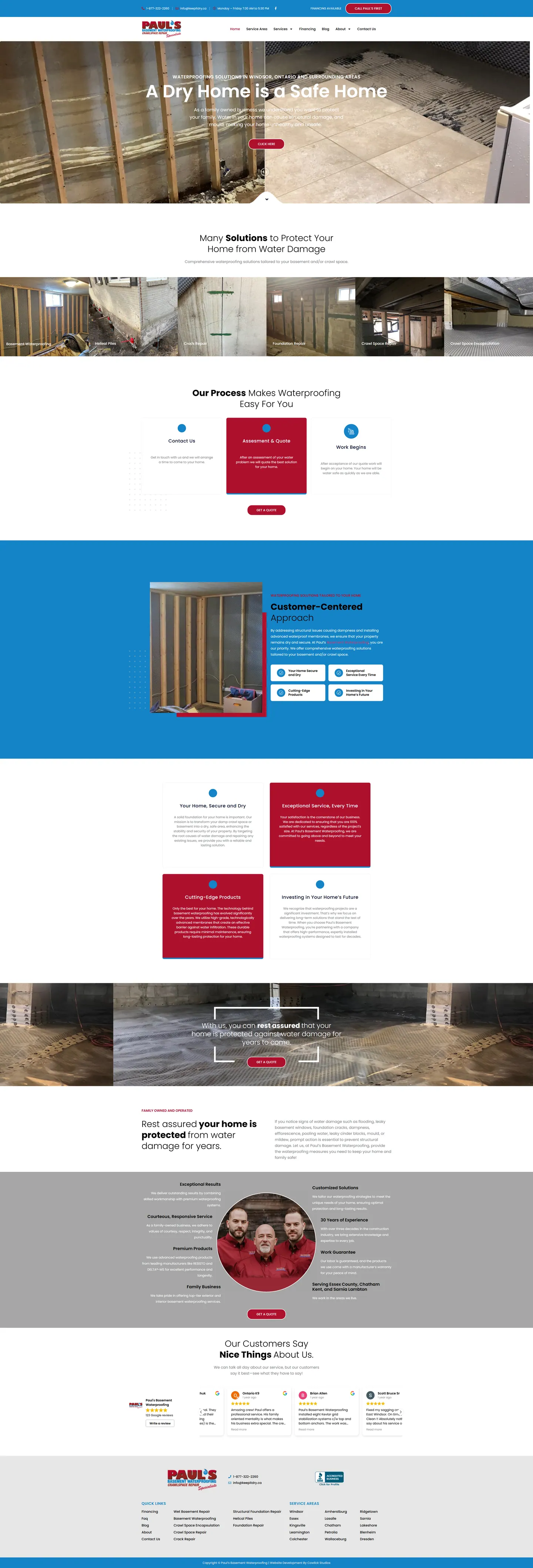
I built a site for a family waterproofing company whose visitors are usually staring at water on the floor. Real job photos, a simple three-step explanation of what happens next and a quote button that never goes far do the reassuring, backed by a carousel of Google reviews.
IndustryHome Services
Timeline2023
Built withGoogle Reviews
 HOVER TO SCROLL

// how it was built
From brief to launch.
The visitor is usually worried and in a hurry, so I built toward reassurance and a fast quote.
-
01 discover
Homeowner stress
I started from the moment someone finds water in the basement and what they need to see to feel it can be fixed.
-
02 plan
Services and process
I mapped a page per service, a three-step process section and a customer care section.
-
03 design
Red, blue, real
I took the palette from the logo and used only real project and crew photos.
-
04 integrate
Google Reviews
I set up the review carousel with a link for customers to add their own.
-
05 build
Service pages
I built an individual page for each repair type, the financing banner and a footer naming every town served.
-
06 ✓ shipped
Quote-ready mobile
I checked that phones show the contact card first and that the quote button never scrolls far away.
What I did
The build, step by step.
- Real work, not stock. Every image comes from actual jobs, like membrane going onto foundation walls, and the page ends on the crew in matching red shirts.
- Every service in one strip. Crack and foundation repair, crawl space sealing and helical piles are introduced in a single image row.
- What happens next, in three cards. Contact leads to an assessment and a price, then the work begins, so a worried homeowner knows what calling sets in motion.
- Google Reviews on show. A carousel pulls in reviews alongside a link inviting past customers to leave one.
- Quote always close. On phones the page runs in a single column with the contact card first, and financing is flagged along the top of every page.
Related work
See them all
More Home Services projects.
austinkitchens.ca
winklerfenceanddeck.com

Want this for your business?
Send me your URL and I'll reply with a prioritised breakdown of what's costing you enquiries and how I'd fix it. No charge, and no call needed.