clearviewdentalmilton.ca
Case study
Britto Children Dentistry.
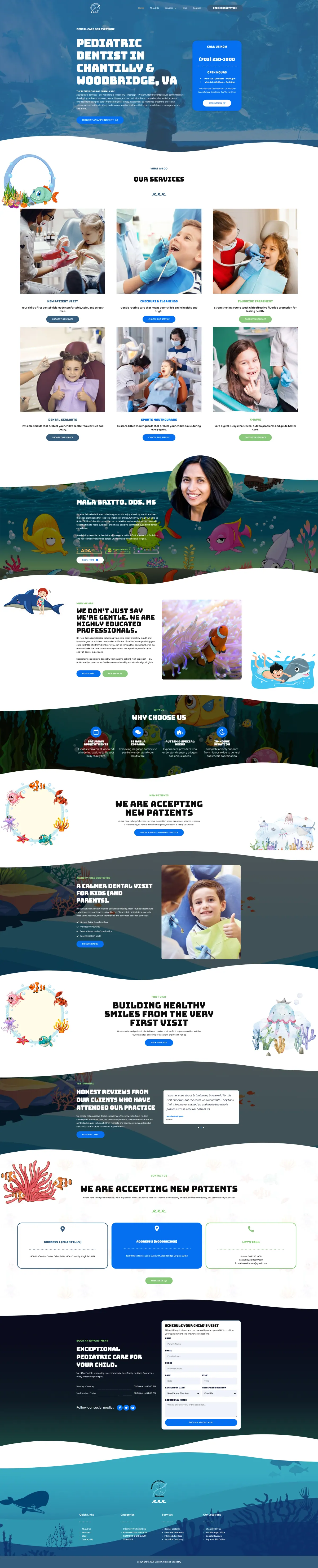
I built Britto Children Dentistry an under-the-sea site that makes a dental visit look like an adventure for kids. For parents, it gathers the practice's strengths, gives each office its own card, and opens the appointment request by asking which location they want, all tuned for one-handed phone use.
IndustryDental & Medical
 HOVER TO SCROLL

// how it was built
From brief to launch.
Two audiences shared this site, anxious kids and busy parents, so I planned each step to reassure one while saving time for the other.
-
01 discover
Fear and logistics
I noted that kids needed reassurance before visiting, while parents needed reasons to trust the practice and a fast way to book.
-
02 plan
Parent path mapped
I ordered the page as reasons to choose, services, office cards and an appointment form that starts with the location choice.
-
03 design
Life under the sea
I carried an ocean theme through every block with playful sea illustrations, curved wave dividers and a soft rounded heading font.
-
04 build
Services and offices
I built service cards from a first check-up to sports mouthguards, plus separate address and hours cards for both offices.
-
05 integrate
Office-aware booking
I set up the appointment request so the chosen office comes first and staff can book the correct location.
-
06 ✓ shipped
One-handed phone use
I checked tap-to-call for both offices and made sure the form is comfortable to fill in with a thumb.
What I did
The build, step by step.
- One theme, start to finish. Fish and coral illustrations, wave-shaped dividers and rounded headings run from the top banner to a seabed-themed footer.
- Plain text for parents. I kept the rounded type for headings and used an easy-to-read face for paragraphs aimed at adults.
- Reasons families choose them. A dedicated row highlights Saturday hours, Spanish-speaking staff, autism and special needs experience and in-office sedation.
- Office chosen first. The appointment form starts by asking for the location, so reception books families into the right office.
- Made for one hand. Parents can phone either location with one tap or fill out the form thumb-only.
Related work
See them all
More Dental & Medical projects.
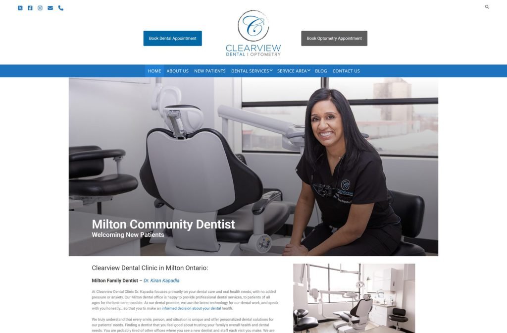
emeryvilledental.ca
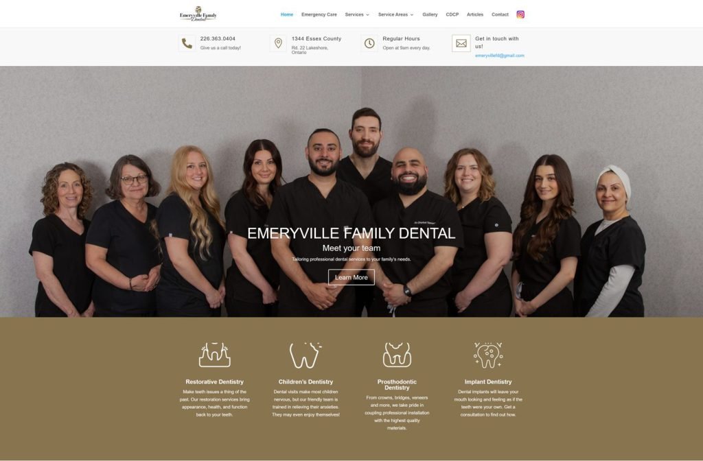
parkwayfamilydental.ca
Want this for your business?
Send me your URL and I'll reply with a prioritised breakdown of what's costing you enquiries and how I'd fix it. No charge, and no call needed.