emeryvilledental.ca
Case study
Clearview Dental Optometry.
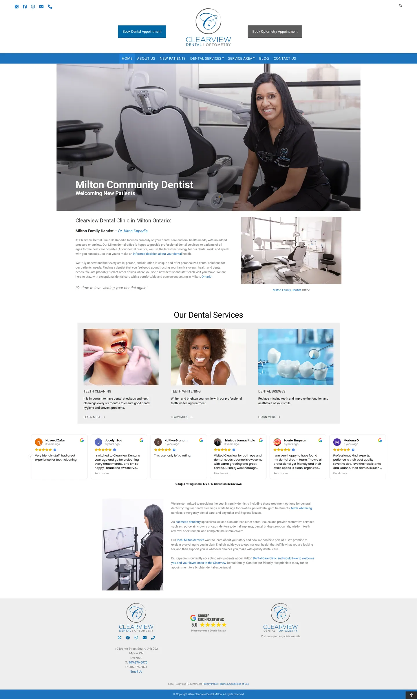
I built one website for two practices sharing a Milton clinic. A patient needing a cleaning and one needing an eye exam both land on the same homepage, so I put two separate booking buttons beside the logo and built out dental and neighbourhood pages to support local search.
IndustryDental & Medical
Timeline2024
Built withGoogle Reviews
 HOVER TO SCROLL

// how it was built
From brief to launch.
With two services and a local search goal, I planned the booking split first and the page structure around it.
-
01 discover
Two patient types
I mapped how dental and optometry visitors differ and agreed that routing them had to happen before the menu.
-
02 plan
Pages for search
I planned per-treatment pages, a page for first-time patients and a set of Milton neighbourhood pages alongside the two booking paths.
-
03 design
Slate blue identity
I worked from the clinic's slate blue monogram, with a blue navigation strip across a white page, framed around the clinic's own photography.
-
04 integrate
Booking and reviews
I tied each button to the matching scheduling system and added the Google Reviews carousel and footer badge.
-
05 build
Mobile first screen
On phones the two booking buttons run full width above everything else, reviews show one at a time and images are recropped for portrait.
-
06 ✓ shipped
Complete at handover
I delivered every treatment and neighbourhood page, the blog, privacy and terms pages, and a footer link out to the eye care practice's website.
What I did
The build, step by step.
- Two bookings, zero guesswork. Dental and eye exam buttons flank the logo and each connects to the clinic's own scheduling.
- Depth where it counts. Dentistry gets individual treatment pages and a new patient page, since that side carries most of the services.
- Pages for every neighbourhood. I built local landing pages so people searching across Milton's areas can find a nearby dentist.
- Reviews that update themselves. A Google Reviews carousel pulls in the current rating and recent patient comments, so staff never have to edit the rating.
- The real clinic on screen. Shots of the imaging area, the operatories and the dentist at work replace stock photography.
Related work
See them all
More Dental & Medical projects.
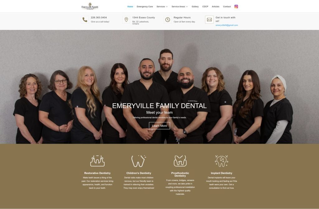
parkwayfamilydental.ca
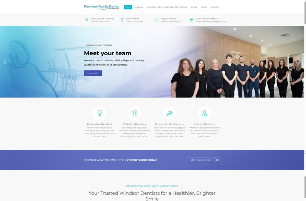
drbritto.com
Want this for your business?
Send me your URL and I'll reply with a prioritised breakdown of what's costing you enquiries and how I'd fix it. No charge, and no call needed.