private client site
Case study
Liquor Liability Expert.
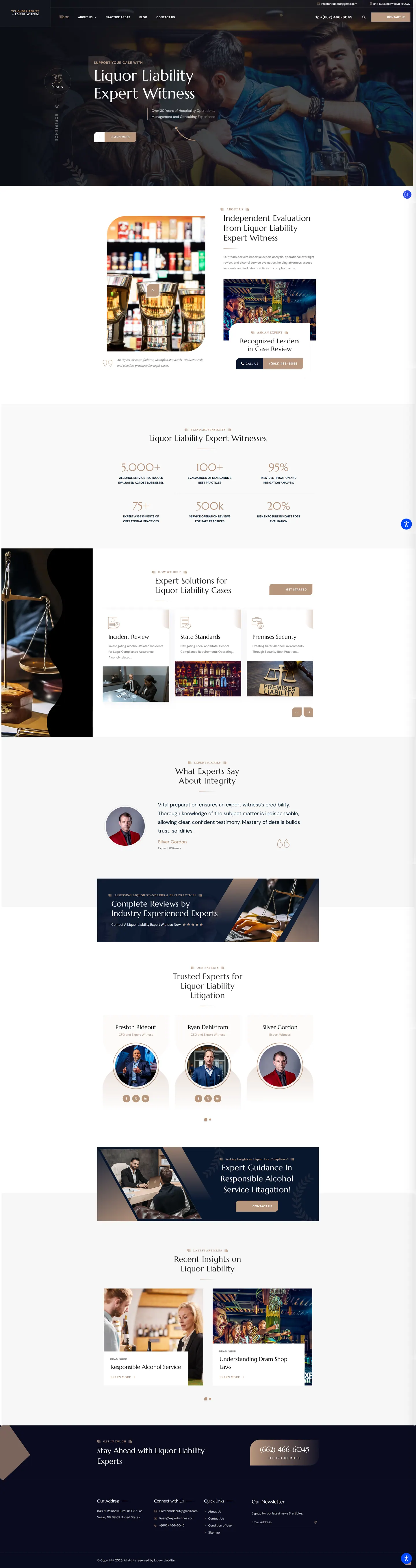
I built a dark WordPress site with an editorial feel whose only job is to prove depth of experience to attorneys. The same team already had a bright site that sells engagements, so I gave this one a different look, evidence-led sections and a blog that grows an email list.
IndustryExpert Witness
Timeline2025
Built withWordPress
 HOVER TO SCROLL

// how it was built
From brief to launch.
Because this was the second site for the same experts, I started by defining what this domain should do that the other one does not.
-
01 discover
Two sites, two jobs
I compared the existing sales-focused site and scoped this one purely around credibility for attorneys.
-
02 plan
Building the argument
I ordered the page as badge, independent evaluation video, figures, practice areas, experts, then articles and signup.
-
03 design
Dark and editorial
I paired a near-black hero with serif headings and bronze laurel ornaments to separate it visually from the blue sister site.
-
04 build
Sliders and counters
In WordPress I built the hero slider, counting figures, a practice area carousel, rotating testimonials and tagged article grid.
-
05 integrate
Newsletter path
I connected the dram shop articles to the email signup so readers have a clear next step after each post.
-
06 ✓ shipped
Mobile polish
I checked the centred logo header, text contrast over the dark hero photo and tap sizes on the slide controls before handover.
What I did
The build, step by step.
- A badge that sets the tone. The first screen shows a round badge for the team's decades in hospitality, next to a short statement of their background.
- Evidence stacked section by section. Animated counts of the protocols and operations the team has reviewed, practice area cards and senior executive profiles each add weight.
- Deliberately unlike the sibling. Near-black panels, serif type, bronze laurel details and plain text arrows keep lawyers from confusing the two brands.
- Articles that build a list. The dram shop blog leads readers into a newsletter signup, so the site grows an audience over time.
- Phone-friendly details. The logo sits in the middle of the header, the hero text holds its contrast and slide arrows become large tap targets.
Related work
See them all
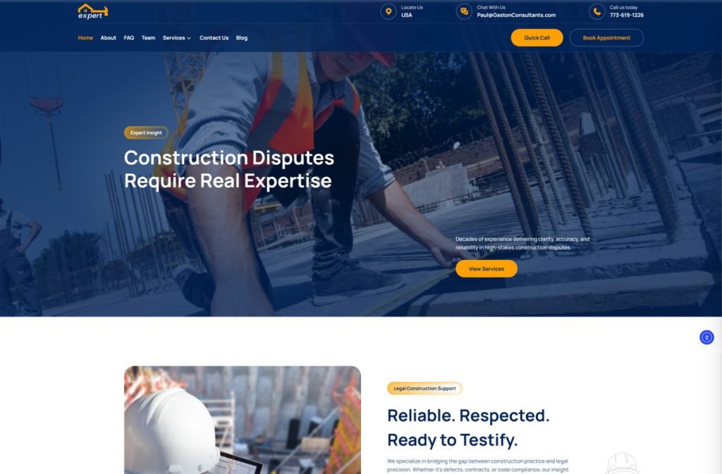
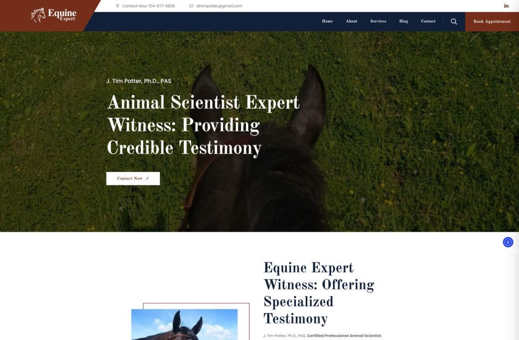
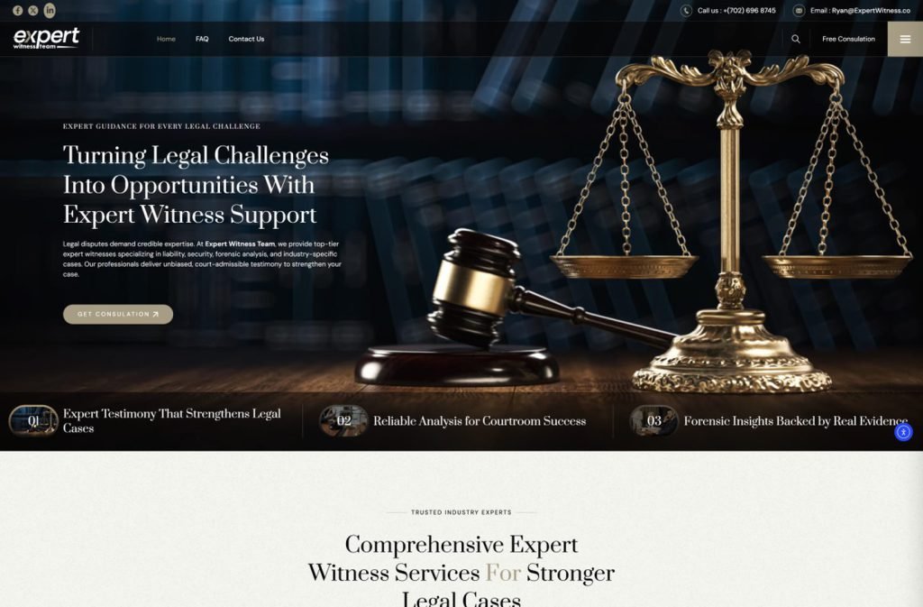
More Expert Witness projects.
private client site
private client site
Want this for your business?
Send me your URL and I'll reply with a prioritised breakdown of what's costing you enquiries and how I'd fix it. No charge, and no call needed.