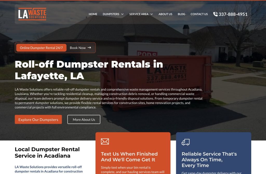
lawastesolutions.com
Case study
Northland Dumpsters.
For Northland Dumpsters I built a rental site that treats the weekly rate as public information. Each container card shows a flat price with its included weight, the FAQ gives a real cost range, and a repeating booking band lets Kansas City renters reserve online or call from wherever they are scrolling.
IndustryDumpster & Equipment Rental
Timeline2026
 HOVER TO SCROLL

// how it was built
From brief to launch.
Northland wanted prices public, so each stage of the build was about helping a renter compare, check the rules and book without waiting on a quote.
-
01 discover
Transparent pricing brief
I confirmed the goal of showing every rate openly and noted the practical questions renters bring: size, weekly cost, allowed materials and coverage.
-
02 plan
Four answers mapped
I planned sections for rate cards, a guide to what can and cannot go in the bin, a cost-focused FAQ and a list of the metro towns served.
-
03 design
Red and black
I built the look from the brand colours, adding angled red action bands, big red quotation marks on reviews and a black footer carrying the logo.
-
04 build
Rate cards and guide
I coded the container cards with weekly rates and weight allowances, the materials guide, the coverage section and footer office hours and address.
-
05 optimise
Repeated booking band
I dropped the rent-plus-call band in at several points down the page so the next step is never more than a short scroll away.
-
06 ✓ shipped
Phones on the job
I checked that both buttons widen to full width and sit low enough for one-handed tapping on a contractor's phone.
What I did
The build, step by step.
- Rates on every card. I gave each container size its own card with a flat weekly price and the weight allowance that comes with it.
- Straight answers on cost. The FAQ quotes an honest price range instead of telling people to phone for a number.
- What can go in the bin. I built a materials guide that splits accepted items from banned ones, which heads off a common source of surprise charges.
- Slanted red action bands. The company red and black carry the design, with slanted call-to-action bands, oversized red quote marks on reviews and the bold logo in a black footer.
- Thumb-sized buttons on site. On phones the rent and call buttons stretch full width in easy reach, which suits contractors checking prices on a job.
Related work
See them all
More Dumpster & Equipment Rental projects.
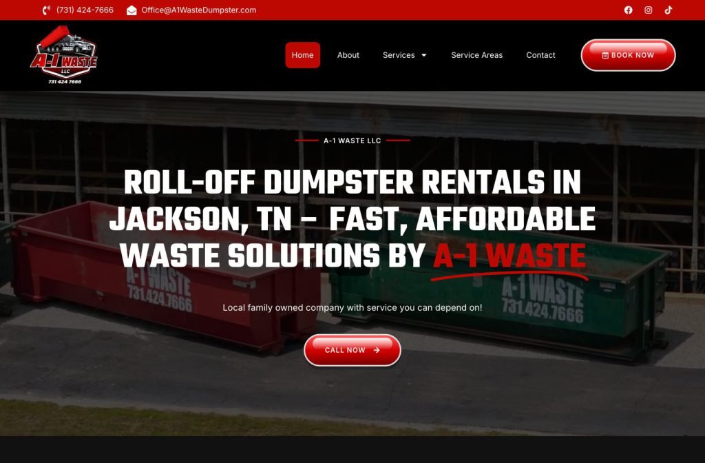
a-1waste.com
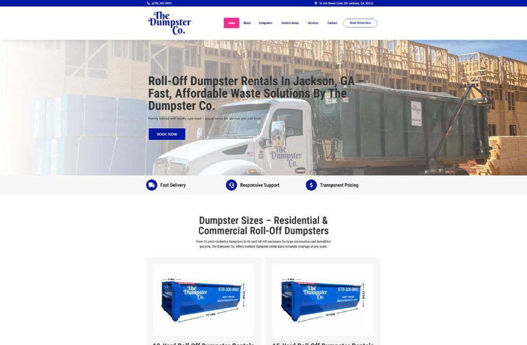
mydumpsterco.com
Want this for your business?
Send me your URL and I'll reply with a prioritised breakdown of what's costing you enquiries and how I'd fix it. No charge, and no call needed.