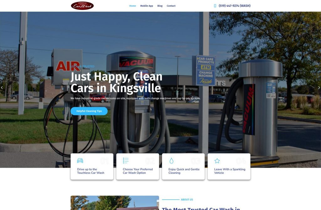
kingsvillecarwash.com
Case study
Bay Master Automotive Shop.
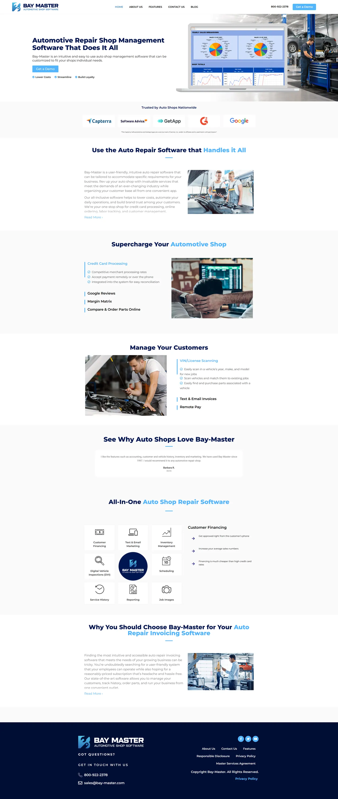
I built Bay Master's site as a software product page rather than a brochure, with a single demo button in the hero. Shop owners often browse from a phone at the counter, so I used collapsible feature sections to cover a wide platform without a tiring scroll.
IndustryAutomotive
Timeline2022
 HOVER TO SCROLL

// how it was built
From brief to launch.
This build was about fitting a broad feature set into something a shop owner can skim between customers.
-
01 discover
Owner at the counter
I planned for shop owners checking the site on a phone mid-shift, which ruled out long feature pages.
-
02 plan
Decision path
I ordered the homepage from trust badges to features, testimonials, platform icons and invoicing.
-
03 design
Product-page look
I alternated white and light grey sections and picked out key words in navy headings with a brighter blue.
-
04 build
Accordion features
I built the collapsible feature areas, the icon grid, testimonials and a rotating long-time customer quote.
-
05 optimise
Shorter on mobile
Closed accordions and a single line of badges keep the phone page manageable.
-
06 ✓ shipped
Ready to grow
The demo request sits in the header, the navy footer carries the legal pages, and the blog is ready for future posts.
What I did
The build, step by step.
- One call to action up top. A laptop displaying sales dashboards sits beside a single demo button in the hero.
- Features that expand on tap. Payments opens by default, while digital invoices, remote payment and vehicle scanning stay closed until needed.
- A decision path. Trust badges, shop and customer management features, testimonials and an icon grid lead down to invoicing.
- Real garages. Photos show mechanics at work, set against alternating white and pale grey sections.
- Badges stacked on phones. Review site badges fall into a single column on small screens.
Related work
See them all
More Automotive projects.
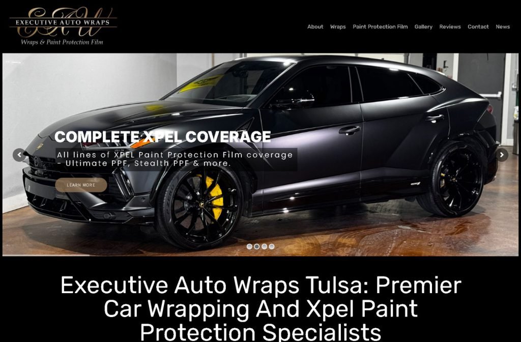
executiveautowraps.com
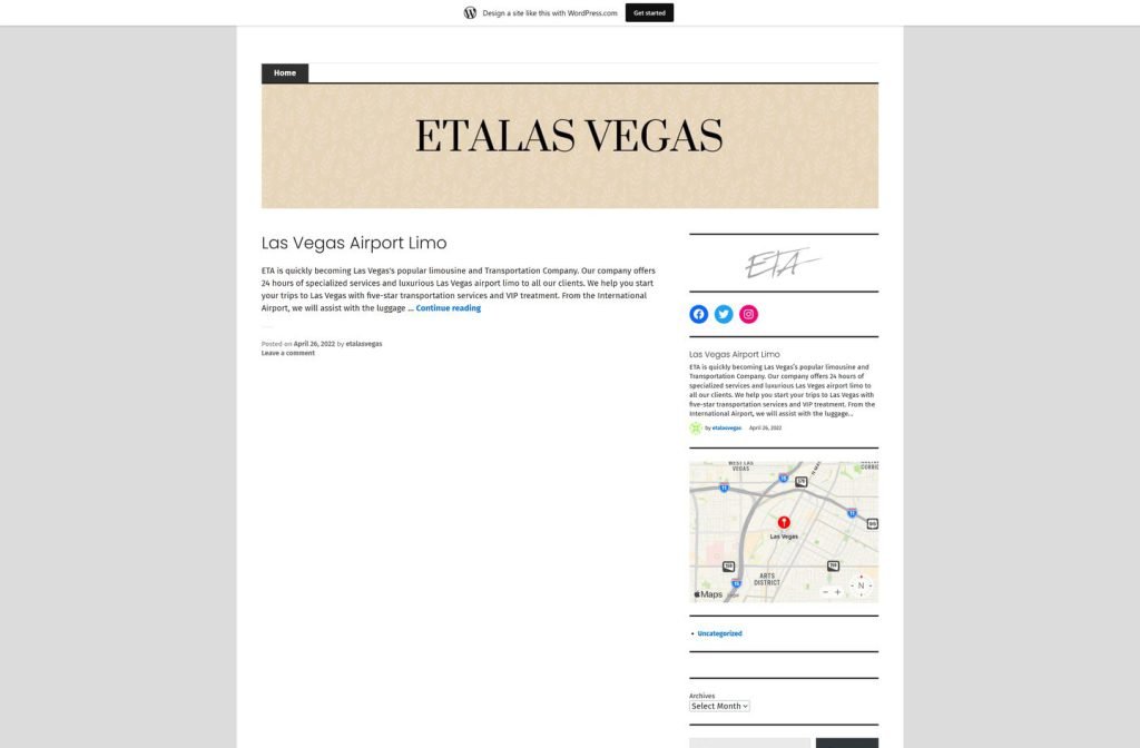
etalasvegas.wordpress.com
Want this for your business?
Send me your URL and I'll reply with a prioritised breakdown of what's costing you enquiries and how I'd fix it. No charge, and no call needed.