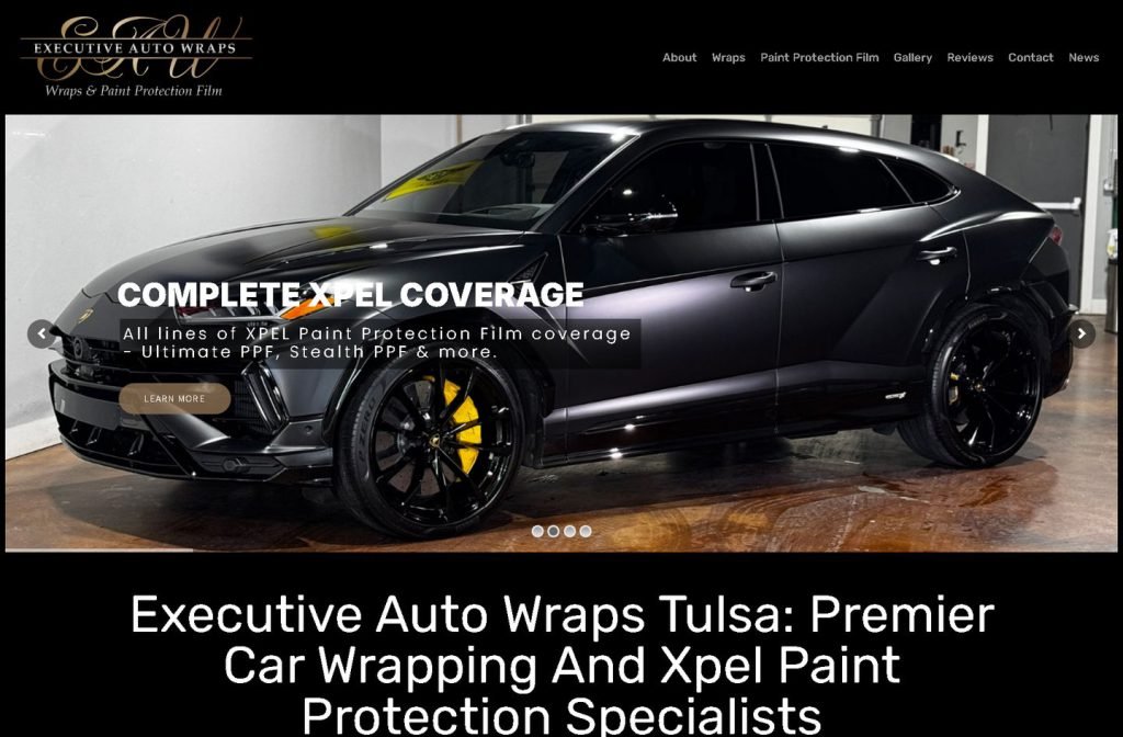
executiveautowraps.com
Case study
Kingsville Car Wash.
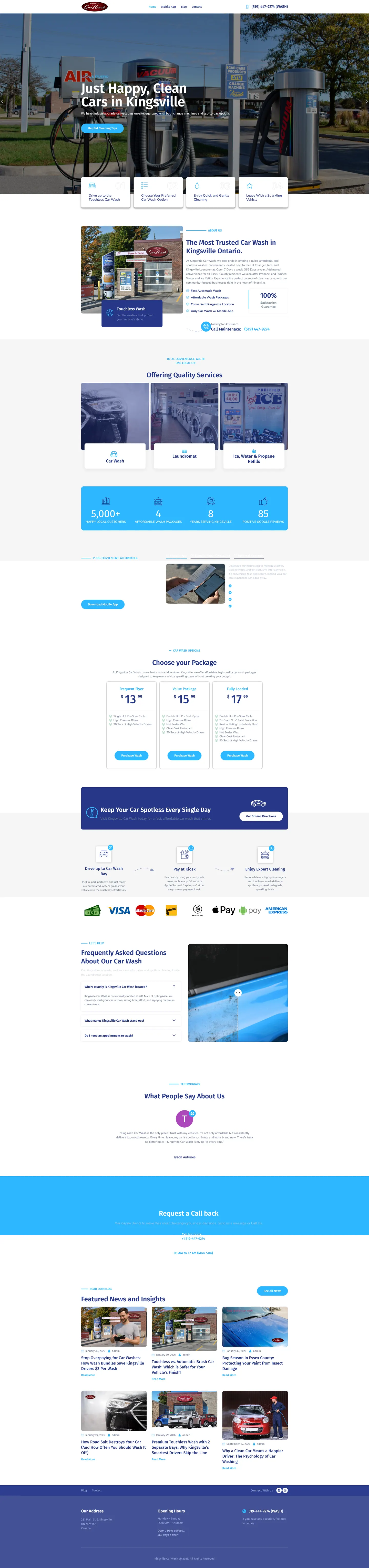
I built Kingsville Car Wash a WordPress site that works like a checkout, not a brochure. Drivers can buy one of three wash packages, learn how the loyalty app and referral rewards work, and see the wash's long run of Google reviews right next to the prices before they drive over.
IndustryAutomotive
Timeline2026
Built withWordPress
 HOVER TO SCROLL

// how it was built
From brief to launch.
The owners measured this site in sales, so I planned the build as a path from first glance to a paid package or a trip to the wash.
-
01 discover
Revenue as the goal
I learned the wash already had a big regular customer base and a strong Google review count, and that the owners wanted online package sales and app sign-ups.
-
02 plan
Homepage as funnel
I ordered the page from rotating headlines to how-it-works steps, trust figures, app tabs, pricing, then FAQs and reviews.
-
03 design
Sky blue and white
I filled the page with photos from the actual site and let the numbered step cards sit partly over the hero photo for a bit of depth.
-
04 build
WordPress sales pieces
I built the three package cards with buy buttons, the tabbed app section, the draggable before and after slider and a call-back request form.
-
05 integrate
Payments shown clearly
I added a strip listing every accepted payment method, from cash through to contactless, near the package pricing.
-
06 ✓ shipped
Mobile step cards
I split the steps into separate cards on phones, stretched the app button across the screen and noted in the footer that the wash opens all year.
What I did
The build, step by step.
- Packages you can buy. I set up three package cards on WordPress, each carrying a buy button, so drivers pay before they pull in.
- Four steps to explain it. A numbered row overlapping the hero walks through how the touch-free wash works in plain terms.
- Tabs for app and rewards. I grouped the loyalty app, referral perks and bundle deals into tabs so they share one tidy space.
- A slider you can drag. Inside the FAQ area I added a before and after comparison that visitors pull across to see the result.
- Real photos, simple palette. I held the palette to white and a light sky blue with shots of the actual bay and vacuum area, and on phones the app download button runs full width.
Related work
See them all
More Automotive projects.
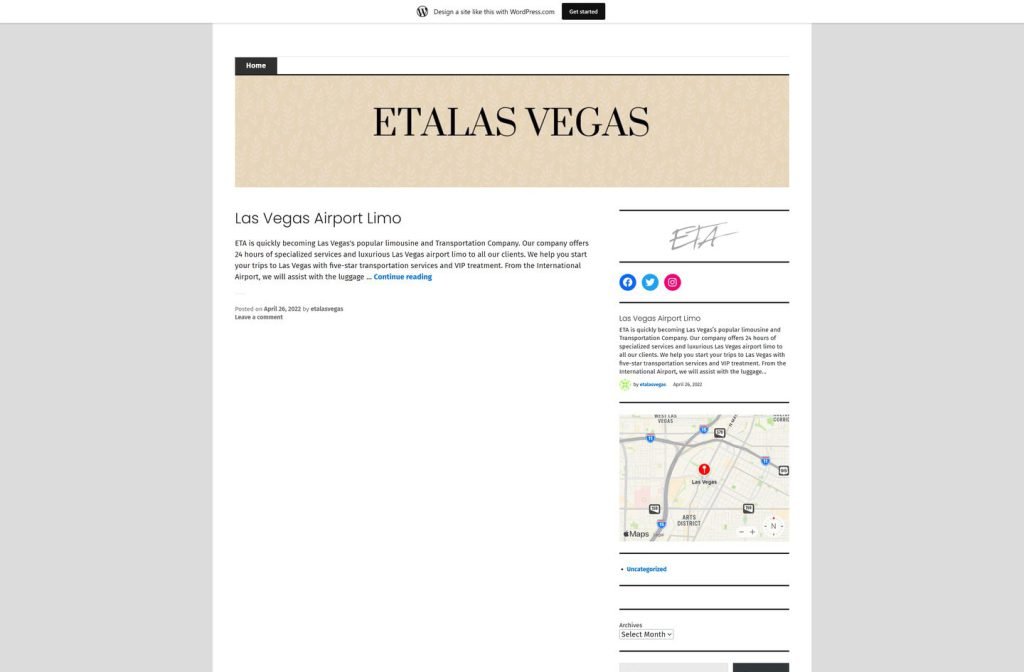
etalasvegas.wordpress.com
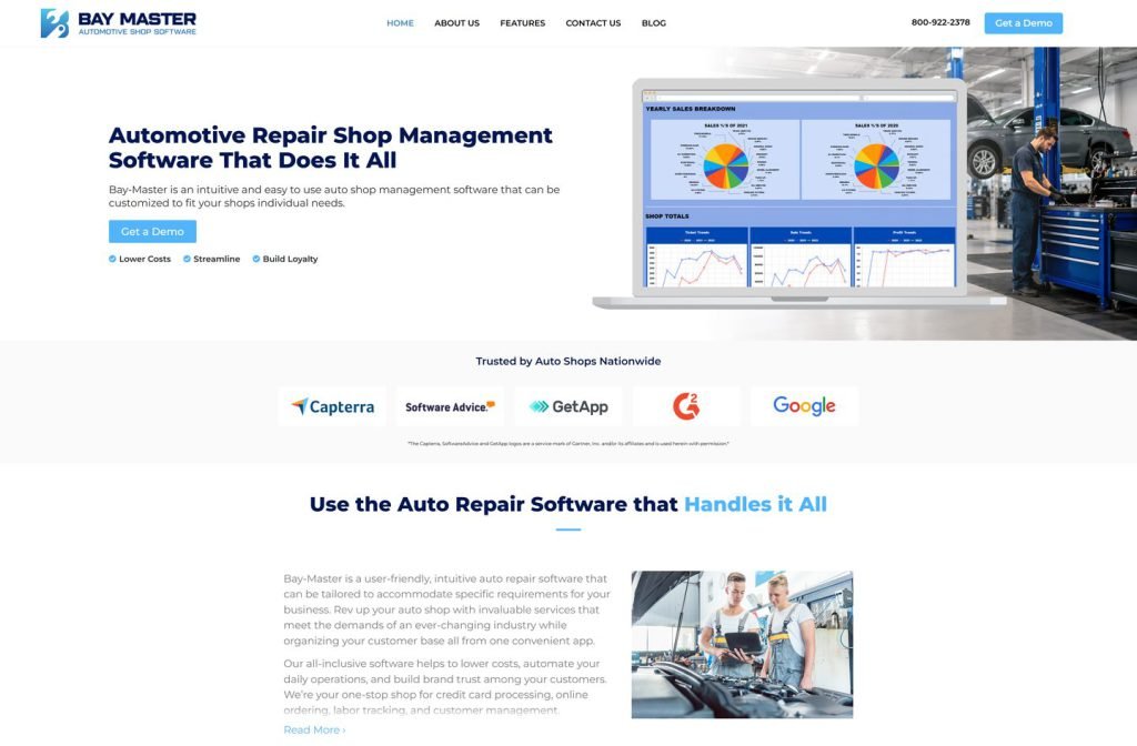
bay-master.com
Want this for your business?
Send me your URL and I'll reply with a prioritised breakdown of what's costing you enquiries and how I'd fix it. No charge, and no call needed.